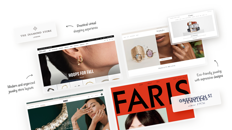
In today's digital world, website serves as an exceptional platform to showcase and sell exquisite jewelry creations, promote your brand, and market products. In this article, we have compiled a list of unique jewelry website examples to serve as a valuable source of inspiration as you embark on your journey to establish a thriving online jewelry business.
In today’s online marketplace, a website is not only a fantastic way to showcase your product and advertise your brand, but also to sell your jewelry creations.
Below, we’ve curated a collection of 31 exceptional jewelry website examples that you can use for inspiration to launch your own online business.
From exquisite designs to user-friendly interfaces, these jewelry website templates encapsulate the art of captivating digital presence, offering insights to propel your own jewelry venture to new heights.
We’ve chosen these websites based on:
- Design aesthetics
- User experience
- Brand consistency
- Images, videos, and media
- Navigation and interactivity
- Effective sales techniques and CTAs, etc.
So, without further ado, here are the best jewelry website examples in 2023.
In This Article
- Example 1: Gemfields – Sophisticated and stylish web design
- Example 2: Cartier – Simplicity and elegance
- Example 3: Sophie Buhai – Clean and elegant web design
- Example 4: Abby Seymour – Web design inspired by nature
- Example 5: Carlo Barberis – Interactive and lively web design
- Example 6: Mejuri – Modern and organized jewelry store layouts
- Example 7: Swarovski – Sophisticated modern web design
- Example 8: Greenwich Jewelers – Clean, simple web design
- Example 9: Leen Heyne – Sleek and minimal jewelry store design
- Example 10: Dinosaur Designs – Radiate positivity through design
- Example 11: ISLYNYC – Out-of-the-box design
- Example 12: Daniella Draper – Engaging jewelry website design
- Example 13: Michael Hill – Exuding quality and trust
- Example 14: The Diamond Store – Practical virtual shopping experience
- Example 15: Tiffany & Co. – Leverage brand power in design
- Example 16: Lin Shiao Tung – Intimate and authentic online jewelry store
- Example 17: Jewel Tree London – Accessible, consumer-oriented design
- Example 18: Ananta – Approachable wedding jewelry web design
- Example 19: Heera Diamonds – Facilitating a confident shopping experience
- Example 20: Charriol – Making a good first impression
- Example 21: Chekotin – Engaging animations and visuals
- Example 22: Alkemistry – The ultimate in style and luxury
- Example 23: Pandora – Attention-grabbing promos and product showcases
- Example 24: BLK and Noir – Jewelry store and lifestyle blog
- Example 25: Aurate New York – Vibrant and colorful online store
- Example 26: Fabrikant – Understated sophistication
- Example 27: Faris – Inclusion through diversity
- Example 28: Anchor & Crew – Unisex jewelry store design
- Example 29: Limnia – Interactive and engaging animations
- Example 30: Aroz – Balanced selection of fonts, images, and colors
- Example 31: Bluboho – Eco-friendly jewelry with expressive designs
- Understand your audience
Example 1: Gemfields – Sophisticated and stylish web design
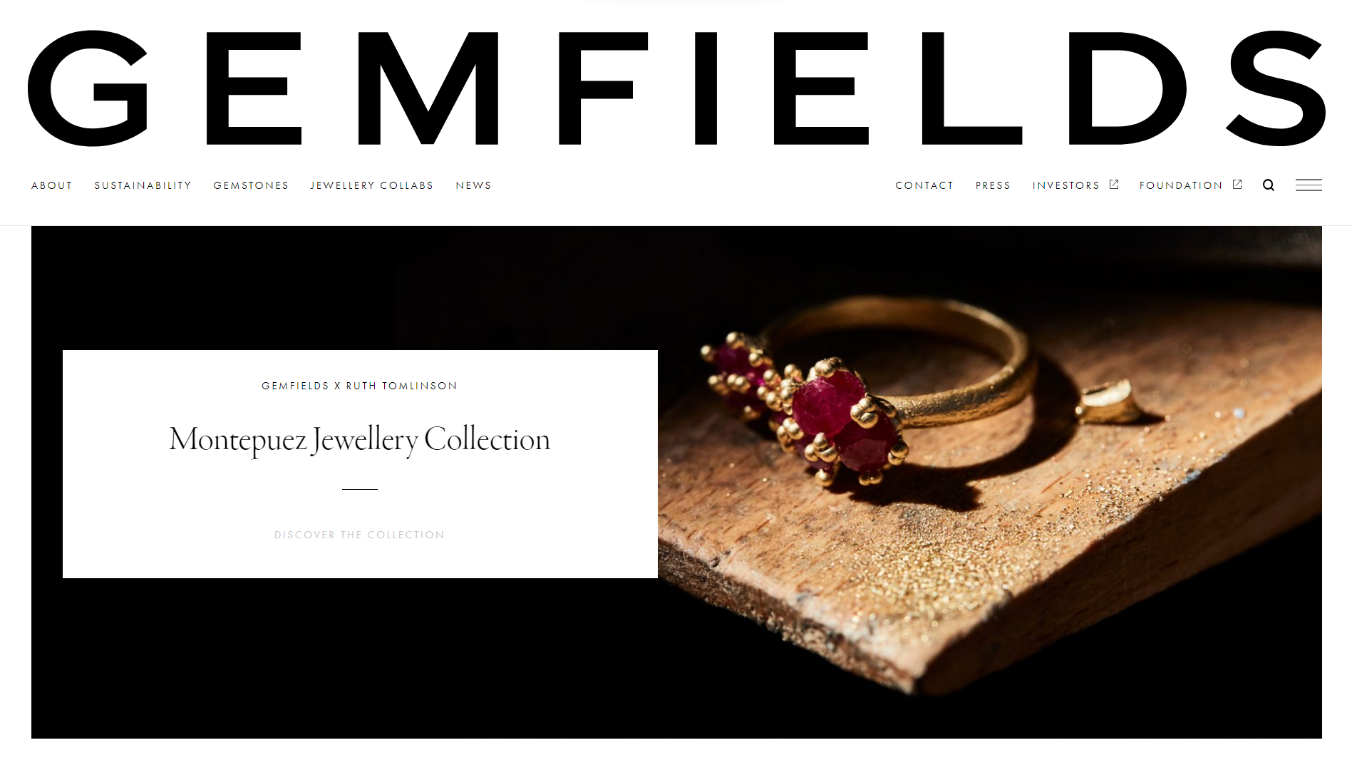
Whether you’re a web designer or in the jewelry business, this jewelry website example from Gemfields is a must-see. Gemfields is a leading supplier of ethical colored gemstones sourced responsibly. Their site boasts a professional, creative design that inspires everyone in the industry.
Highlights include engaging hero videos, ample white space for clarity, and a smart news layout. A sticky header ensures branding visibility and easy navigation. While the design is sophisticated, you’ll be able to quickly and easily replicate it for your own website using the 10Web AI Website Builder.
What we like:
- High-quality, brand-consistent design.
- Excellent use of ample white space for visual clarity.
- Beautiful use of high-quality, overlapping images and video clips.
Create a custom website tailored to your business needs 10X faster with 10Web AI Website Builder!Get a head start on website creation with AI
Example 2: Cartier – Simplicity and elegance
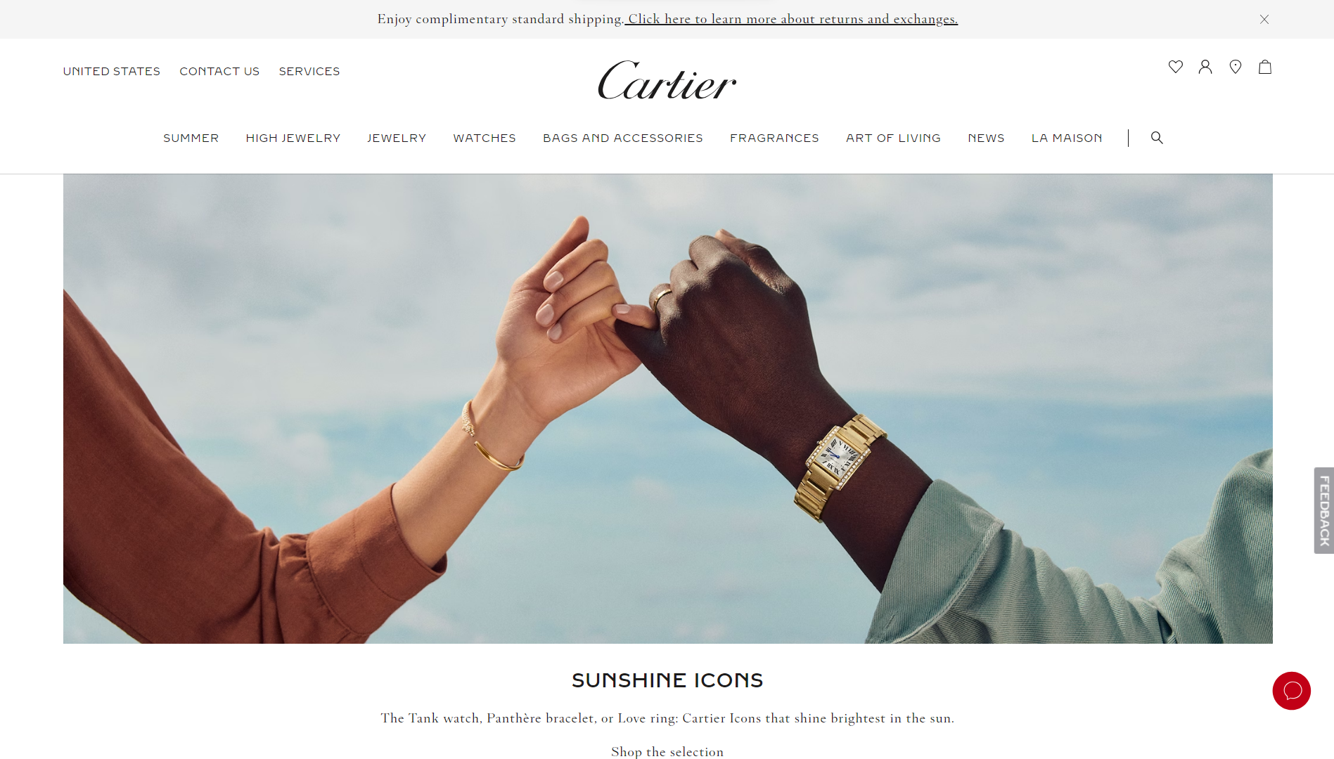
The Cartier website personifies simplicity and elegance with ample use of whitespace, uncomplicated layouts, and a user-friendly mega menu for navigation. As befits a brand with global reach, they also effectively showcase their jewelry using a diverse selection of models. From Vanessa Kirby to Jake Gyllenhaal, they also use celebrity status to highlight the organization’s prestige.
What we like:
- Diverse and star-studded cast of models.
- Understated and minimalist design.
- User-friendly mega menu navigation.
Example 3: Sophie Buhai – Clean and elegant web design
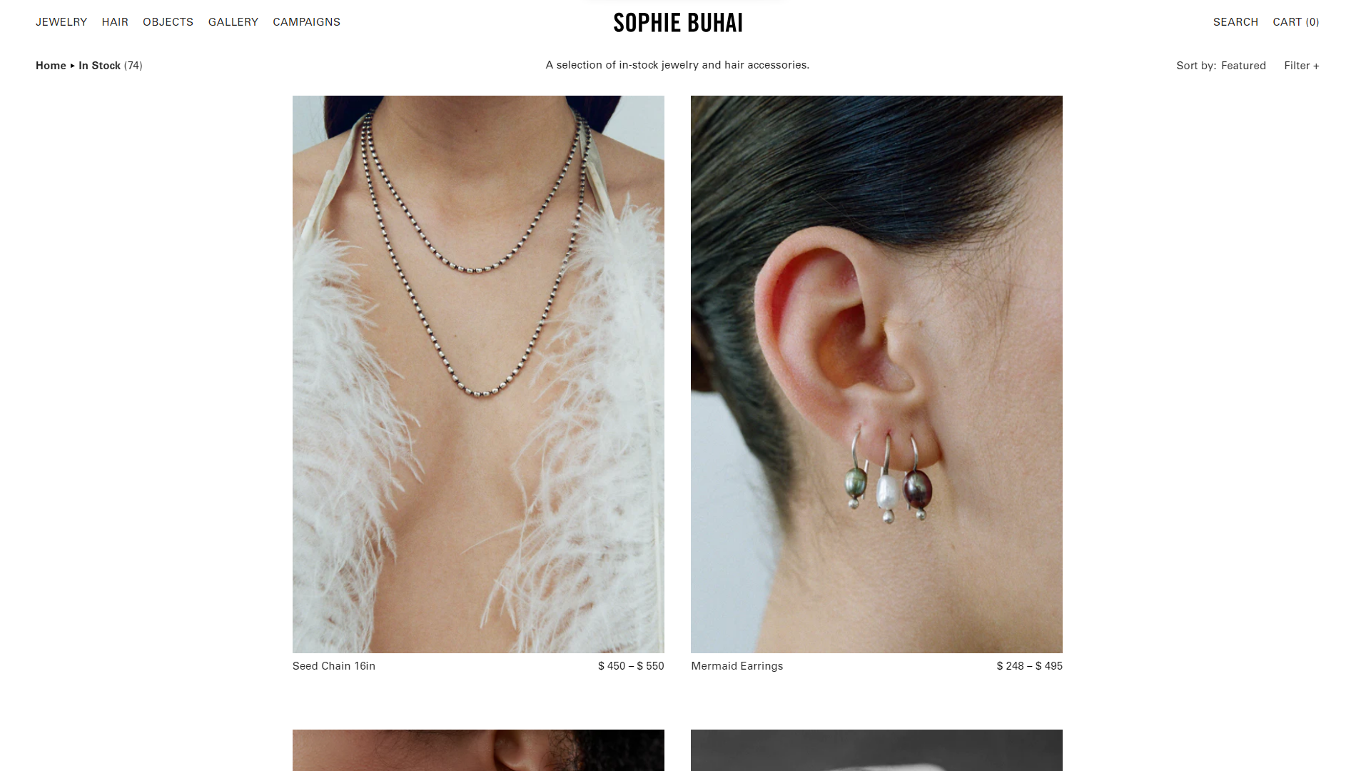
Sophie Buhai’s online jewelry website is a prime example of how to make your goods the center of attention. The minimal and clean design puts all of the focus on its jewelry products. In another conscious decision, all products are showcased on models, but even their faces are hidden, so nothing distracts from its gorgeous accessories. The jewelry is also left to speak for itself, with almost no website content or copy to speak of.
What we like:
- Clean and minimal design highlights jewelry pieces.
- Navigation is very straightforward and highly intuitive.
- An excellent example of using minimal content.
Example 4: Abby Seymour – Web design inspired by nature
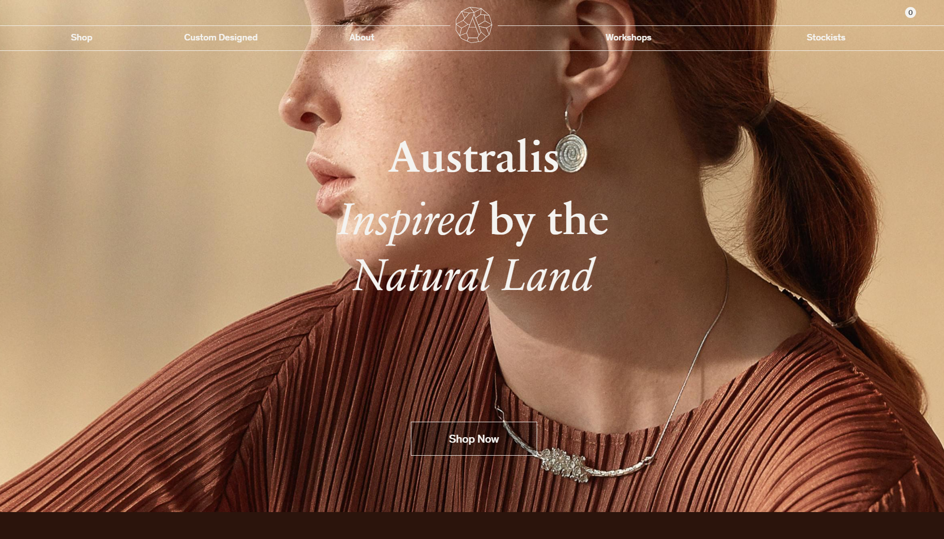
Abbey Seymour’s Australis jewelry collection is strongly inspired by the natural land in her home country of Australia. This is beautifully illustrated in the web design, which is based on earthy hues that remind one of the Australian Outback and its desert landscapes.
Somehow, the earthy colors balance seamlessly with the modern interactive elements and classic fonts. In contrast, the product areas are completely minimal, with only pictures of the jewelry products, with a hover effect that shows an individual item’s name and pricing.
What we like:
- Seamlessly balances different aesthetics throughout the design.
- Minimal content on shopping pages with a comprehensive about page.
- Useful mini floating navigational menu.
Example 5: Carlo Barberis – Interactive and lively web design
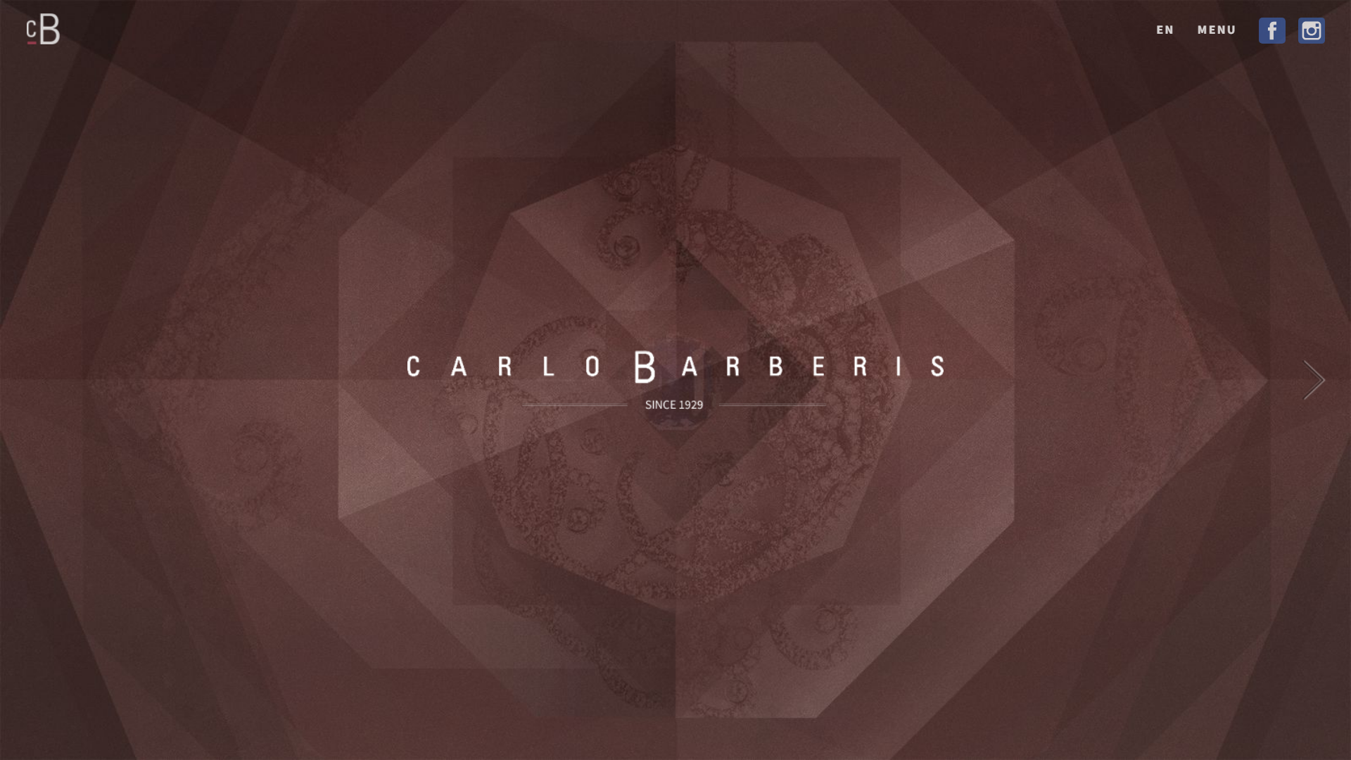
Carlo Barberis’ website is one of the most visually striking jewelry website examples on this list. This brand, infused with Italian flair, embodies a deep passion for nature, beauty, and exquisite jewels. The homepage boasts a captivating fullscreen layout featuring branding, navigation, and social icons seamlessly integrated.
The site employs an engaging slider with lively background animations to transition between pages. Every page exudes creativity, featuring remarkable elements like parallax effects, smooth sliders, and scroll animations that collectively create an exceptional user experience.
What we like:
- No-scroll horizontal homepage layout makes top-level navigation easy.
- Jewelry collection pages use engaging scrolling animations.
- Captures the prestige and social status of jewelry.
Example 6: Mejuri – Modern and organized jewelry store layouts
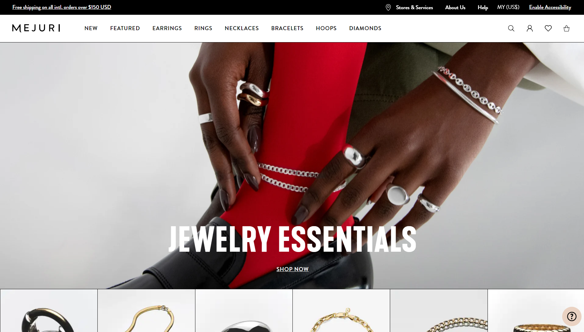
Hailing from Toronto, the Mejuri brand prioritizes sustainability with 100% traceable gold and specializes in everyday wear. Unlike many other jewelry website examples, Mejuri took a more consumer-focused approach with a design that has a modern, urban feel to it. While some might think the pages are too “busy”, the website actually does a great job of organizing and presenting a lot of information and products in a way that’s easy to digest.
What we like:
- The modern and sleek design makes the store feel accessible.
- Able to meaningfully organize a lot of content.
- Uses easy-to-read sans serif fonts throughout.
Example 7: Swarovski – Sophisticated modern web design
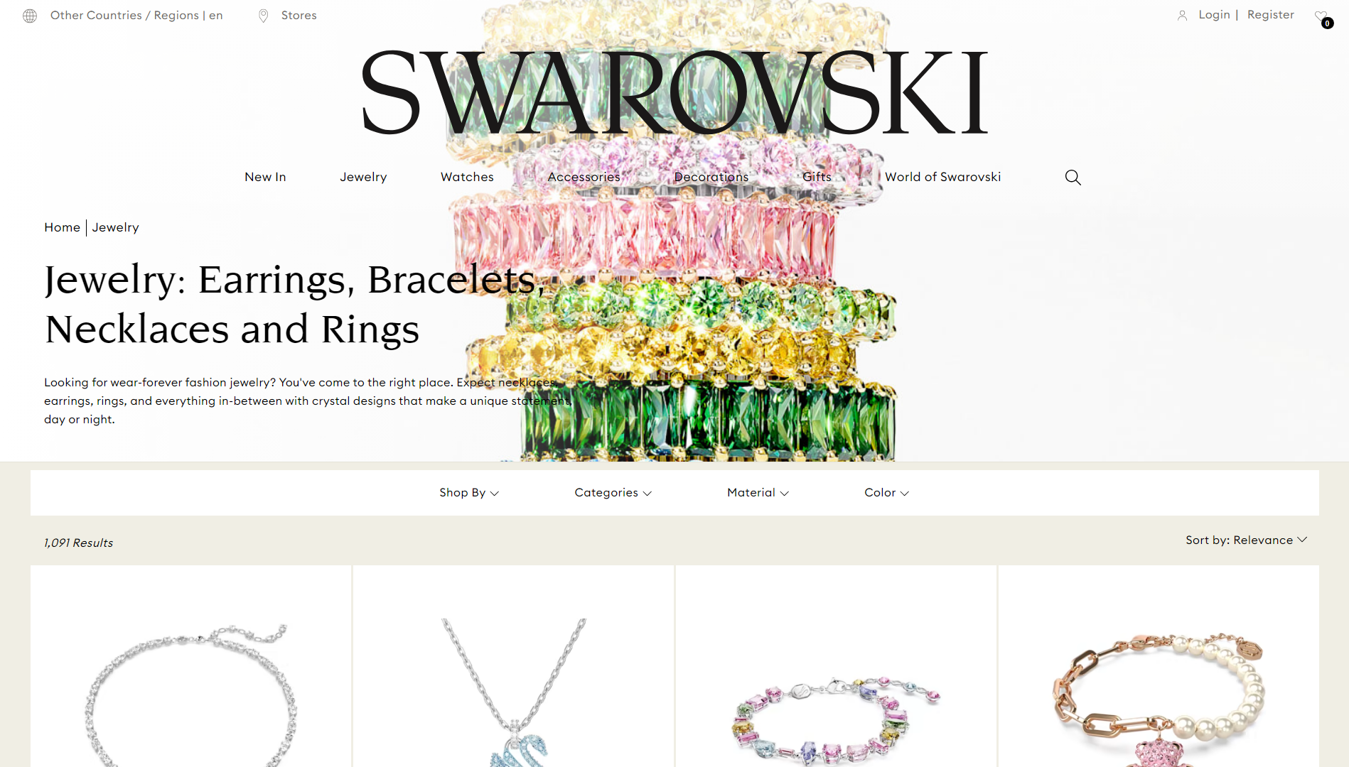
Swarovski is one of the most illustrious names in the jewelry industry, and its website does the brand’s name justice. Even among these jewelry website design templates, Swarovski’s website exudes elegance and sophistication with modern serif fonts and sleek page layouts. Its more colorful and eye-catching accessories really sparkle thanks to the neutral background. While it’s undoubtedly a gorgeous theme, they didn’t compromise usability for aesthetics at all.
What we like:
- The modern and structured layout makes browsing easy.
- Uses modern content sections and navigational elements.
- The understated and muted color palette makes jewelry pop.
Example 8: Greenwich Jewelers – Clean, simple web design
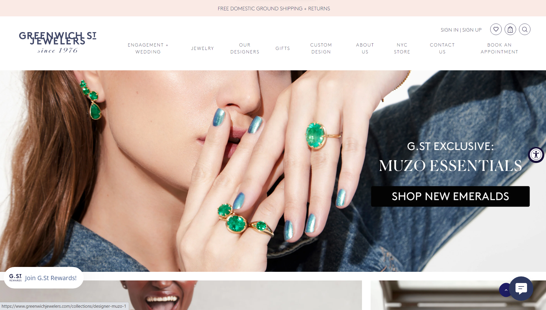
A local, family-owned venture in New York City, Greenwich St. Jewelers exudes intimacy. For aficionados of visually striking websites boasting clean aesthetics and a structured layout, this is a must-see.
Greenwich’s imagery does a good job of showcasing its captivating array of jewelry that caters to diverse tastes as well as giving off positive vibes. Aside from the interactive chat widget, they do a good job of helping customers stay in touch with social media and map integration.
What we like:
- Functional chat to engage and support visitors.
- Well-structured and organized image-based layout.
- Clean and simple aesthetics.
Example 9: Leen Heyne – Sleek and minimal jewelry store design
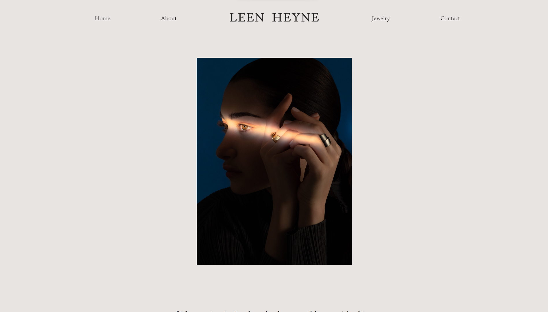
Of all the spectacular jewelry website examples on this list, Leen Heyne might feature the best minimal design of all.
The homepage’s understated, monotone design is like a breath of fresh air that doesn’t assault a new visitor with information. The single-column layout that consists mostly of images with the occasional illustration, animation, and short-form copy keeps the user scrolling for more.
Another highly creative touch is using sleek, dark-toned images in which the jewelry is highlighted under a spotlight.
What we like:
- Perfectly balanced, sleek, elegant, and minimal design.
- Doesn’t overwhelm new visitors with information and options.
- Excellent use of animations and effects.
Example 10: Dinosaur Designs – Radiate positivity through design
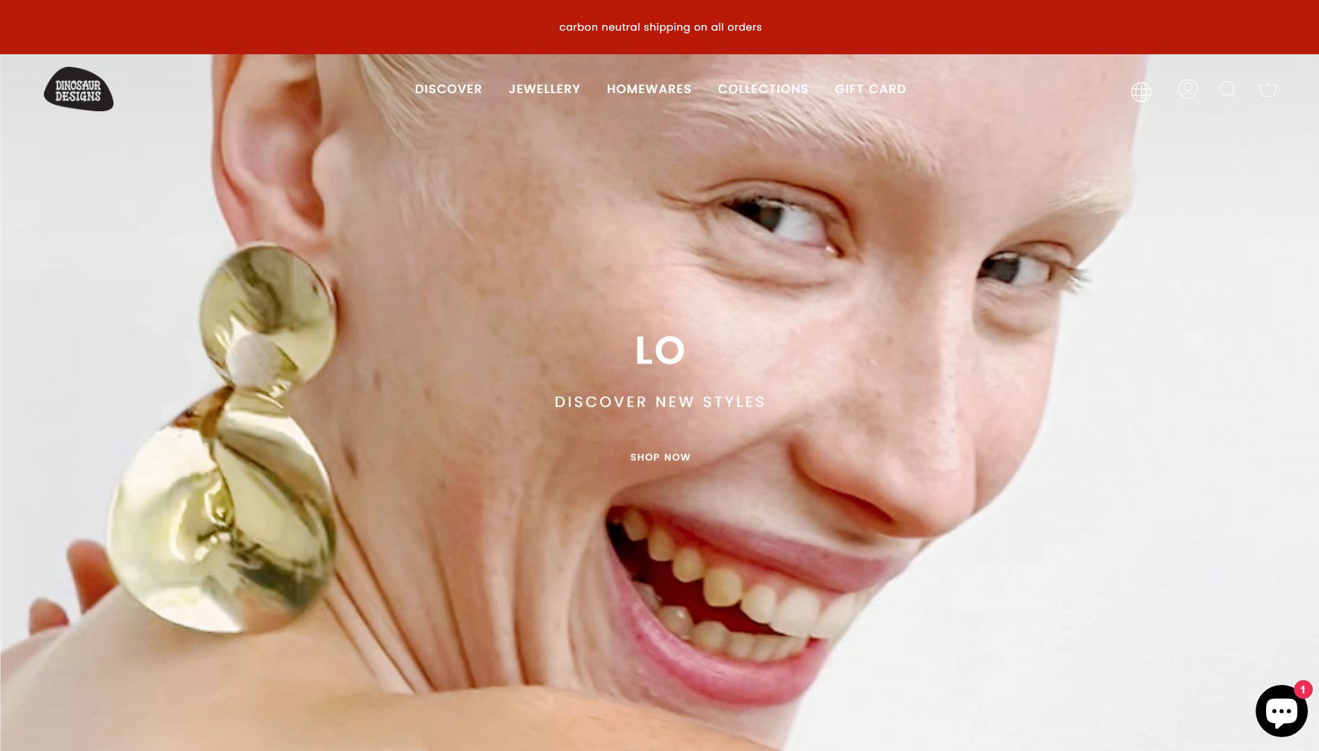
Dinosaur Designs proves that you can run a successful online jewelry business with a quirky and fun approach. The fast-paced, lighthearted hero background video sets the tone for the rest of the design, which is filled with vibrant colors and unexpected visual elements.
The website also does a good job of showcasing specific pieces with immersive videos, without overusing this tactic. Despite its eclectic look and feel, the navigation is straightforward, with a clean and minimal full-page menu.
What we like:
- Autoplay videos create a sense of vibrancy.
- Design sets itself apart from other jewelry websites.
- Simple, flat navigational hierarchy.
Example 11: ISLYNYC – Out-of-the-box design
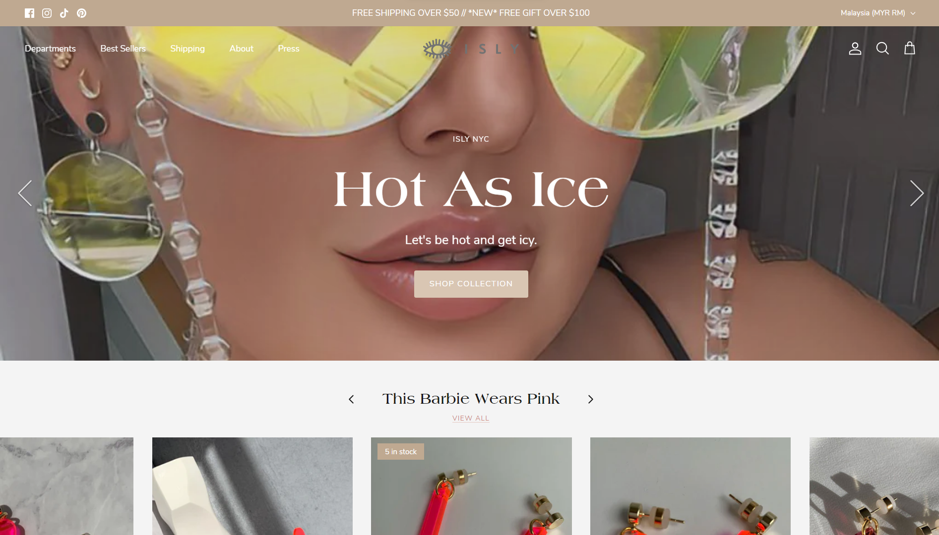
ISLYNYC is another jewelry website that isn’t afraid to break with the norm. This design continuously engages and delights visitors with the unexpected. From eclectic collection names like “This Barbie Wears Pink” to highly stylized images and text overlays, it’s not your typical jewelry and accessory store.
As a brand, they are also not afraid to show their support for various causes that their designers represent. From a business perspective, another smart move was to provide direct add-to-cart listings of their top sellers on the home page.
What we like:
- The design doesn’t follow typical jewelry website templates
- Branding and marketing through social proof.
- Conversion-oriented design.
Example 12: Daniella Draper – Engaging jewelry website design
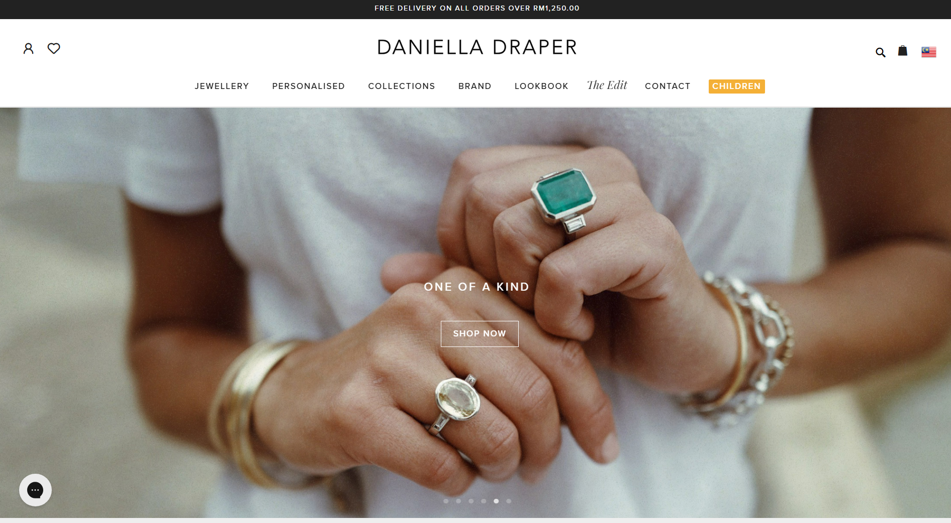
Meet Danielle Draper, the esteemed British jewelry designer with a string of awards to her name. With a commitment to sustainability, she crafts enduring, top-tier pieces using recycled gold and silver. Her global e-commerce platform is finely tuned to meet the needs of worldwide shoppers.
Notably, the hero section gives visitors immediate access to a splendid showcase of individuals adorned in her prestigious creations through an engaging slider. Combining user-friendliness with style, the sticky menu ensures easy navigation, while the jewelry categories feature a visually pleasing and crystal-clear tile layout.
What we like:
- Relatable and highly engaging photography.
- Functional and intuitive navigational mega menu.
- Excellent use of lookbooks to encourage cross-selling.
Example 13: Michael Hill – Exuding quality and trust
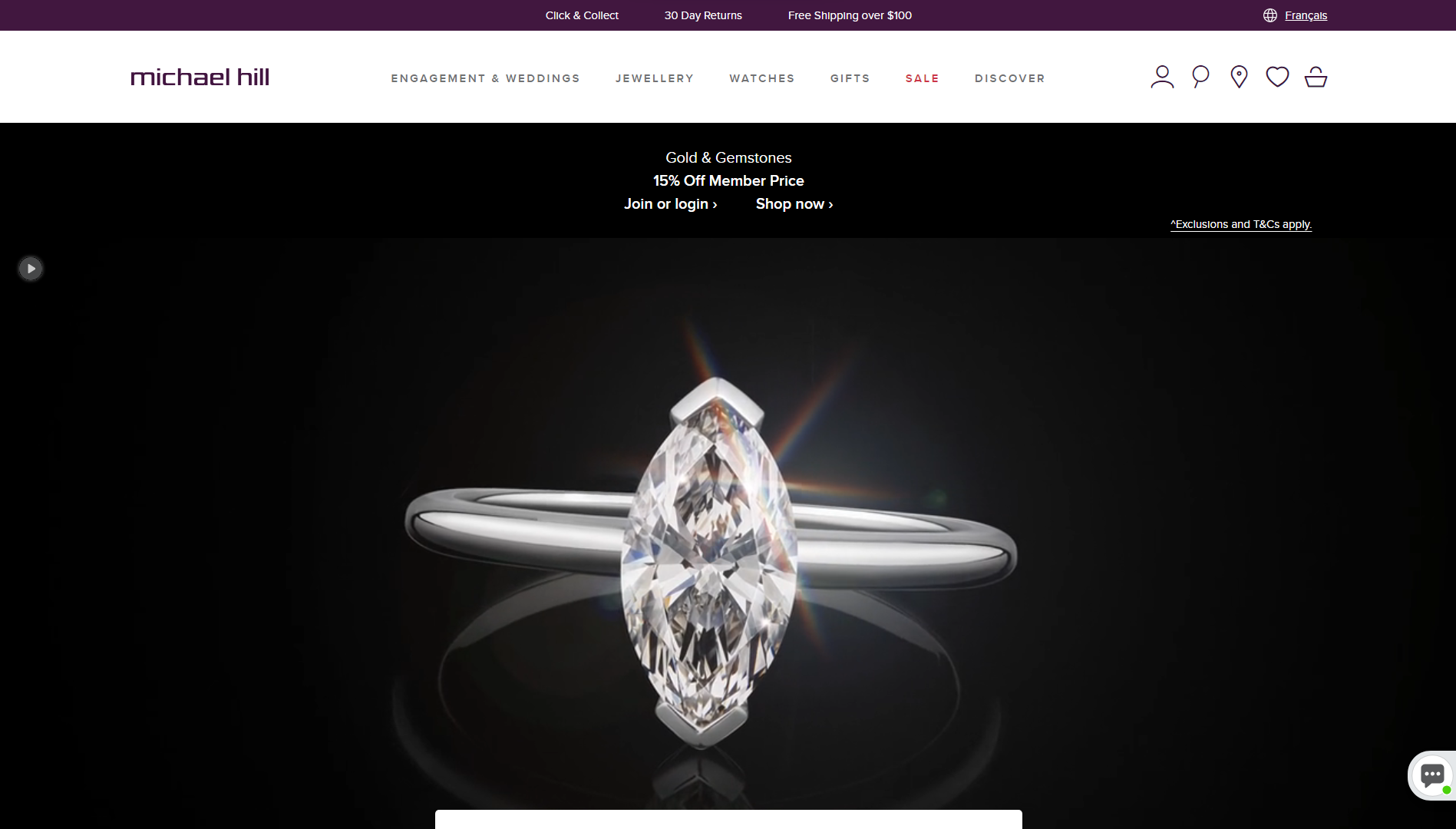
Michael Hill is another one of the jewelry website examples that does a fantastic job of highlighting its jewelry pieces. The production quality of its jewelry photographs, 3D renders, and animations is obvious, assuring potential buyers of the level of service they can expect. The rest of the design continues to establish trust with a business-like black-and-white aesthetic.
What we like:
- Showcases jewelry with high-quality images and animations.
- Highly conversion-focused use of discounts and promotions.
- Users can pause/play autoplay videos at will.
Example 14: The Diamond Store – Practical virtual shopping experience
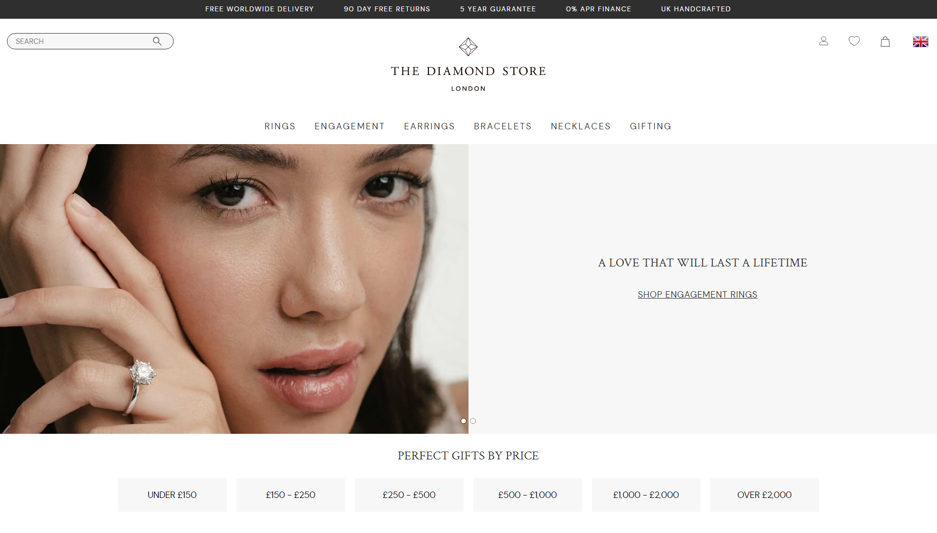
The Diamond Store’s website is tailored to assist consumers in discovering the perfect jewelry within their budget, adding a touch of elegance to their special occasions. This is achieved through a seamless blend of clean, uncomplicated design with fantastic help resources in the form of FAQs, sizing guides, buying guides, etc.
The homepage makes starting your journey extremely easy by allowing you to immediately choose between browsing different jewelry types, diamond shapes, or budget ranges to narrow down your search. By using the 10Web AI Website Builder to replicate this site, you can also create a jewelry store website that combines gorgeous design with practical functionality.
What we like:
- Sleek and uncluttered web design.
- Ample whitespace for clarity.
- Skillful incorporation of appealing shapes.
Get a head start on website creation with AI
Create a custom website tailored to your business needs 10X faster with 10Web AI Website Builder!
Get a head start on website creation with AI
Create a custom website tailored to your business needs 10X faster with 10Web AI Website Builder!

Example 15: Tiffany & Co. – Leverage brand power in design
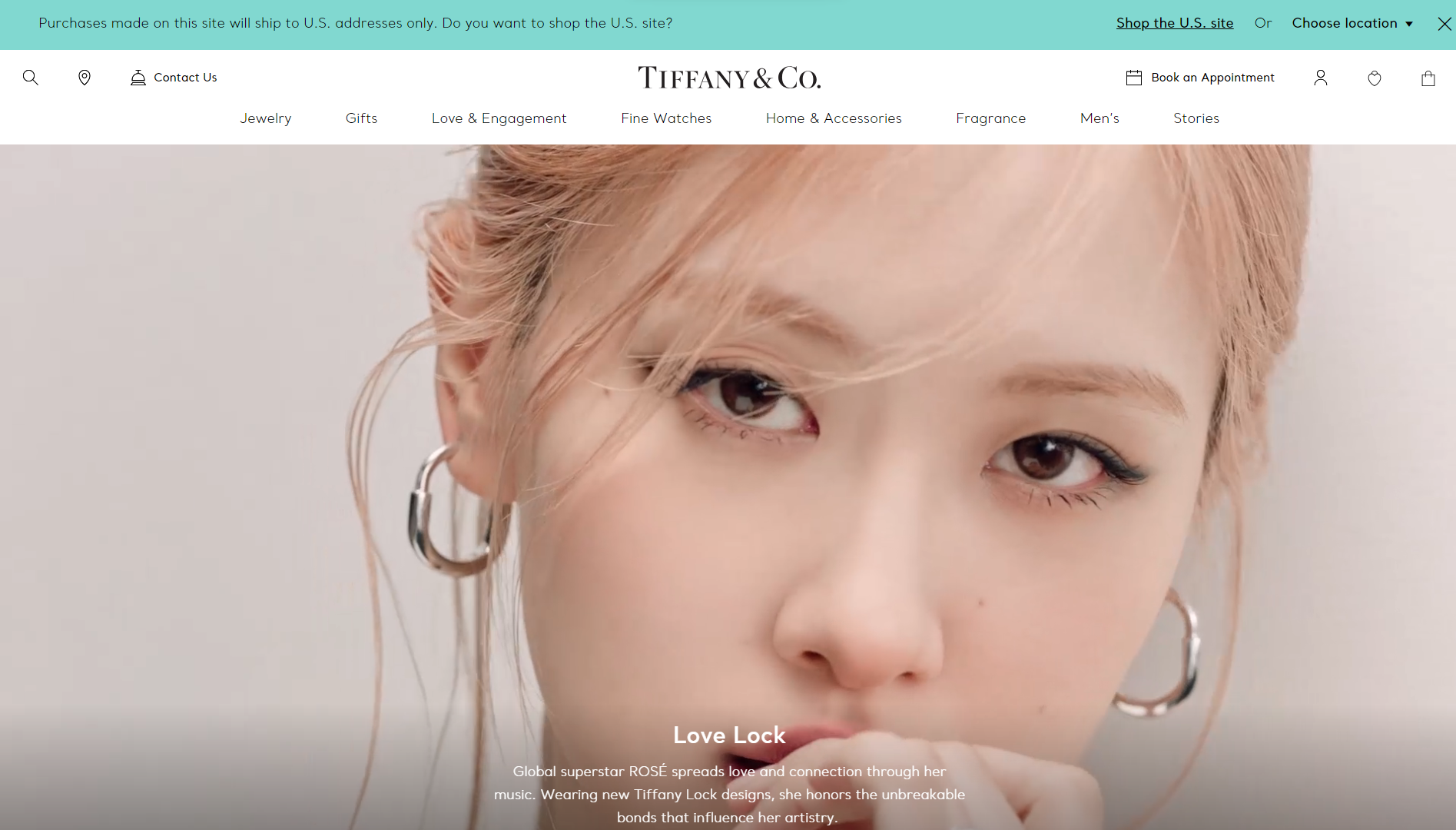
Another household name in the industry, Tiffany & Co. also makes it to our list of the best jewelry website examples. While the design doesn’t take too many chances, it’s exactly this familiarity that makes it so intuitive and user-friendly. The homepage immediately establishes Tiffany & Co. with the use of their iconic “Tiffany Blue” as well as by featuring stars like Rosé and Zoë Kravitz.
What we like:
- Highly intuitive and accessible online store design.
- Emphasizes the brand as well as the quality of service.
Example 16: Lin Shiao Tung – Intimate and authentic online jewelry store
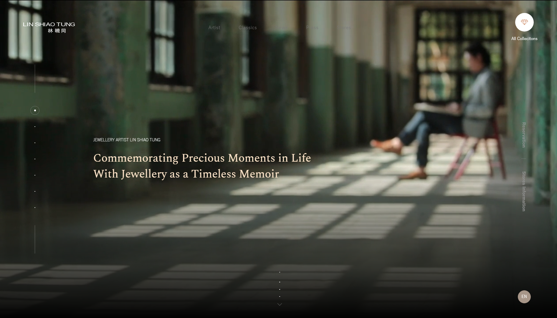
Lin Shiao Tung Jewelry’s website perfectly showcases the profound meaning woven into each of the artist’s creations and his strong belief that his works embody significance. Of all these jewelry website templates, this one offers the most intimate experience with background videos that illustrate Tung’s creative process and dedication to his craft.
The feed-like homepage layout makes the visitor feel as if they’re on a journey with the artist to discover collections, important events, and more about the man himself. Navigation is versatile, offering both side-slider exploration and effortless scrolling. Much like his work, the website has an authentic, handcrafted feel that sets it apart from generic sites.
What we like:
- Innovative navigation and layout elements.
- Beautifully made video productions draw visitors in.
- Gives off a feeling of authenticity and exclusivity.
Example 17: Jewel Tree London – Accessible, consumer-oriented design
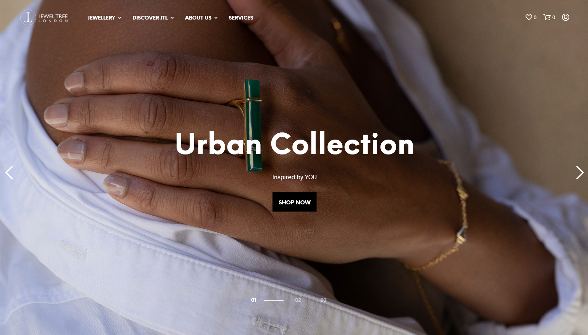
Jewel Tree London boasts a welcoming website adorned with top-notch images, masterfully organized for a seamless experience. Upon arrival, a plethora of well-presented products await your perusal, without overwhelming you with options.
As a store that offers handcrafted jewelry at affordable prices, the design does its best to come across as accessible and less exclusive. While the photography is high-quality, its accessories are portrayed in a more casual and everyday manner to attract a broad audience.
What we like:
- Appealing imagery caters to the general public.
- Crisp and uncluttered design.
- Bold and highly legible fonts allow for quick scanning.
Related Articles
Example 18: Ananta – Approachable wedding jewelry web design
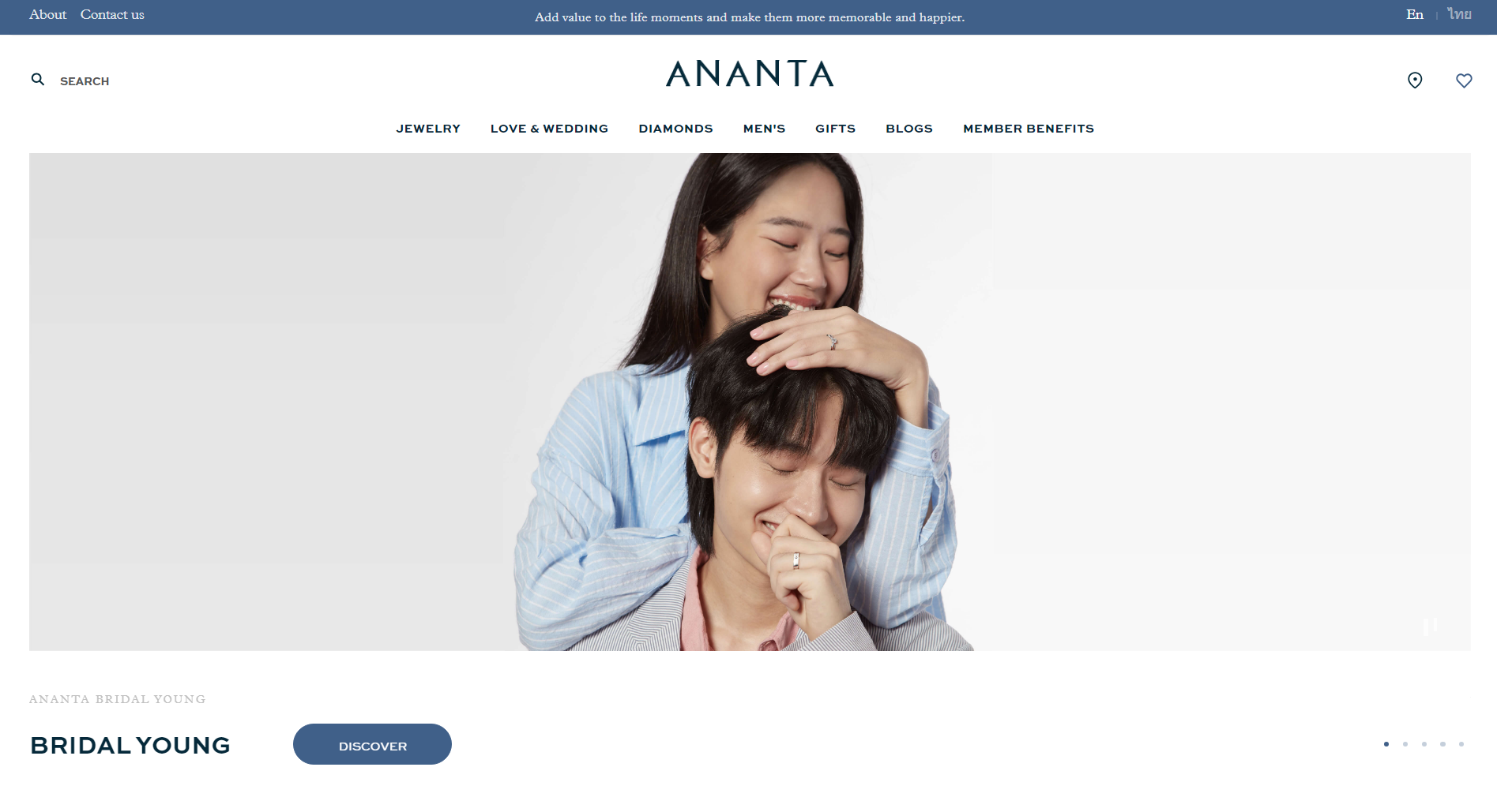
Ananta, named after the Sanskrit term for eternity, is one of Thailand’s leading brands in the wedding jewelry scene. The website’s design, while straightforward, is primed to deliver an exceptional shopping journey for jewelry enthusiasts.
The hero section captivates with a fluid slider showcasing diverse images. Moreover, well-structured categories feature enticing thumbnails and compelling CTAs. The site’s intelligent use of a sticky header enhances visibility for branding, navigation, and collections alike.
What we like:
- Well-structured and easy-to-follow layouts.
- Clean and light visuals feel welcoming.
- Communicates the happy emotions associated with its wedding jewelry.
Example 19: Heera Diamonds – Facilitating a confident shopping experience
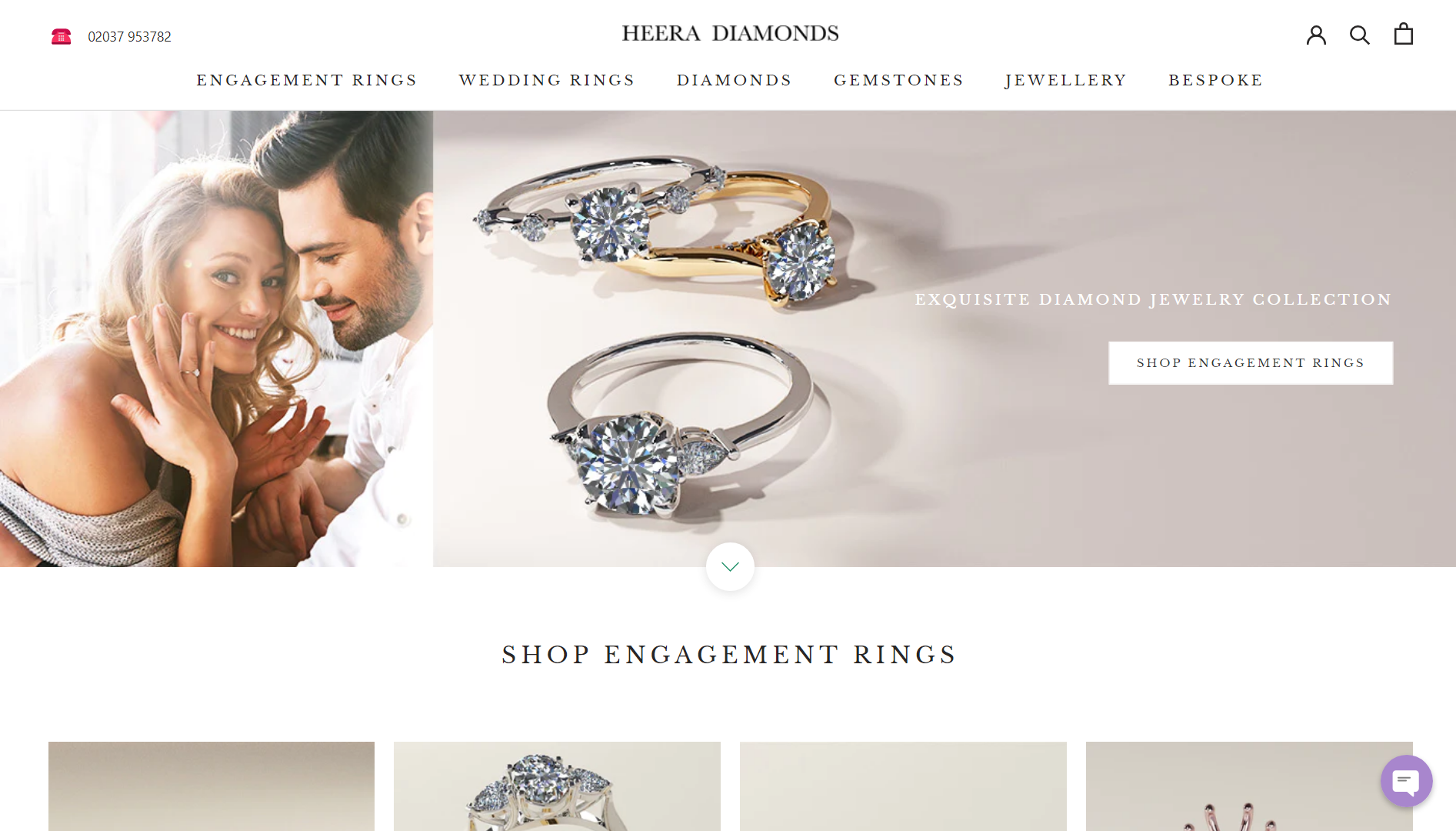
Established in 2015 and rooted in Hatton Garden, London, Heera Diamonds has rapidly expanded to four stores within five years. As an online jewelry store in the wedding niche, it makes it easy for shoppers to narrow down their search with helpful guides that break down the different types of rings, stones, and other jewelry items. The built-in chat widget also assures shoppers that support is always on hand.
What we like:
- Well-structured menu layout.
- Prominent above-the-fold call to action.
- Thoughtful incorporation of whitespace.
Example 20: Charriol – Making a good first impression
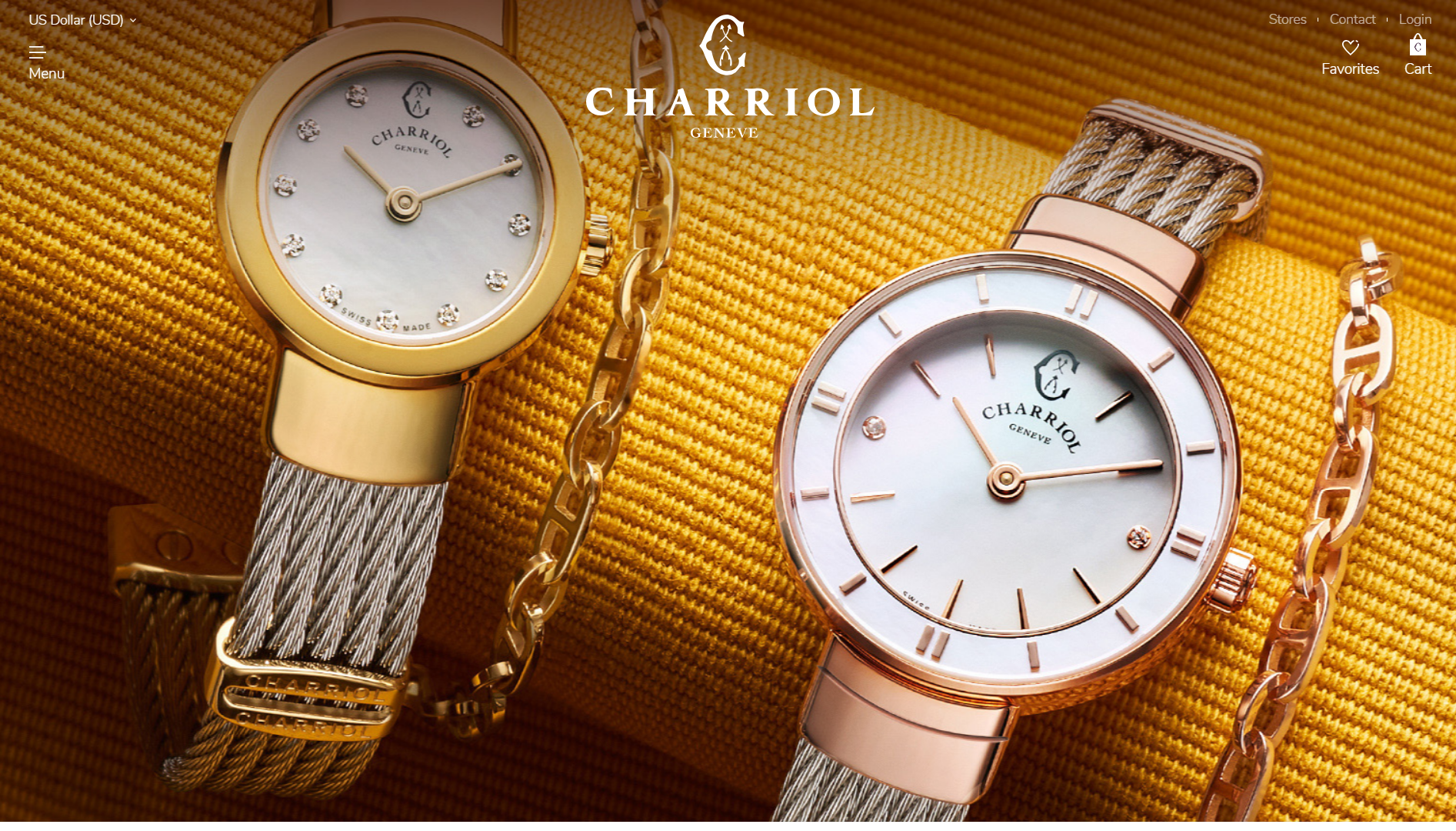
Meet Charriol, a Swiss jewelry business with a website design that positively drips prestige and exuberance. Charriol excels in crafting luxury watches and exquisite jewelry, and its luxurious, highly detailed imagery perfectly captures the essence of its works.
The website boasts a captivating hero header with a compelling background image, spotlighting the brand’s name and an off-canvas menu.
Like Charriol, you also need to ensure key elements like high-quality images, well-chosen fonts, and a cohesive color palette harmonize to faithfully represent your brand and its essence. Luckily, the 10Web AI Website Builder can do this for you by taking a few prompts about your business and turning them into a cohesive, professional-looking design.
What we like:
- Captivating header image sets the tone for the website.
- The slide-in off-canvas menu makes navigation seamless.
- Showcases the history and reputation of the brand.
Get a head start on website creation with AI
Create a custom website tailored to your business needs 10X faster with 10Web AI Website Builder!
Get a head start on website creation with AI
Create a custom website tailored to your business needs 10X faster with 10Web AI Website Builder!

Example 21: Chekotin – Engaging animations and visuals
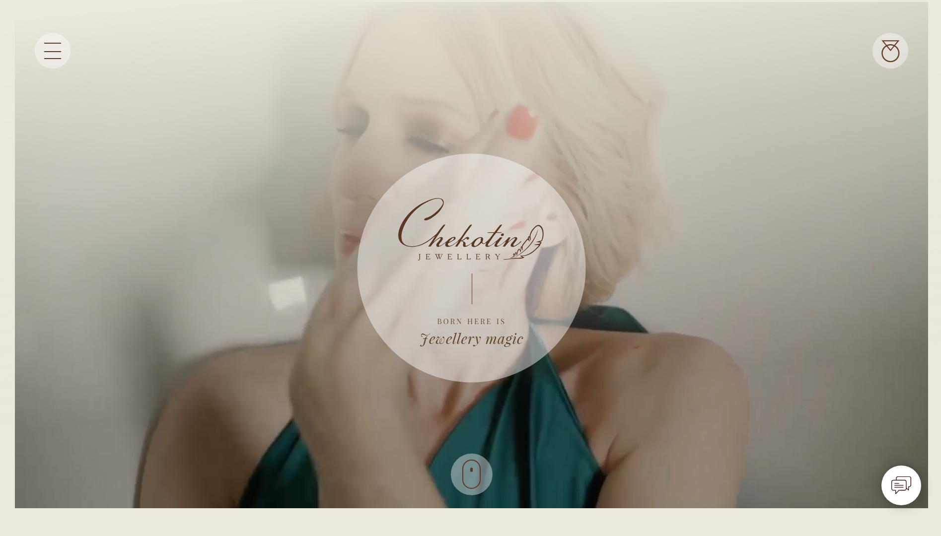
Every inch of the Chekotin website feels alive thanks to the clever use of loading states, scrolling animations, looped background videos, and hover animations. Whereas most other jewelry website examples are pretty static, Chekotin bubbles with activity.
The most impressive feat is that Chekotin could incorporate all of this movement without it getting in the way of a smooth and seamless shopping experience. Inspired by nature, it illustrates this side of its creations by seamlessly superimposing photos of its jewelry on background illustrations.
What we like:
- Striking background imagery.
- Thoughtfully designed fullscreen menu.
- Beautiful and captivating use of animations and movement.
Example 22: Alkemistry – The ultimate in style and luxury
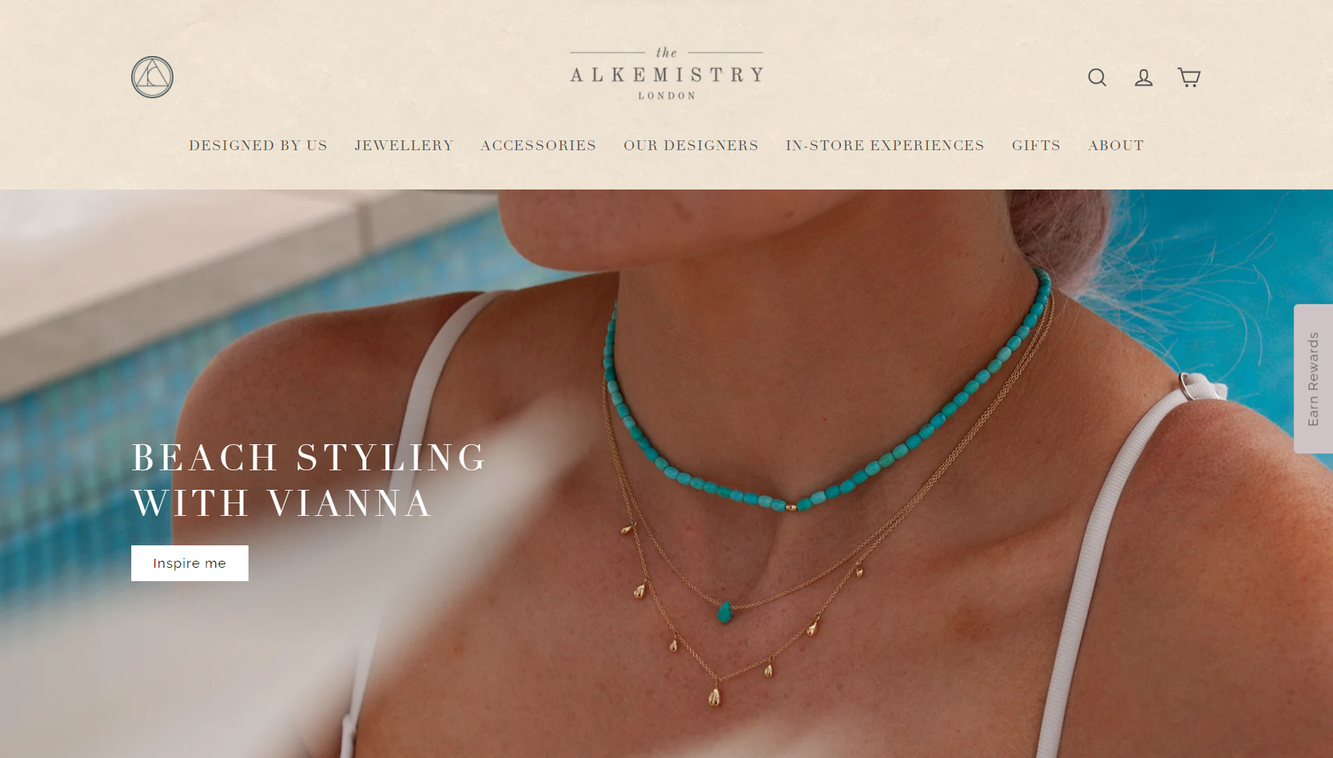
The Alkemistry redefines jewelry shopping into an engaging and delightful journey. Catering to discerning women who relish luxury, it’s a haven for discovering distinctive, wearable fine jewelry. Through the meticulous organization and detailed presentation of their items, they make the experience of online shopping a joy.
The whole feel of the design has an Instagram/influencer style, so it’s no surprise that they prominently link to their social channels.
What we like:
- Effective use of typography and gorgeous fonts.
- Interactive sliders optimized for mobile touch.
- Subtly appealing color palette.
Example 23: Pandora – Attention-grabbing promos and product showcases
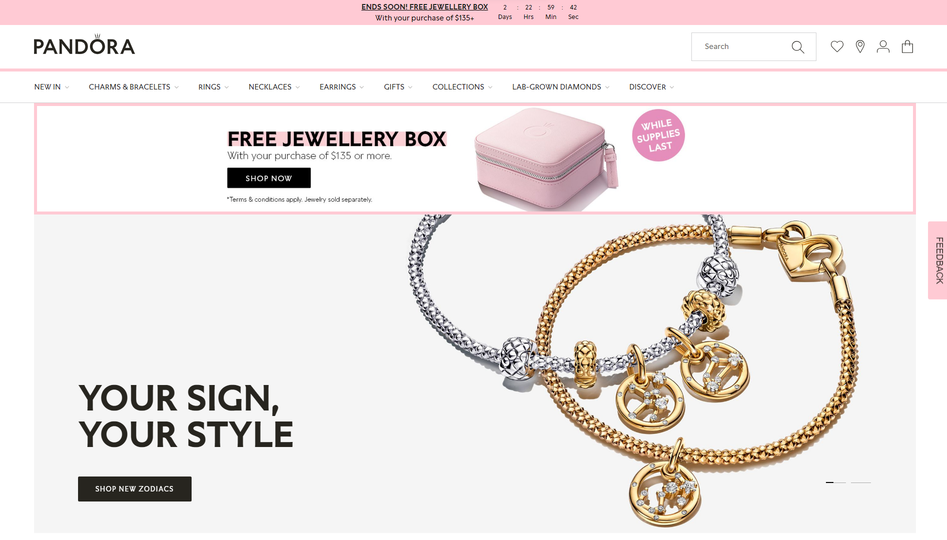
As one of the leading sellers of wearable jewelry in the world, it should come as no surprise that Pandora features one of the top jewelry website examples to follow. The design doesn’t hesitate to use its feminine charms to entice women looking to treat themselves or men looking to get a gift in time for that upcoming special occasion.
What we like:
- Effective use of CTAs, limited-time offers, and offers.
- Makes it easy to find trending products with featured sliders.
- Minimal design highlights jewelry products.
Example 24: BLK and Noir – Jewelry store and lifestyle blog
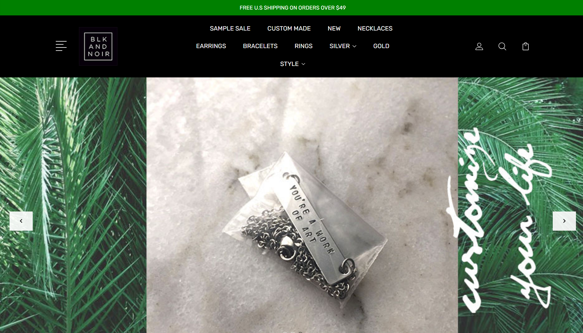
BLK and Noir specialize in crafting customizable, handmade, and personalized jewelry, setting a prime example for other hopeful entrepreneurs. Navigating through their selection is a breeze, thanks to a thoughtfully organized menu. The pages boast a captivating color scheme and engaging imagery that gives off its own unique vibe. Plus, they make sure to show off the popular news and media outlets that have featured or recognized them.
What we like:
- Well-structured menu layout.
- Thoughtfully curated color palette.
- Visually appealing imagery.
Example 25: Aurate New York – Vibrant and colorful online store
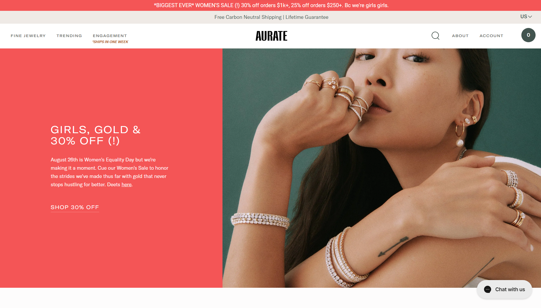
Recognizing the pivotal role of a website in business growth, Aurate has meticulously crafted a digital platform to extend its brand’s global reach. Noteworthy features include ample whitespace, enhancing readability, and comprehension. The homepage seamlessly integrates essential elements—crisp CTAs, high-quality images, engaging video content, and fluid sliders. A convenient sticky header also provides swift access to shopping, the blog, and user accounts.
What we like:
- Captivating images and videos keeps users engaged.
- Important navigational links are always within reach.
- Successful use of CTAs and promotional offers.
Example 26: Fabrikant – Understated sophistication
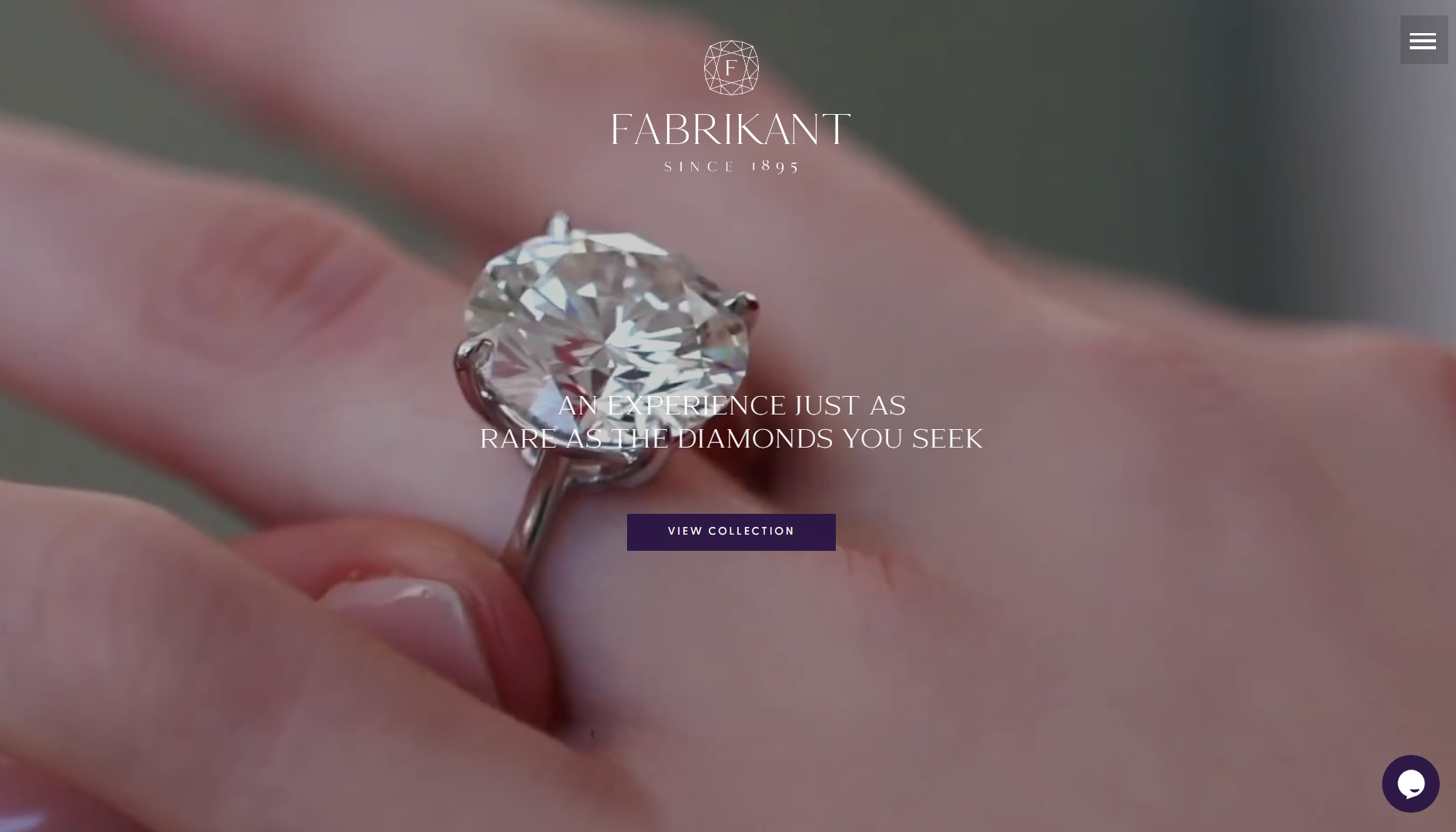
Even among this list of top jewelry website examples, Fabrikant takes its design to new levels of sophistication and elegance. A cinematic hero video immediately captures your attention while also demonstrating the potential of their featured line of jewelry. From there, the design uses a muted color palette that exudes understated sophistication and forms the perfect backdrop for their awe-inspiring creations.
What we like:
- Cinematic videos with high production value.
- A simple and understated color palette highlights jewelry.
Example 27: Faris – Inclusion through diversity
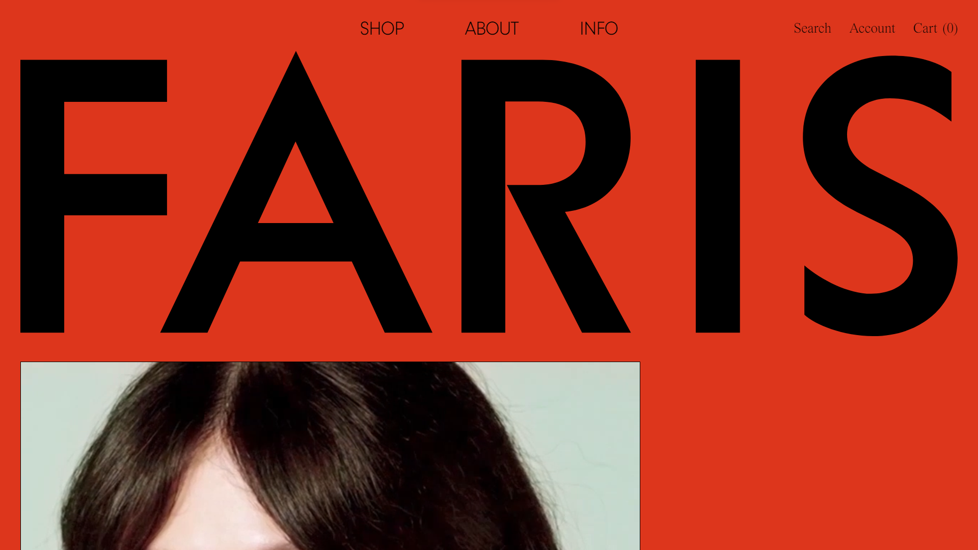
In contrast to many other jewelry website templates, Faris is not afraid to make bold design choices. Not many designs can pull off a bright red background instead of a whitespace. However, it somehow creates the perfect backdrop for the site’s eclectic, yet sophisticated visuals. Another thing this site does really well is to use a diverse cast of models to showcase its accessories. Short video clips that show their production process also give it a tailored feel.
What we like:
- Unique and memorable design.
- A diverse range of models.
- Visually arresting images and videos.
Example 28: Anchor & Crew – Unisex jewelry store design
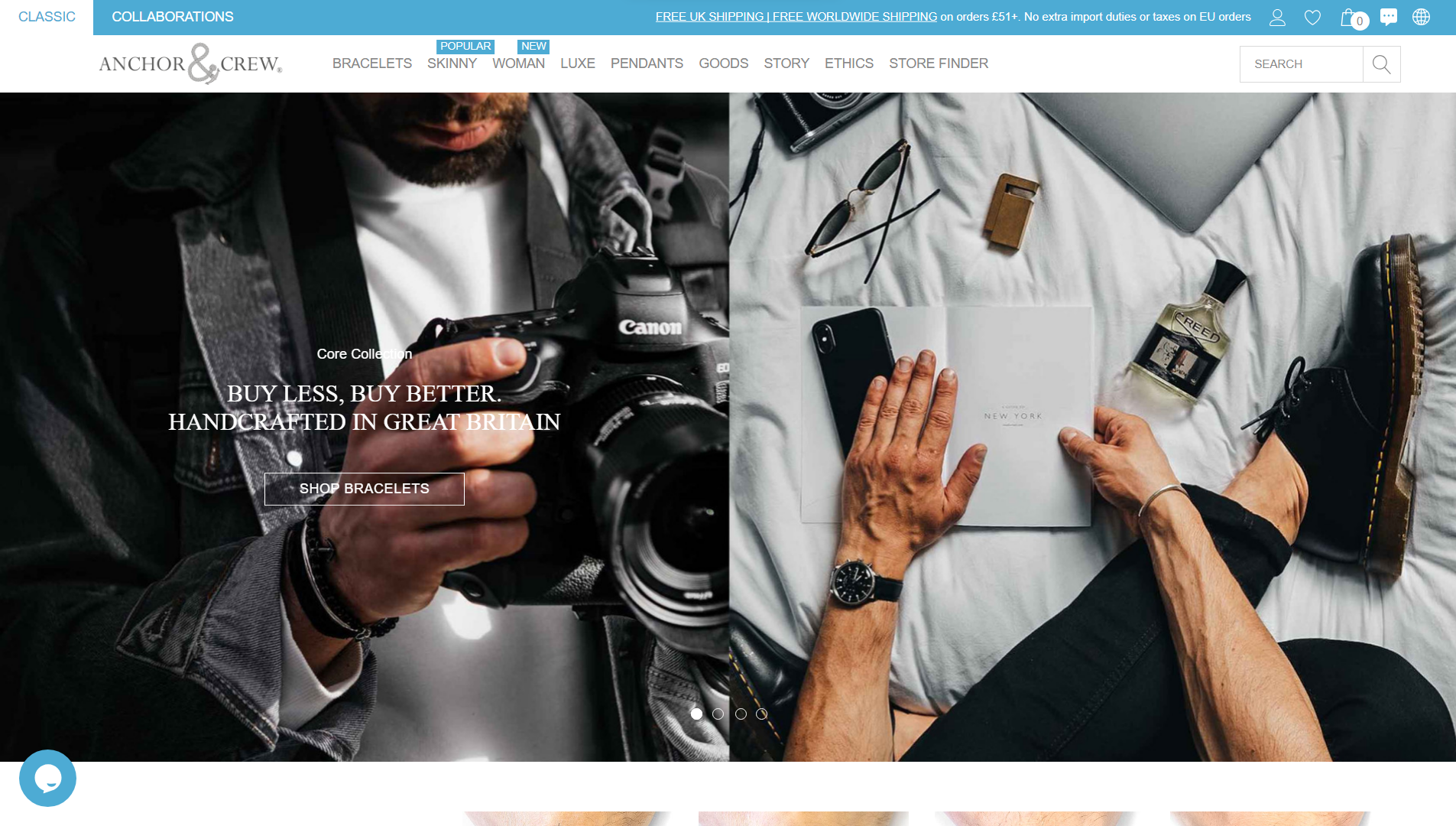
As you can see, this list of jewelry website examples is dominated by brands catering mostly to women. Anchor & Crew illustrates how you can effectively market your brand to anyone, regardless of their identity, lifestyle, or tastes. The website design is simple, with a neutral feel that will appeal to anyone. Plus, they do an excellent job of portraying their products in many different situations so that anyone will feel they can find something that suits them.
What we like:
- The simple and modern design will appeal to anyone.
- Showcases their jewelry and accessories in many different contexts.
Example 29: Limnia – Interactive and engaging animations
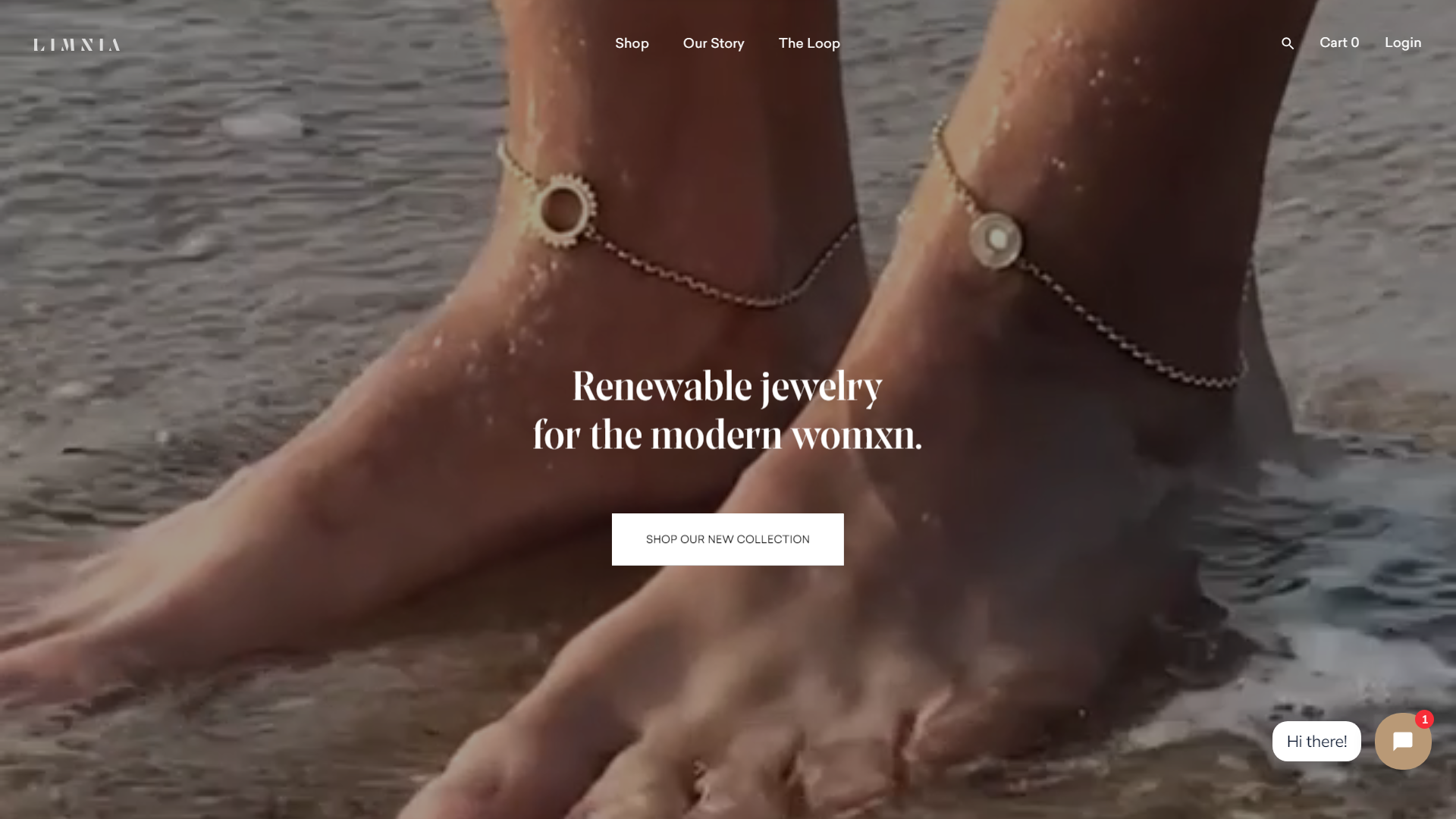
Feet isn’t the first body part that you think of when it comes to jewelry, but that’s exactly how Limnia catches your attention. Once you start scrolling, its smooth and engaging animations keep the page from feeling static and boring. Plus, a high-quality blog helps the brand position itself as a prominent lifestyle voice as well.
What we like:
- The above-the-fold video piques your interest.
- Smooth and engaging scrolling animations.
- Superb blog.
Example 30: Aroz – Balanced selection of fonts, images, and colors
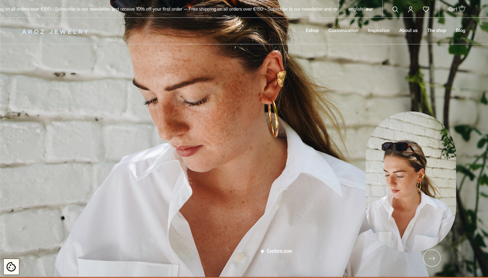
There seems to be no end to the unique design elements when it comes to Aroz. From image overlays that showcase related items or the same ones from a different angle to the offer carousel to its extensive use of animations and hover states. What’s more, its fonts and images pop against the neutral background, creating a sense of liveliness.
What we like:
- Feels interactive thanks to hover states and scrolling animations.
- Excellent combination of fonts.
Example 31: Bluboho – Eco-friendly jewelry with expressive designs
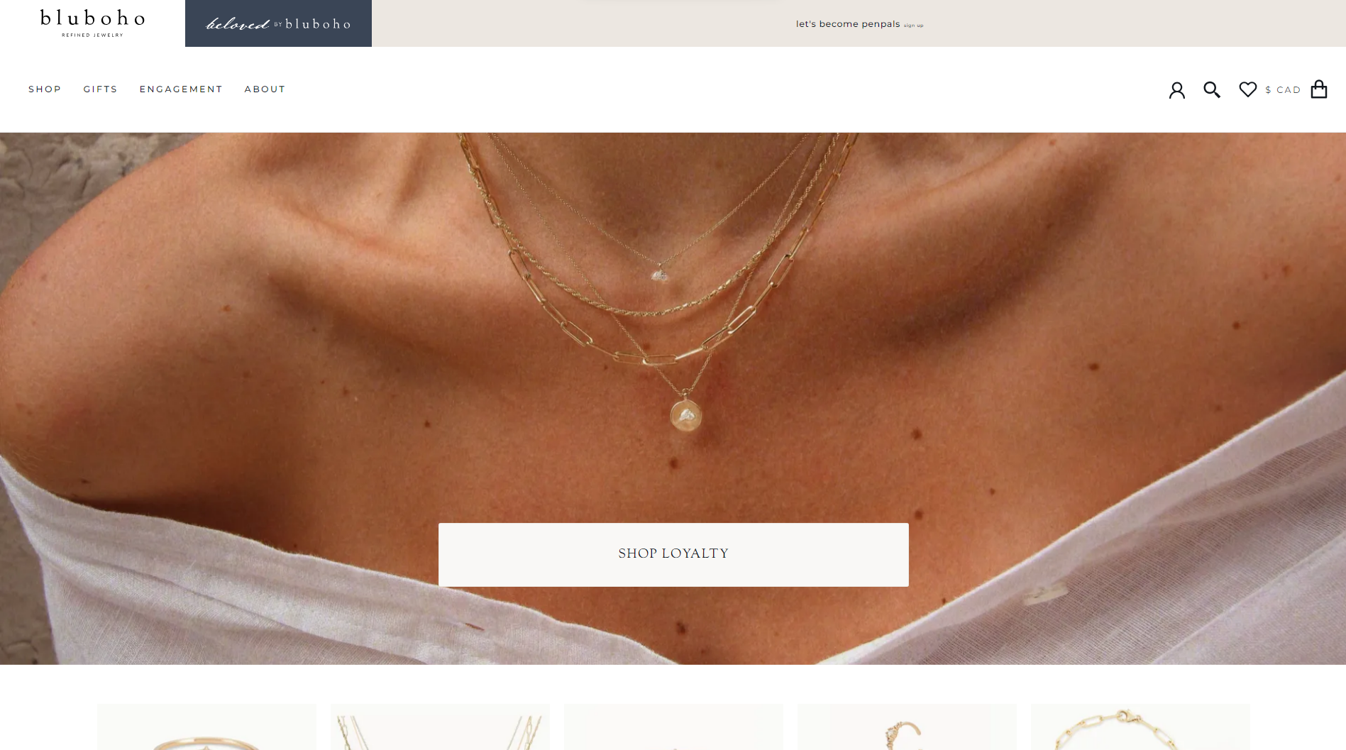
Bluboho introduces you to a world of hand-crafted jewelry crafted from recycled materials. The website is adorned with captivating photos and videos, capturing the essence of a carefree lifestyle. With a refined color palette, the jewelry website employs colored shapes and illustrations to accentuate various categories, creating an engaging visual experience.
What we like:
- Showcases the crafting process.
- Images and videos blend seamlessly with the brand concept.
Conclusion
And, that concludes our list of the best jewelry website design templates that should inspire or guide you to create your own magnificent online presence. As you can see, there are many different approaches you can follow to create an amazing experience for your visitors, while successfully marketing your products.
If you like any of these jewelry website examples, you can now create a similar website in no time. Using the 10Web AI Website Builder, you can replicate any of these designs within minutes and use the customization tools and AI Assistant to populate it with your own unique branding, style, and content. Or, you can create a jewelry website from scratch just by answering a few basic questions. The world is your oyster!
Get a head start on website creation with AI
Create a custom website tailored to your business needs 10X faster with 10Web AI Website Builder!


