Share article


Having a restaurant website is crucial for potential customers to find your business. It's also an opportunity to showcase your menu, ambiance, food, and service. In this article, we have compiled to list of exceptional restaurant examples that will guide you in optimizing online orders, embracing your brand identity, or authentically recreating your in-person experience online.
Having a restaurant website today is crucial to help potential customers find your business. It’s also the perfect opportunity to lure them in by showcasing your menu, ambiance, food, and service. Not only that, but it opens up new revenue streams by serving as a digital storefront, enabling online reservations and orders.
In this article, we have curated a list of 25 exceptional restaurant websites that blend stunning design with seamless user experience. From Urbanbelly’s immersive street food experience to Marlowe’s atmospheric bistro website, these restaurant website examples captivate with visuals and easy navigation. These examples will also show you how to maximize online ordering, embrace a mission-driven brand, or faithfully replicate your in-store ambiance online.
Without further ado, get ready to be served a full course of the best restaurant websites today, and get ready to elevate your own restaurant website’s success.
In This Article
- Example 1: Urbanbelly – Immersive street food experience
- Example 2: Marlowe – Atmospheric bistro website
- Example 3: Pujol – Minimalist high-end design
- Example 4: Flaner – Dynamic texture and modern grid design
- Example 5: Smith & Wollensky – Selling the experience
- Example 6: The Original – Welcoming and accessible design
- Example 7: Giusto – Showcasing your strengths
- Example 8: Punkt – Eye-catching use of color
- Example 9: Yang’s Kitchen – Keep it simple
- Example 10: Federalist Pig – On-point branding
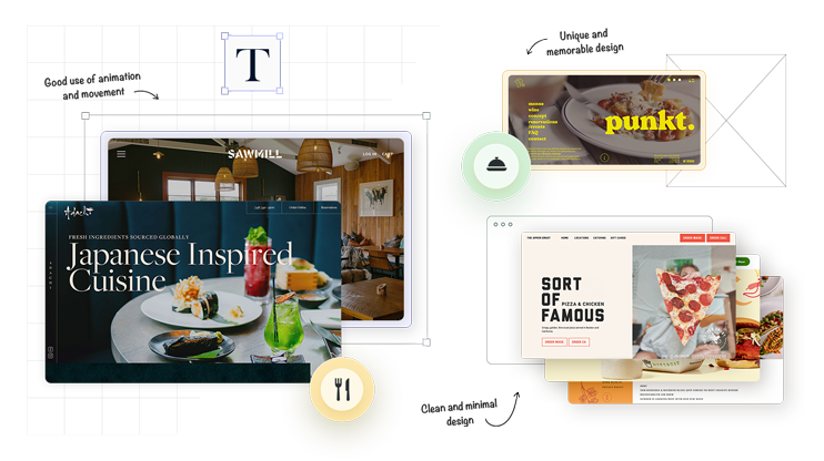
- Example 11: Sawmill Brewery – Distraction-free web design
- Example 12: Bon Bouquet Cafe – Sparking wonderment through design
- Example 13: The Upper Crust Pizzeria – Smooth, integrated online ordering
- Example 14: Big Gay Ice Cream – Mission-driven website design
- Example 15: Bull & Last – Elegant web design at its best
- Example 16: BARRA – Less is more design
- Example 17: Mida – Unexpected, yet memorable design
- Example 18: Canlis – Intriguing, minimalistic, captivating design
- Example 19: Shake Shack – Accessible design with transparent menu
- Example 20: Girl & the Goat – Highlighting ambiance through contrast
- Example 21: The Clove Club – Captivating and cinematic design
- Example 22: Brasserie Blanc – Elegant and functional brasserie website
- Example 23: Frantzen – Immersive web design
- Example 24: Rose Foods – Vibrant, nostalgic, and stylish website design
- Example 25: Adachi – Stunning Japanese-inspired website design
- Conclusion
Example 1: Urbanbelly – Immersive street food experience
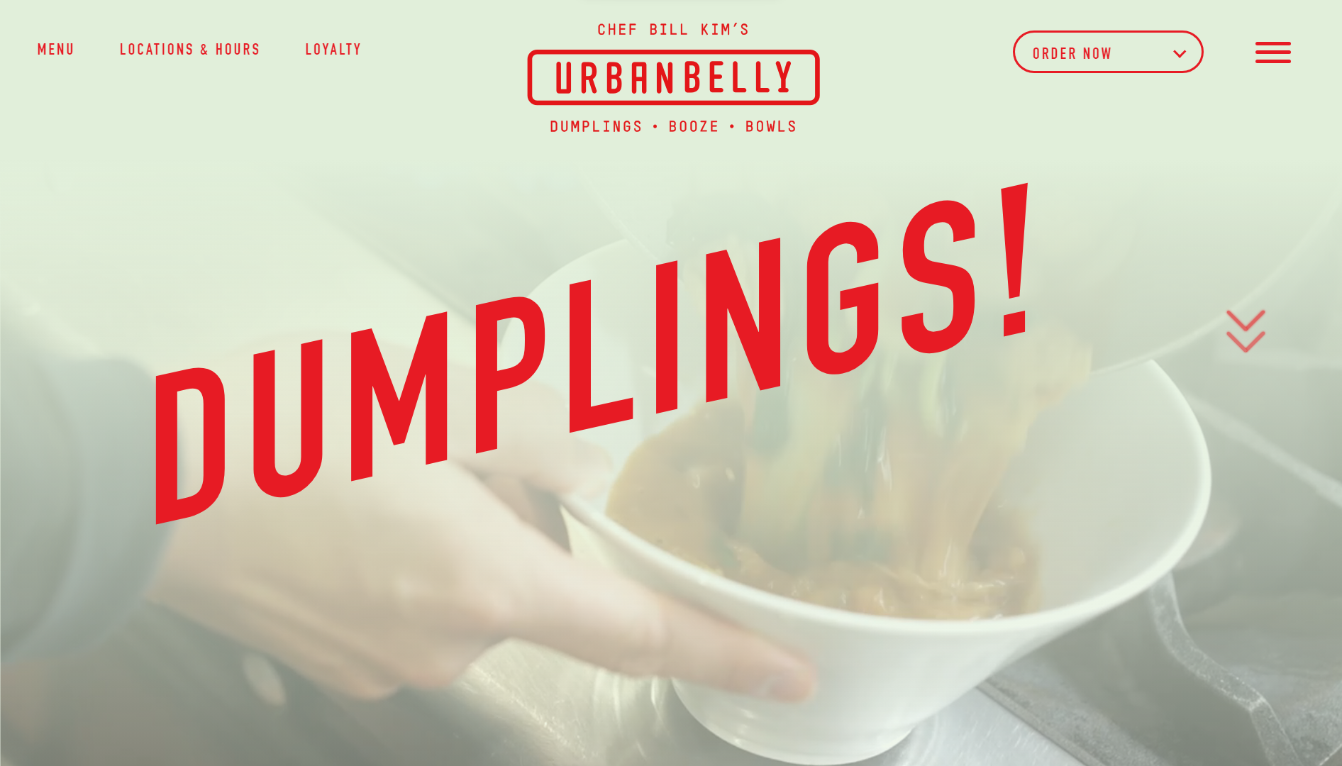
Chef Bill Kim’s Urbanbelly is an Asian-fusion restaurant based out of Chicago, Illinois. The restaurant’s slogan is “Dumplings, Booze, and Bowls,” and the design perfectly encapsulates that essence with mouthwatering photos and videos as well as a chic, playful design aesthetic.
What makes it stand out among restaurant websites are its highly immersive full-screen images and autoplay video clips that make you feel as if you’re already in the restaurant. The food speaks for itself, with very little content to distract you. The little text that there is is bold and eye-catching in bright red.
The site also does an excellent job of directing you to their social channels, especially Instagram, where you can find more enticing content.
What we like:
- Simple and uncomplicated layout.
- High-quality videos beautifully showcase the restaurant’s food.
- An immersive and unique design creates a highly memorable experience.
While the design is highly unique, you could easily replicate a similar look and feel with your own unique twist using 10Web AI Website Builder.
Get a head start on website creation with AI
Create a custom website tailored to your business needs 10X faster with 10Web AI Website Builder!
 No credit card required
Example 2: Marlowe – Atmospheric bistro website
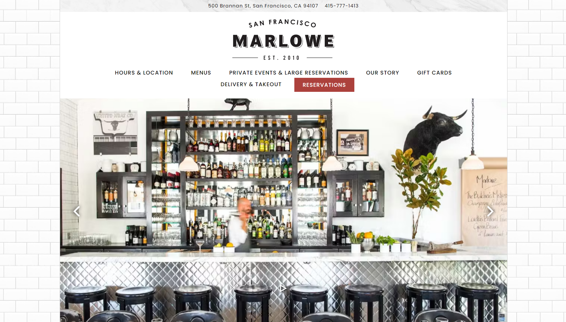
Marlowe’s is a “New American Bistro” based in San Fransisco, California. The website pays equal attention to promoting both the establishment’s food and gorgeous ambiance, portraying itself as an all-inclusive experience.
Although there’s nothing unique about the navigation compared to some other restaurant websites, it makes the website extremely easy to navigate. Visitors have no trouble accessing the most popular content, like the menu, delivery & takeout, reservations, and opening hours.
With plenty of whitespace and a straightforward layout, the website creates a relaxing atmosphere that preps visitors for the real deal. It also makes the colorful and high-quality photography of the interior, food, and drinks really “pop” against the background.
What we like:
- Clean and minimal design aesthetic.
- Conventional and straightforward navigation.
- Exceptionally high-quality photography.
Example 3: Pujol – Minimalist high-end design
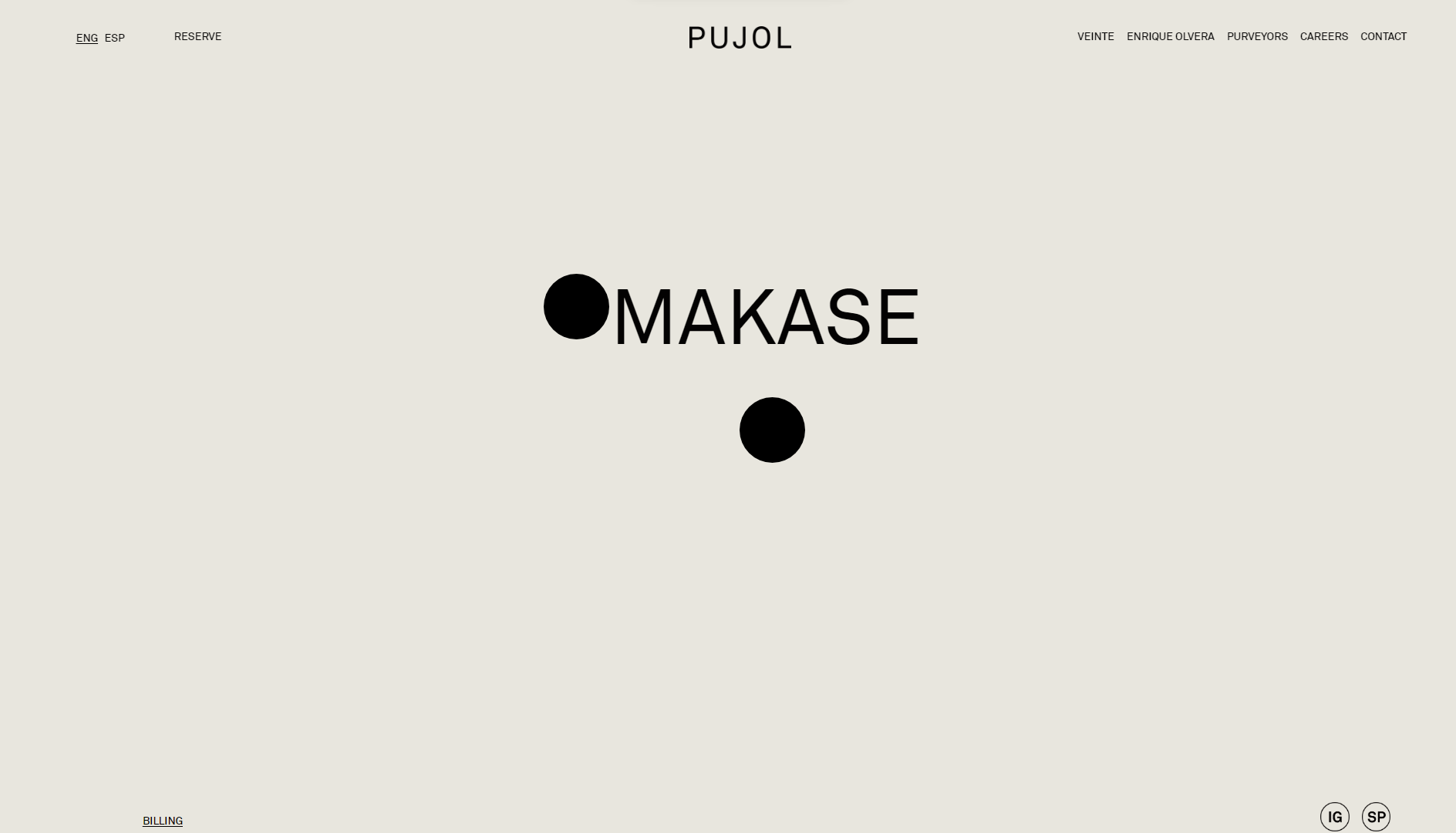
Pujol’s is an acclaimed restaurant in Mexico City that combines the flavors of Latin cuisine with the concept of Japanese Omakase. As a high-concept restaurant, Pujol’s can only be encapsulated by an equally sophisticated and distinctive website.
The design is about as minimal as you can get, basically consisting of only black text on a mono-color backdrop. Interestingly, instead of enticing you with pictures of its culinary creations, it maintains an air of mystery. Although this strategy won’t work for all restaurants, it works for a world-renowned establishment like Pujols.
Despite its sparse design, the website uses some interactive elements to draw visitors in and keep their attention.
What we like:
- To-the-point and minimalist design.
- Exudes an air of sophistication.
- Sparks curiosity.
Example 4: Flaner – Dynamic texture and modern grid design
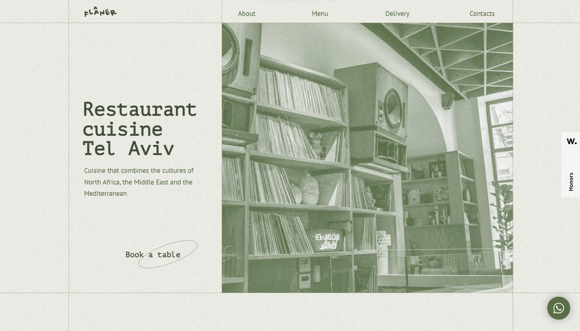
Flaner’s website stands out with its intriguing use of texture to evoke a captivating mood. The animated static, reminiscent of vintage speaker systems and vinyl records, set a unique tone. Harmonizing perfectly with the site’s green palette, the texture adds depth and charm. When users hover over images, vibrant colors infuse life into them, creating an engaging visual experience.
Additionally, Flaner creatively employs grids throughout its pages, avoiding the clichéd and mundane approaches used by many other restaurant websites. The clean lines delineating content into neat boxes contribute to a refreshing layout rarely seen on restaurant websites, making a lasting impression on visitors.
What we like:
- The unique use of color and texture makes it stand out
- Visitors are guided to menus
- The vintage style creates a nostalgic look and feel
Example 5: Smith & Wollensky – Selling the experience
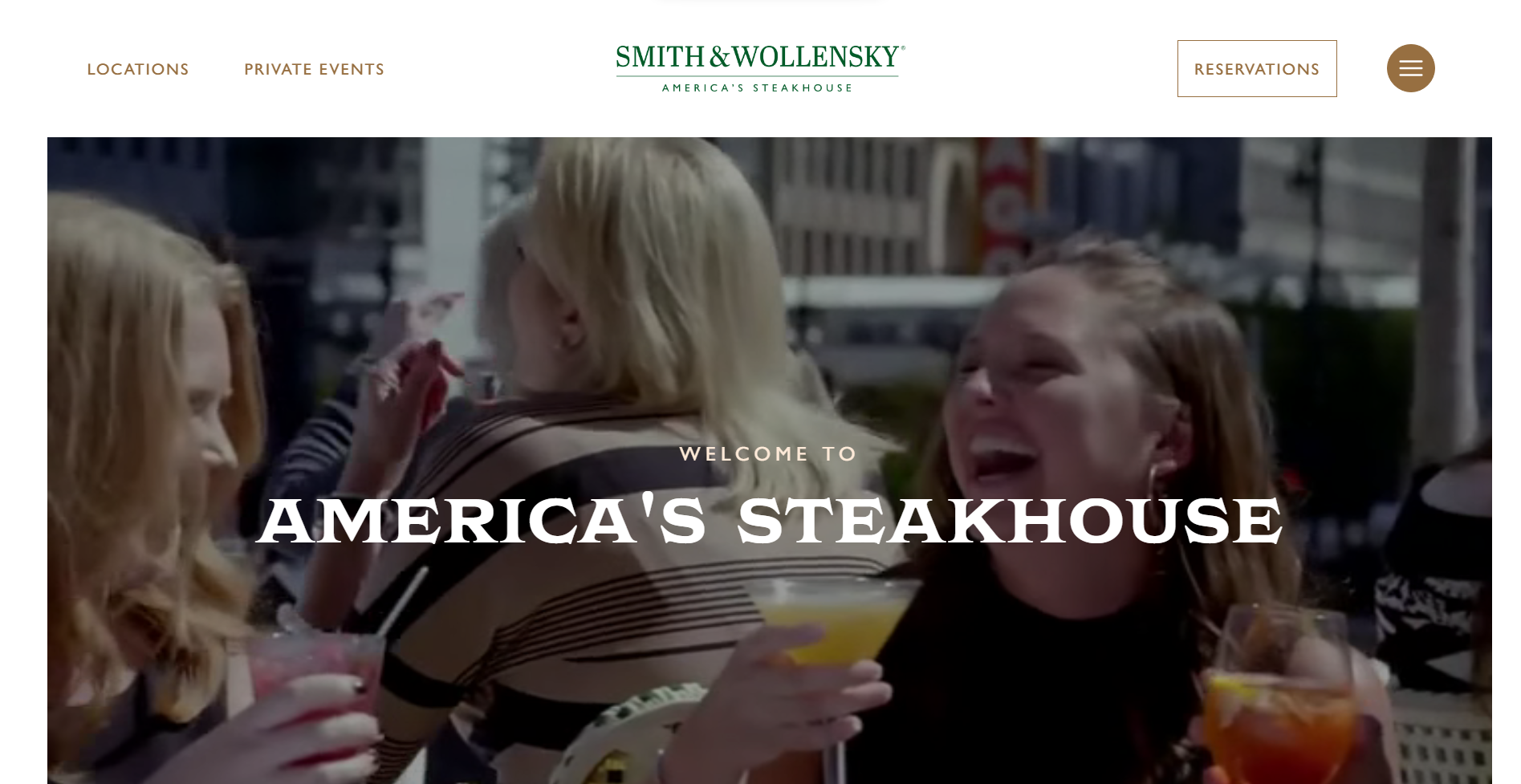
Marketing itself as “America’s Steakhouse” Smith & Wollensky sells you the experience of dining at their establishment – even more so than the actual food itself. This is made evident by the use of large videos showing families, colleagues, and business partners sipping drinks, laughing, and having a good time.
The layout and navigation will be familiar to anyone who has visited a restaurant website before. However, it does feature an excellent fullscreen menu that makes navigating the site a breeze.
It’s clear that hosting private events is a big part of the business. The website effectively showcases their various event spaces, with photography that highlights their prime locations.
What we like:
- A classy design with wide-ranging appeal.
- Effectively highlights the experience offered at their various locations.
Example 6: The Original – Welcoming and accessible design
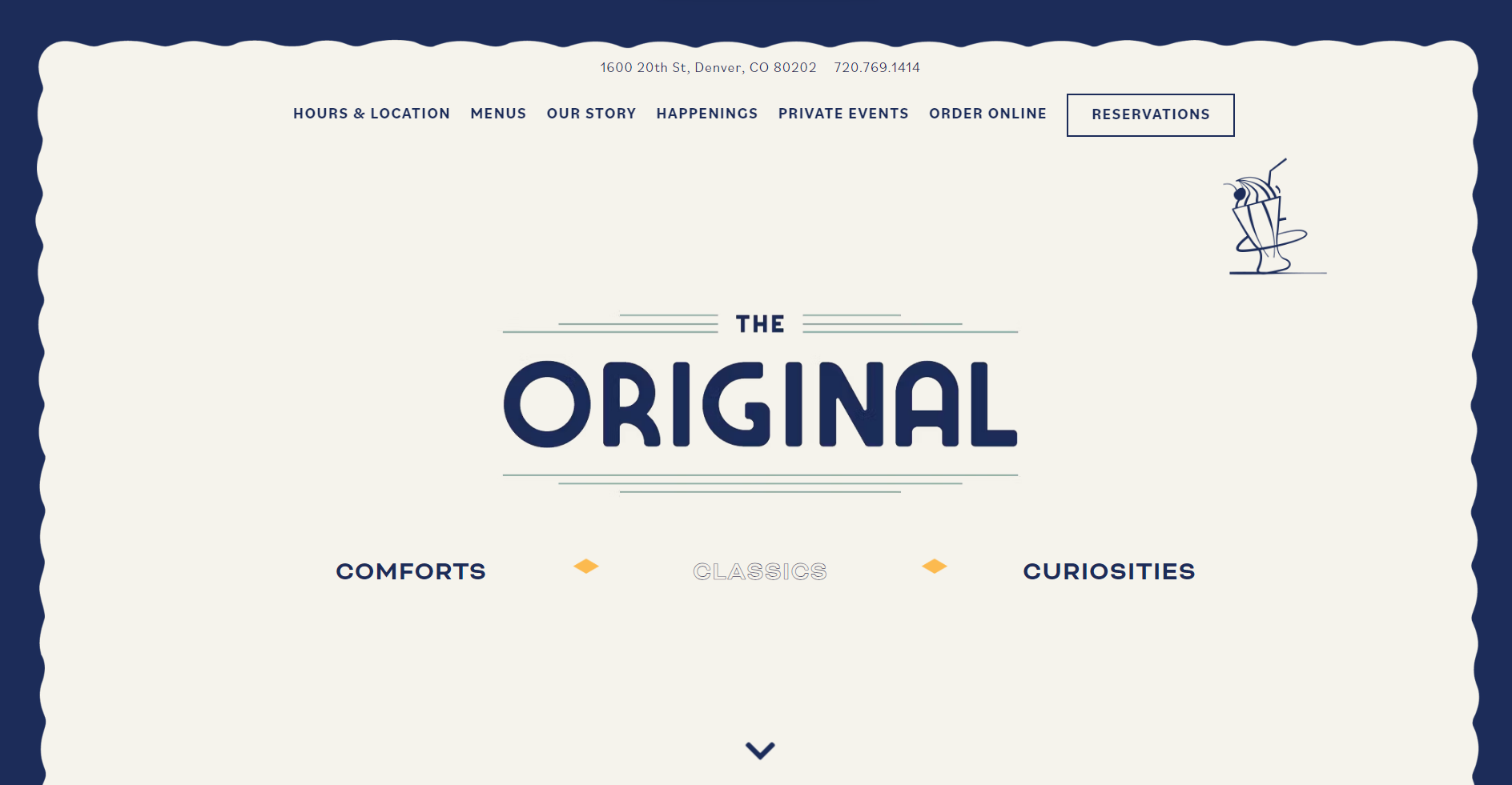
A popular Denver institution, The Original serves elevated American comfort foods, with a twist. Its bold and stylized website design perfectly captures the restaurant’s quirky, yet familiar, vibe. From the moment you land on the website, it feels friendly and welcoming.
The website utilizes an equal blend of content, images, and design elements to draw in and keep visitors’ attention. The custom icons of milkshakes and t-bone steaks capture your imagination, but it’s backed up with scintillating food photography.
The reservation system is smooth and hassle-free, and they ensure that contact methods are always visible, which encourages engagement.
What we like:
- Fun and engaging design with custom graphics.
- Easily accessible contact and reservation methods.
Example 7: Giusto – Showcasing your strengths
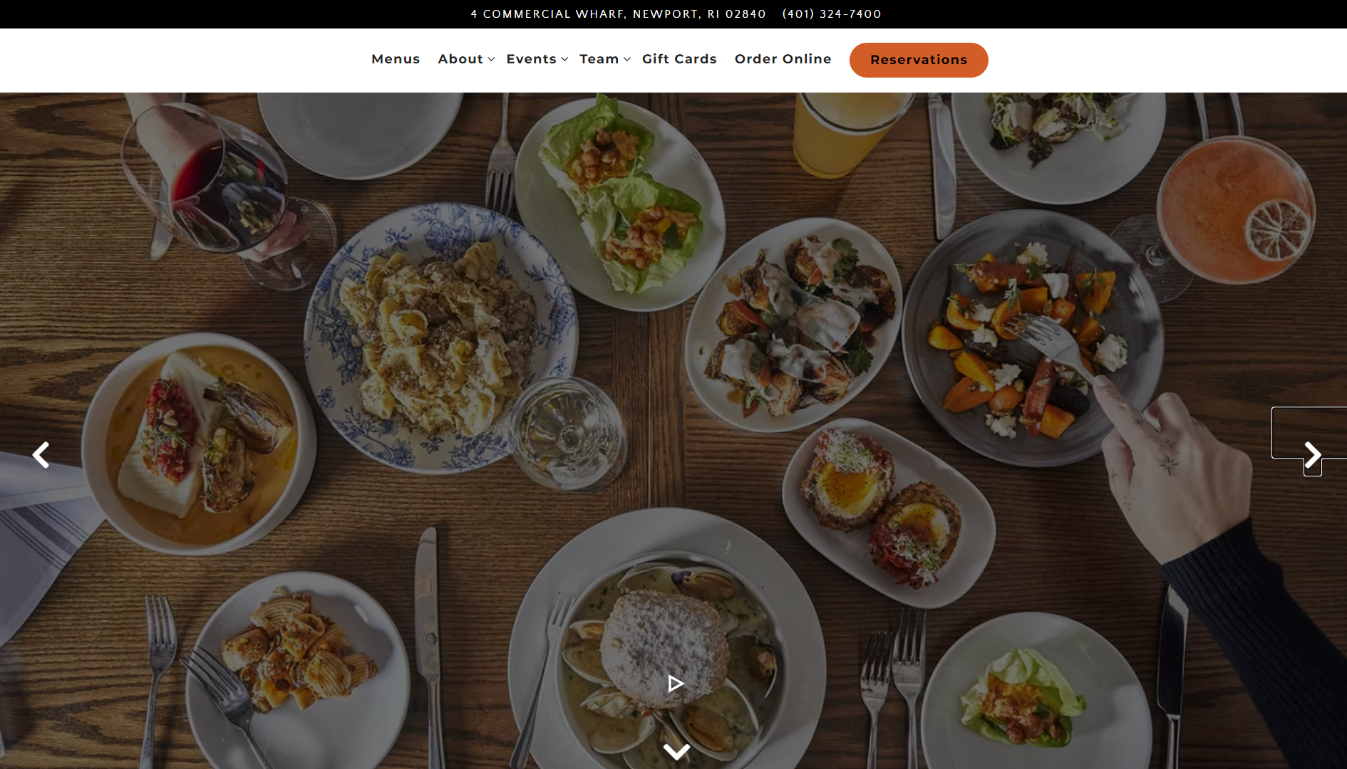
Among restaurant websites, Giusto excels at showcasing its unique selling points. From a scenic deck overlooking Newport, Rhode Island’s harbor to a cozy indoor section, the website beautifully captures the restaurant’s distinctive ambiance. Highlighting what makes your establishment special is vital, whether it’s a signature dish, picturesque location, or cherished family tradition.
Giusto’s homepage prominently features an inviting image of its open-air bar, effectively conveying the essence of its one-of-a-kind dining experience. Aside from the food and ambiance, there are also photos that highlight the handmade nature of its foods, assuring visitors of a fresh, high-quality dining experience.
What we like:
- Integrated, easy-to-use reservation system.
- Images that illustrate different aspects of the business.
Example 8: Punkt – Eye-catching use of color
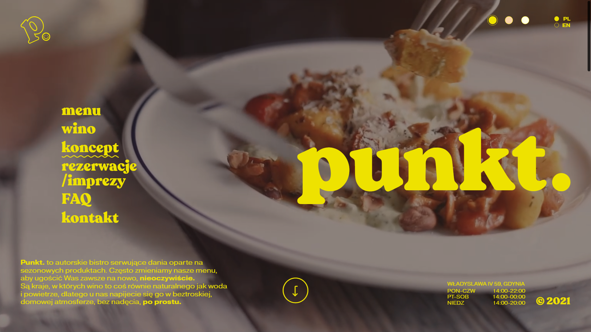
Polish for “point,” Punkt is a bistro based in Lodz, known for its cozy and carefree atmosphere. The unconventional, off-center website design perfectly embodies the restaurant’s unique approach to social dining.
The default website design features large, eye-popping yellow text that perfectly contrasts the homey and mellow background videos. As a thoughtful touch, the website allows visitors to change it to a less distracting beige or white at the click of a button.
The home page includes quite a lot of text explaining the bistro’s concepts and unique approach.
What we like:
- Finally balanced contrast between text and imagery.
- Unique and memorable design.
- The informative FAQ section clearly explains the restaurant concept.
If you want a similarly compelling and effective design, 10Web AI Website Builder can help you generate a unique and on-brand website with a similar look and feel.
Get a head start on website creation with AI
Create a custom website tailored to your business needs 10X faster with 10Web AI Website Builder!
No credit card required
Get a head start on website creation with AI
Create a custom website tailored to your business needs 10X faster with 10Web AI Website Builder!
 No credit card required

Example 9: Yang’s Kitchen – Keep it simple
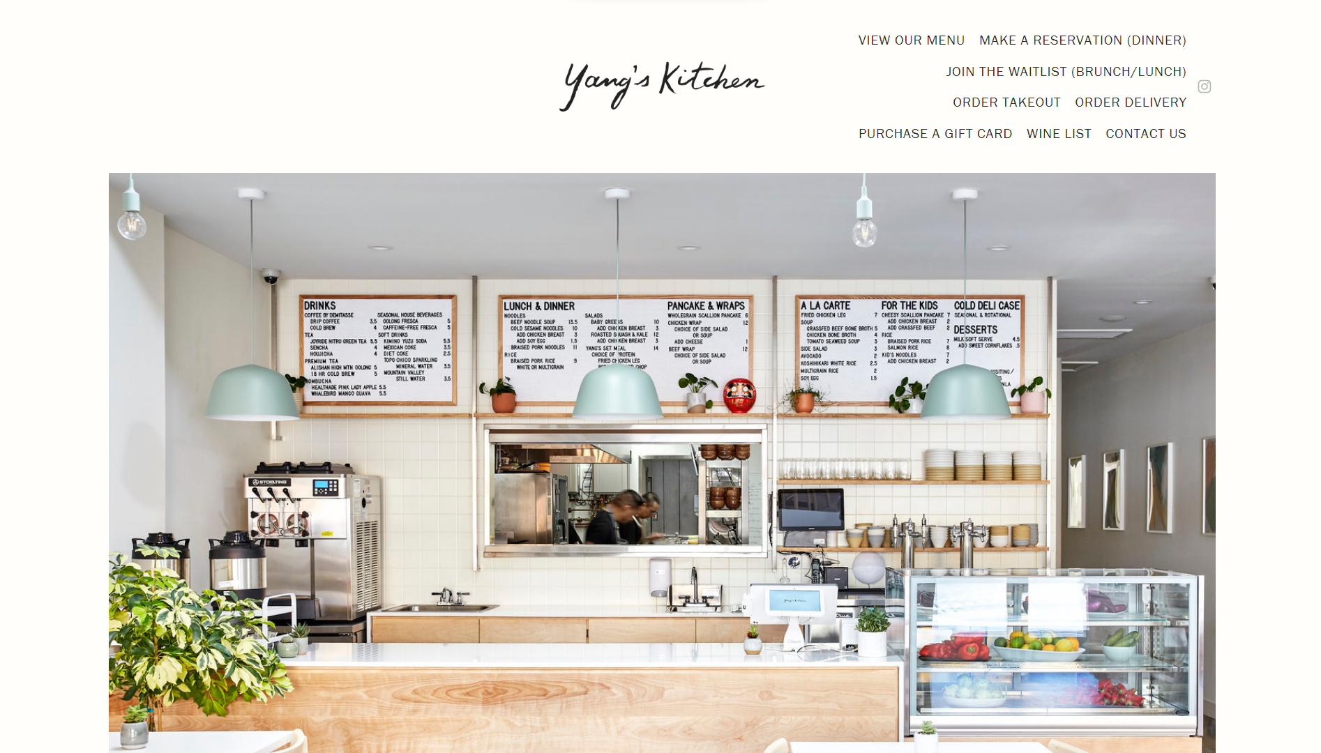
Asian restaurant websites are a staple on this list, and Yang’s Kitchen is no different. Based in the Alhambra neighborhood of Los Angeles, Yang’s Kitchen is an Asian/Western fusion joint specializing in simple, yet heartwarming dishes. Serving Asian comfort food and fast bites, like wraps, its no-nonsense approach to food is embodied perfectly in its website.
Like the joint’s interior, the website makes ample use of white space to create a relaxing and open atmosphere. The photography used is more toned-down and natural-looking, cementing their image as an accessible and welcoming business.
That being said, the website still does an excellent job of guiding visitors toward their ordering channels and social media.
What we like:
- The black-and-white design is minimalist and accessible.
- Natural photography creates a sense of familiarity.
- All important information is presented on the home page.
Example 10: Federalist Pig – On-point branding
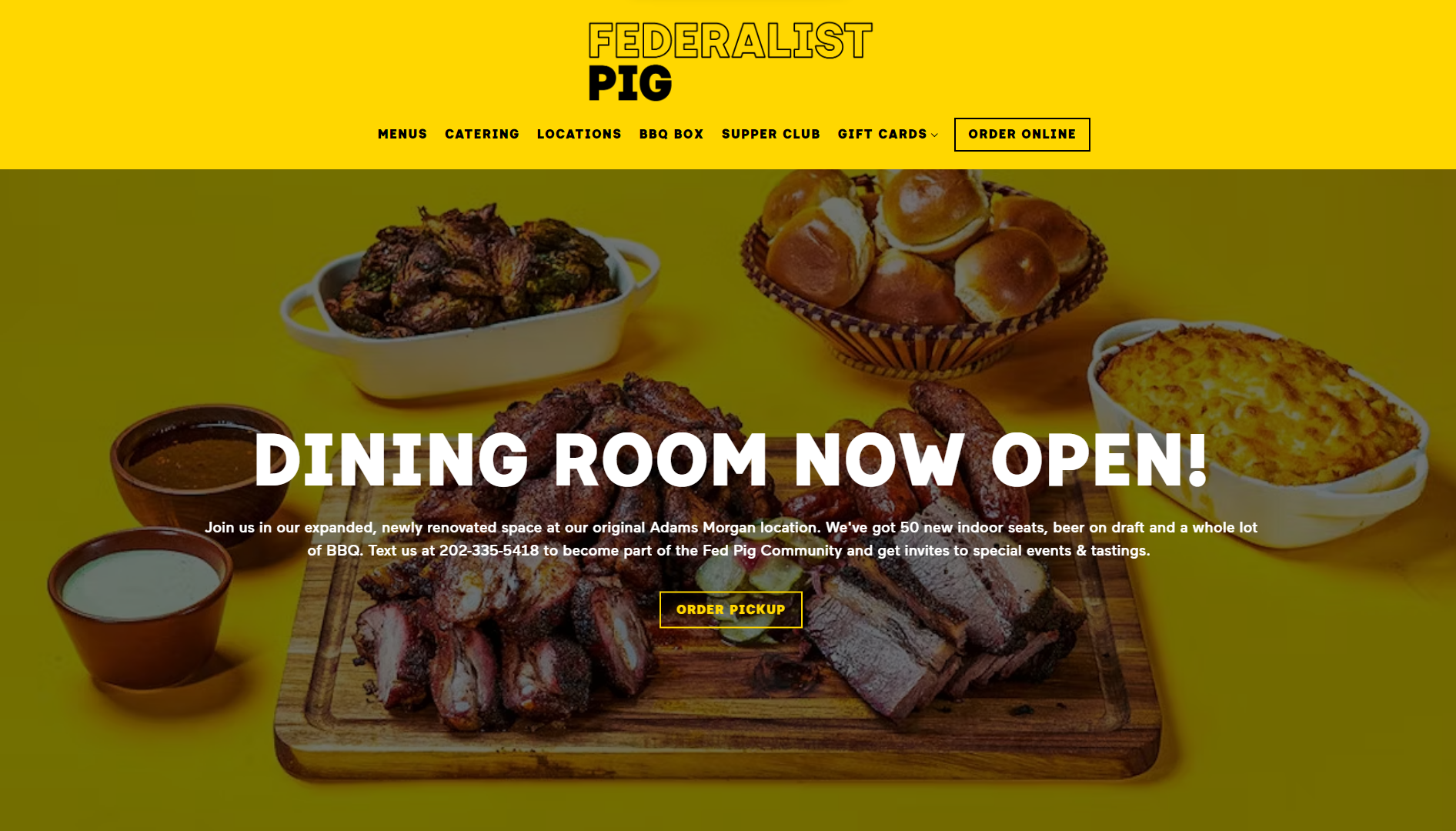
Federalist Pig’s bold and bombastic design immediately gives the impression that you can expect big servings of big flavor. The use of in-your-face fonts and colors captures your attention from the first moment you land on the site. And the mouthwatering pictures of their elevated street foods on massive wooden carving boards make it impossible for you to look away.
The strong contrast created by the bold fonts on the bright backgrounds also makes the content super legible. Combined with a straightforward layout and interactive elements, it makes the website very easy to navigate.
While it’s not overtly boastful, the website also clearly highlights the restaurant’s prominent features, awards, and accomplishments.
What we like:
- Highly representative and on-point branding.
- Bold and memorable use of fonts and imagery.
- Consistent and tactile design.
Example 11: Sawmill Brewery – Distraction-free web design
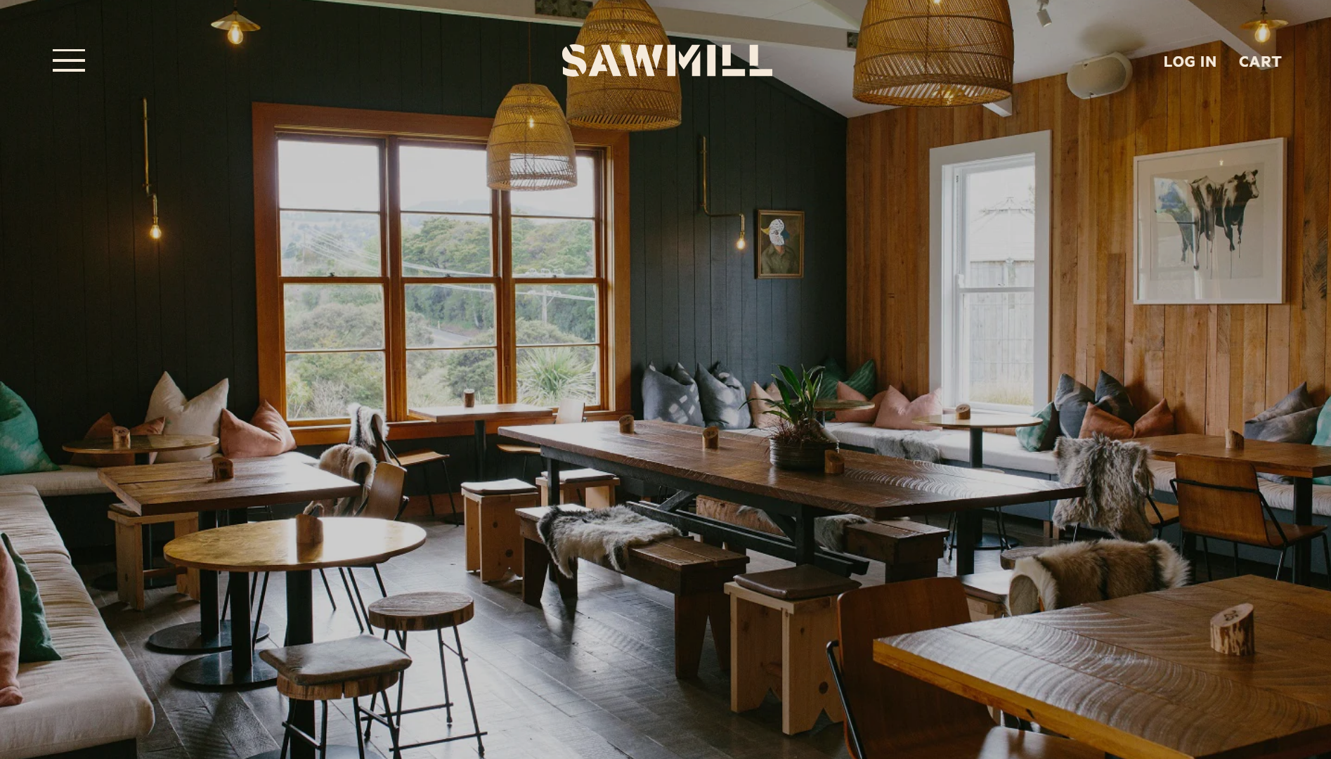
The Sawmill Brewery is an independent brewery based in Matakana New Zealand. It’s clearly a community-driven business that’s proud of its heritage and its connection with its surroundings. A short summary of its recent history right on the home page immediately establishes that personal connection with website visitors as well.
The website also does its beautiful indoor space justice. The fullscreen hero image is displayed with the absolute minimum of distractions so that you can really soak up the atmosphere. Everything, from the colors to the fonts used, supports that overall theme.
The website also features an excellent built-in shop that sells some of their brews and merchandise.
What we like:
- Distraction-free design highlights the restaurant atmosphere.
- Minimal and effective online shop.
- Highly consistent decision choices.
If you also want to integrate a shop into your store, 10Web Ecommerce plans offer the high-performance, scalable infrastructure you need to operate your business without downtime.
Example 12: Bon Bouquet Cafe – Sparking wonderment through design
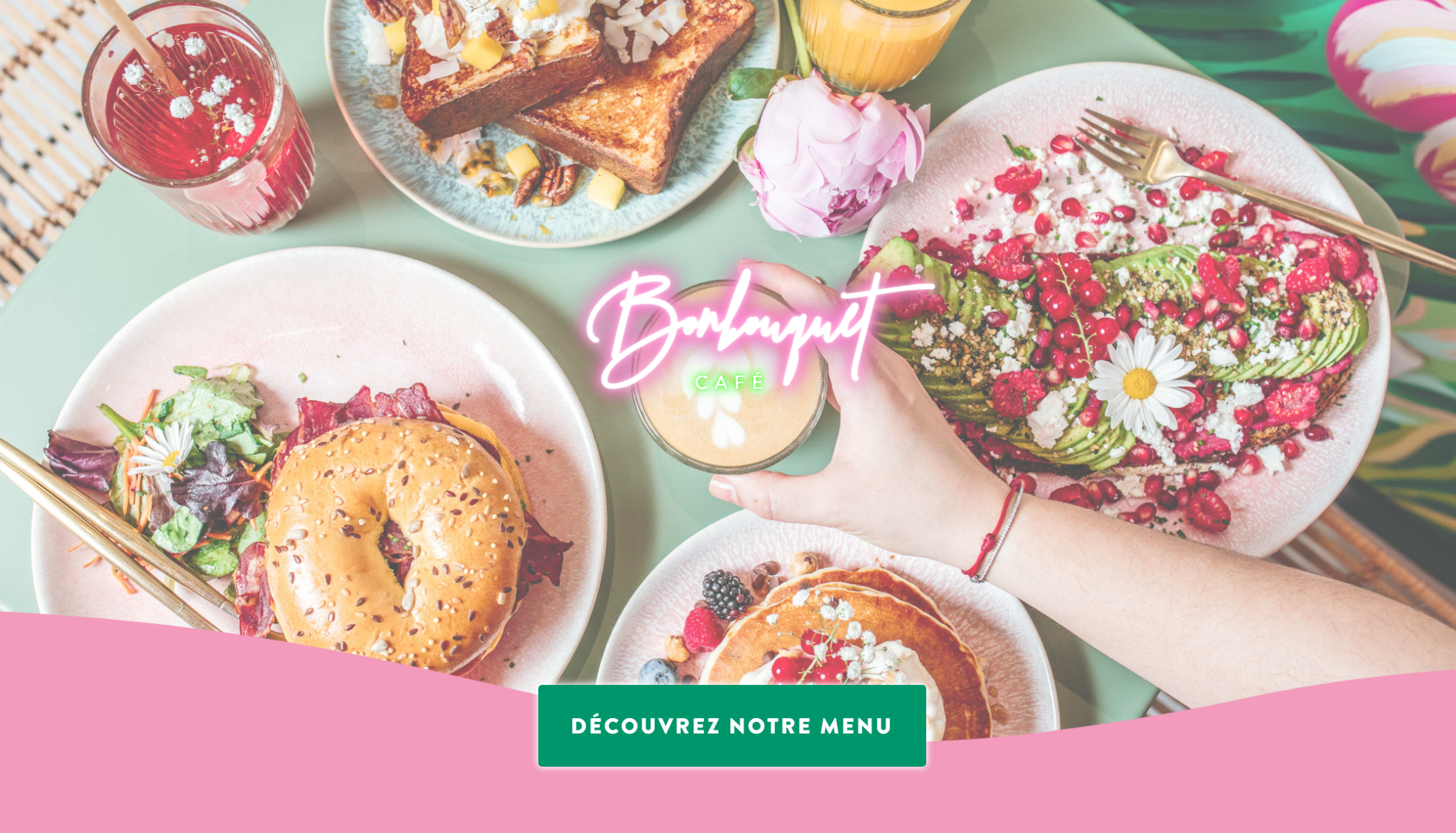
Based in Paris, France, this “Bali-style” brunch cafe aims to bring tropical island vibes to an urban European setting and succeeds. The unabashed use of shocking pink, neon graphics, and eye-popping platings is sure to inspire anyone with a sense of wanderlust and intrigue.
The overall aesthetic is unmistakably Bali-esque and looks as if it comes straight from a travel influencer’s Instagram page. Regardless of whether it pulls you in for the food or the setting, the gorgeous imagery promises an escape from the hustle and bustle of everyday life. It backs this up by giving visitors an actual inside look at the restaurant online through Google Streetview.
As one part of The Hungry Family group of establishments, the website also guides visitors to its other establishments and many social channels.
What we like:
- Perfectly replicates the restaurant’s aesthetic.
- Visitors can view and navigate the restaurant interior online.
- Prominently features the menu.
Related Articles
Example 13: The Upper Crust Pizzeria – Smooth, integrated online ordering
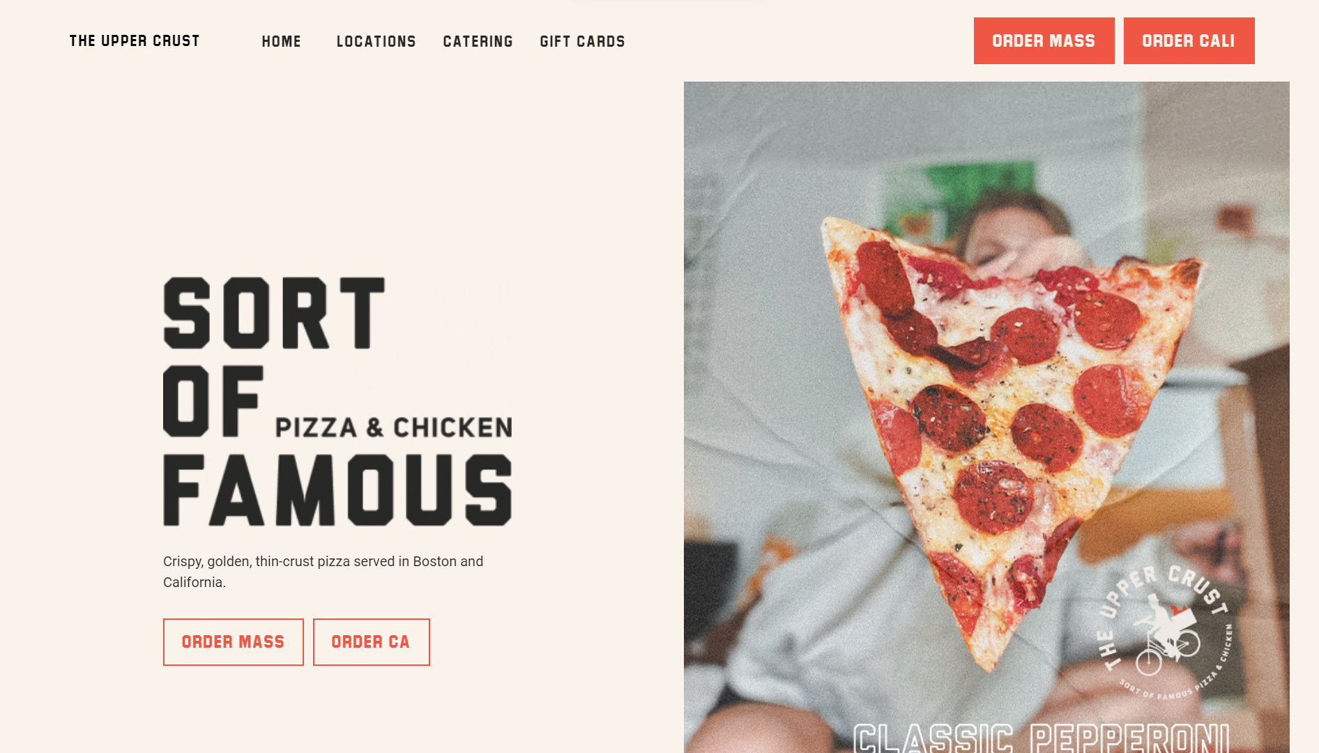
Maximizing your restaurant’s online ordering potential is essential for increased revenue. Upper Crust Pizzeria does this by offering a seamless online ordering process for takeout and delivery on its website. It also helps them avoid costly third-party delivery service fees by encouraging customers to use your platform, like Toast, for greater cost control and profit retention.
Upper Crust Pizzeria successfully capitalizes on online orders with a prominently displayed ordering button at the top of its website, providing customers with easy access. As 10Web’s platform is based on WordPress, you’ll be able to easily create a restaurant website and integrate a similar ordering system using a popular plugin, like WPCafe or WooCommerce restaurant ordering.
What we like:
- Smooth and easy-to-use online delivery.
- Clean and minimal design.
- Unique images with a nostalgic feel.
Example 14: Big Gay Ice Cream – Mission-driven website design
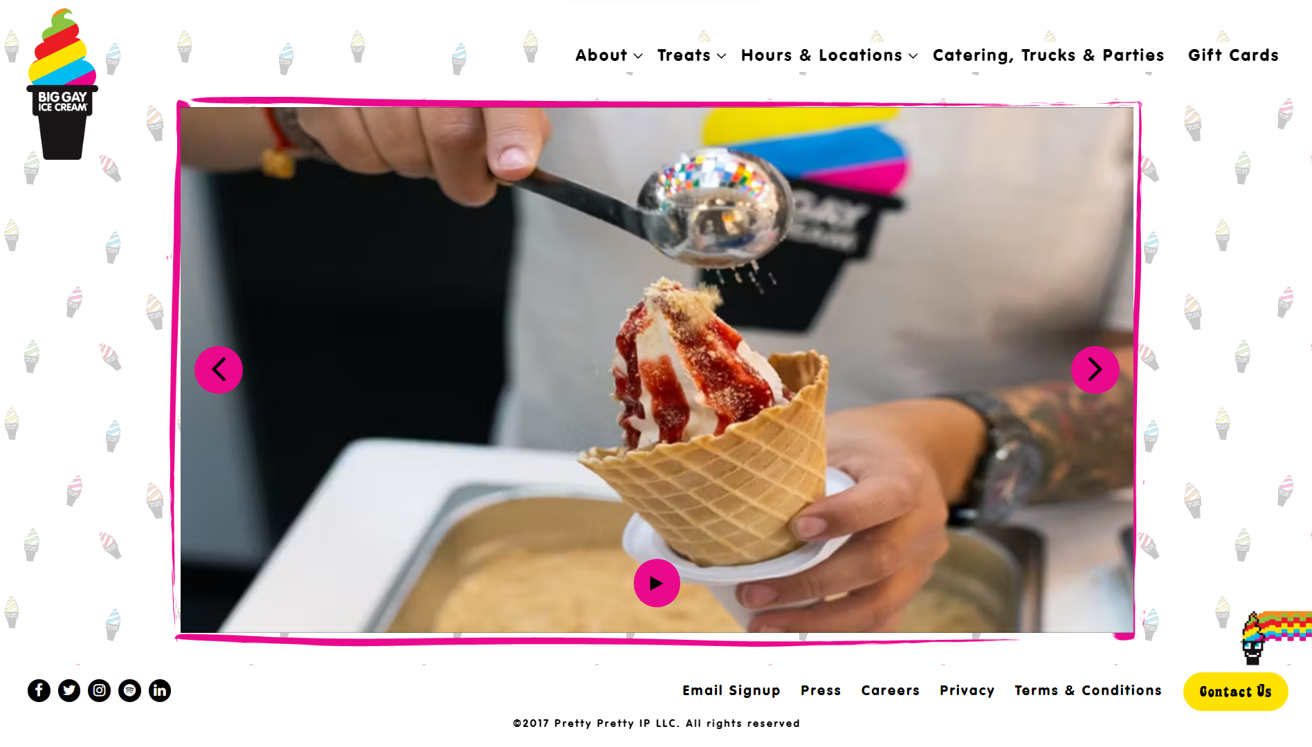
Today, many customers want to spend their hard-earned money at businesses they feel affiliated with on social issues. Big Gay Ice Cream expertly balances its affiliation with the LGBTQ+ cause and its commitment to serving delicious soft-serve creations to its community.
The website has a simple hierarchy with a no-scroll layout and flat navigation. This helps reinforce the playful and fun design, which is backed up by the use of bright colors, unique icons, and a quirky design.
Photos of the iconic truck and its location further illustrate the business’s ties with the local community.
What we like:
- Fun and interactive design.
- Simple, no-scroll layouts.
- Strong, mission-driven design.
Example 15: Bull & Last – Elegant web design at its best
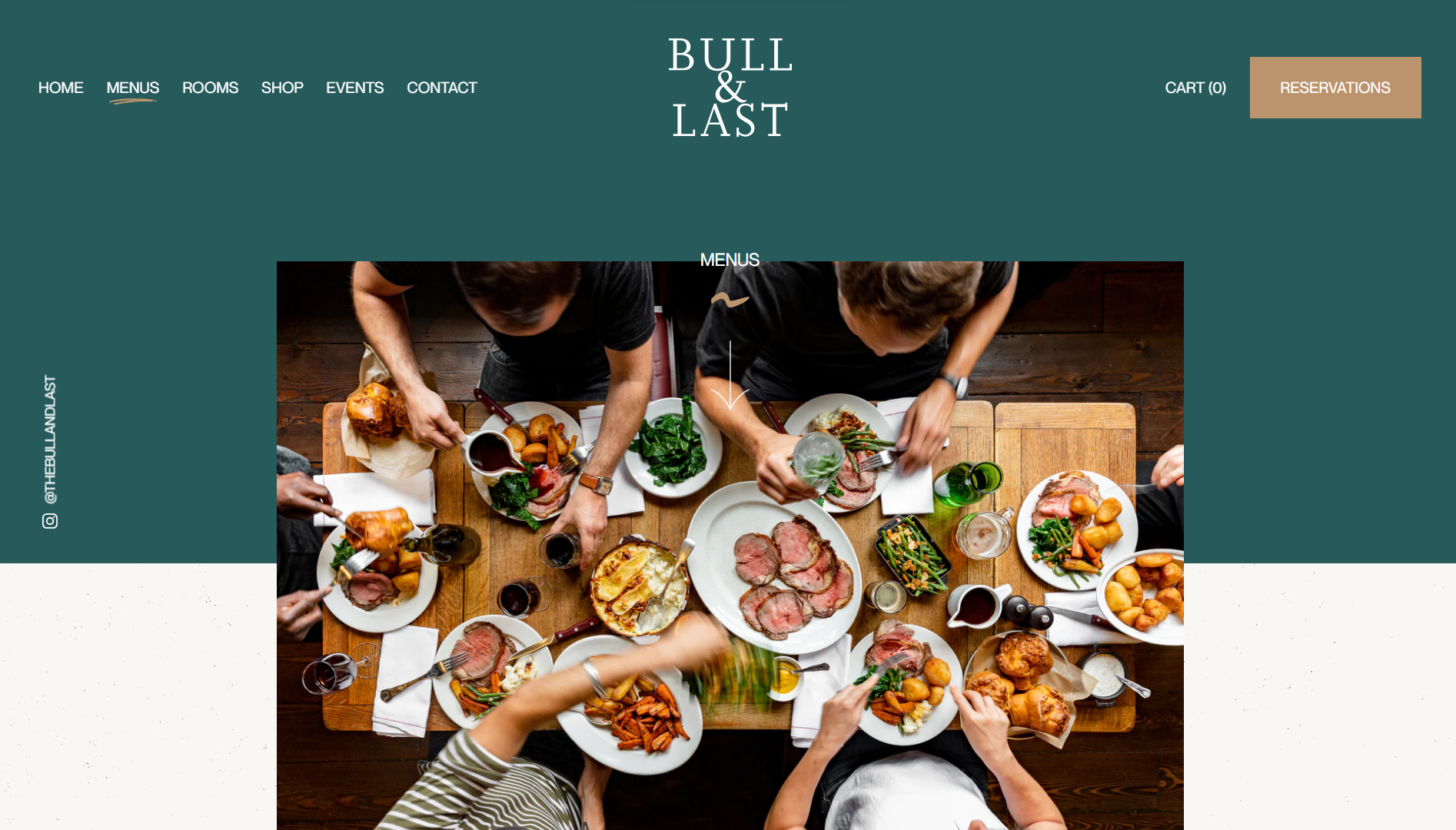
This London-based eatery proves that simplicity doesn’t necessarily mean boring when it comes to restaurant websites. Serving carved meats and other British and Continental comfort foods, the website sticks to Bull & Last’s back-to-basics approach to serving food.
A straightforward vertical gallery of images showcasing some of its most inventive dishes keeps visitors engaged and wanting more. At the same time, large menu text and buttons clearly point visitors to the most important areas, such as its menus, reservations, group booking, the shop, and events.
The occasional custom illustration sparks some visual interest and blends in seamlessly with the overall aesthetic.
What we like:
- Straightforward design with clear site navigation.
- Excellent reservation system.
Example 16: BARRA – Less is more design
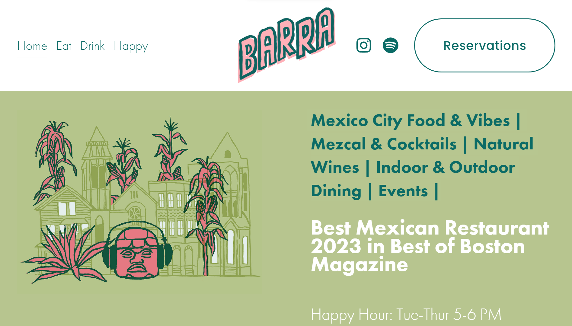
Barra’s website stands out as a color scheme masterpiece. Embracing a clean tiled layout, it delivers a distinct and pleasing visual experience. The thoughtfully chosen color palette and bespoke illustrations perfectly match the restaurant’s focus on tacos and Mexican small plates.
Barra excels in simplicity, offering clear navigation with easily identifiable options for takeout, gift cards, reservations, and location information. A quick scroll and click lead visitors to their desired destination. The website’s user-friendly design ensures a seamless and efficient browsing experience for all visitors.
It’s also one of the restaurant websites that doesn’t overwhelm users with information. Instead, it relies on our expectations of a Mexican restaurant and its reputation to do the talking.
What we like:
- Excellent, highly appropriate choice of color palette.
- Uses a minimal amount of content while still communicating clearly.
Get a head start on website creation with AI
Create a custom website tailored to your business needs 10X faster with 10Web AI Website Builder!
No credit card required
Get a head start on website creation with AI
Create a custom website tailored to your business needs 10X faster with 10Web AI Website Builder!
No credit card required
Example 17: Mida – Unexpected, yet memorable design
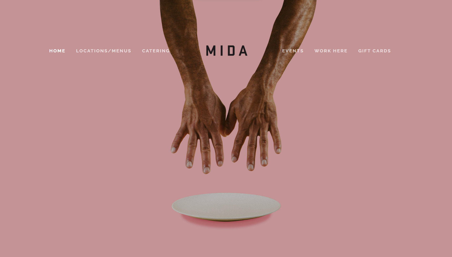
From the first moment you lay eyes on it, it’s clear that you haven’t seen any restaurant websites quite like Mida’s. Mida, located in Boston’s South End, exudes an Italian charm with its exceptional pasta dishes, impressive wine list, and effortlessly cool ambiance. The restaurant’s website design impeccably complements this vibe.
The alluring Millennial pink background, paired with a sleek sans serif font and captivating photographs, creates a cool and inviting effect. Its appealing aesthetics make it highly clickable, making it the perfect choice for securing reservations and attracting online orders.
Mida’s website design exemplifies how to entice customers and capture the essence of the dining experience through an elegant and modern online presence.
What we like:
- Captivates users through unique and unexpected visuals.
- Great use of layout and content to tell a coherent story.
Example 18: Canlis – Intriguing, minimalistic, captivating design
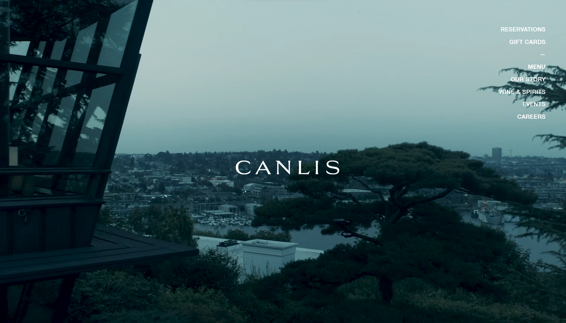
At first, Canlis’ website looks more like one for a high-end architecture or perfume business than one of the top restaurant websites. However, this only adds to its intrigue, largely owing to its full-width video backdrop showcasing the picturesque Seattle shoreline.
Yet, on closer inspection, visitors discover it is indeed an extraordinary restaurant. The website strategically emphasizes its location and building as a compelling selling point, generating curiosity from visitors.
The imagery prominently features the captivating surroundings even before highlighting the delectable food (which is also showcased). The site’s minimal and clean content layouts, exemplified by the simple navigation menu in the top right corner, further enhance its appeal. Canlis’ website masterfully blends aesthetics with functionality to create an exceptional online experience.
What we like:
- Encourages exploration from the start.
- Showcases the food, ambiance, and prestige of the establishment.
- Sophisticated and balanced design.
Example 19: Shake Shack – Accessible design with transparent menu
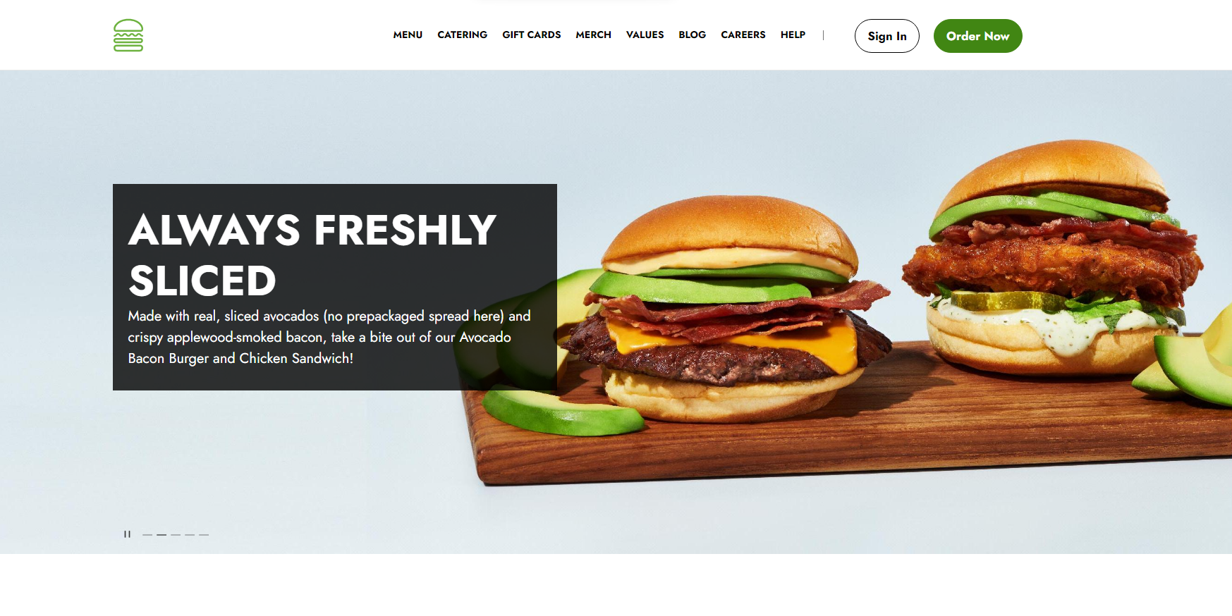
Shake Shack’s modern, youthful website boasts a sleek black-and-white color scheme accented with vibrant green. Featuring its menu prominently on the home page, the site caters to searchers seeking quick access to its offerings. Although many large chains resort to generic-looking restaurant websites, Shake Shack still feels modern and relatable.
The detailed photos of burgers and sandwiches, accompanied by full descriptions and allergen information, prioritize customer satisfaction and safety. This approach isn’t limited to large chains; it benefits any establishment aiming to efficiently serve a diverse audience, including those with dietary restrictions. Thereby, it effectively embraces transparency and accessibility to ensure a positive dining experience for all.
What we like:
- Provides essential information for diners with unique requirements.
- The approachable and accessible design suits a wide audience.
Example 20: Girl & the Goat – Highlighting ambiance through contrast
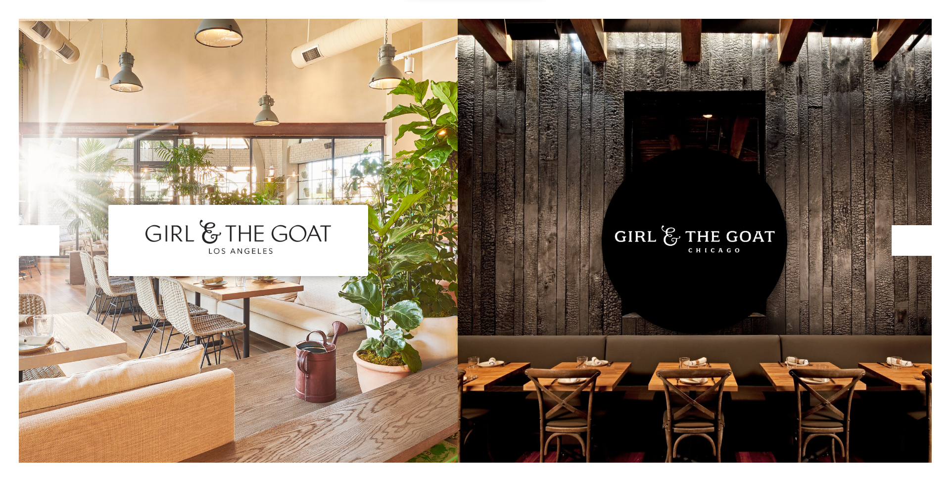
While many restaurants have multiple identical locations, others boast unique personalities at each site. The Girl & the Goat beautifully showcases this aspect on its website. The Los Angeles branch boasts a light and airy interior filled with natural sunlight and greenery. In contrast, the Chicago location exudes a darker and moodier atmosphere, adorned with deep wood tones, black accents, and an ornate bar.
The website thoughtfully presents captivating photos, highlighting the distinct appeal of each ambiance while maintaining focus on their delectable cuisine. What we thought was particularly clever is how it directly contrasts two of its locations on the home page, which highlights their unique experiences.
What we like:
- Excellent use of contrast.
- Highly illustrative use of photography.
Example 21: The Clove Club – Captivating and cinematic design
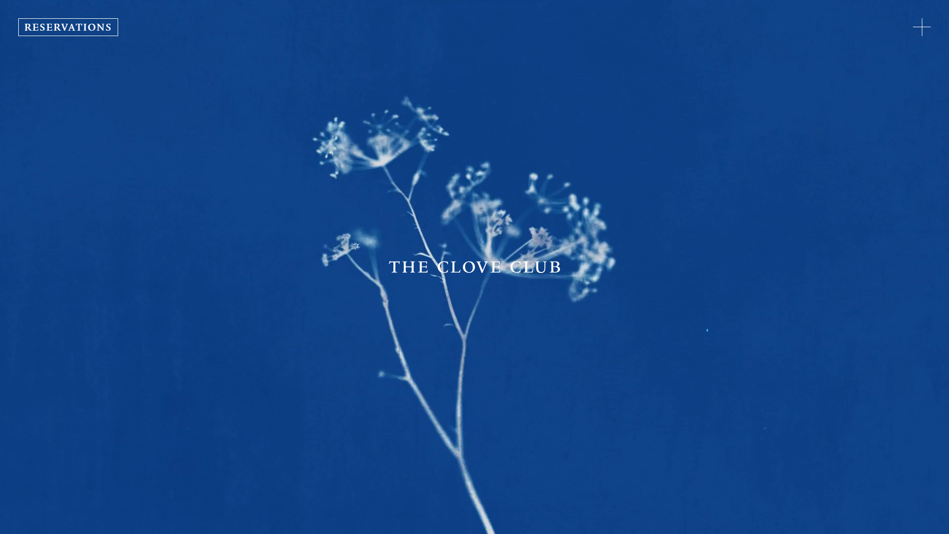
The Clove Club’s website captivates with its breathtaking beauty and cinematic feel. Animated sprouting plant visuals on the homepage add a touch of enchantment. The stripped-back, accessible menu, denoted by a “+” symbol in the top corner, is an intuitive way to provide a menu button without cluttering the screen.
Unlike many other restaurant websites, it doesn’t provide images of any of its food. Instead, it relies on its descriptions and air of mystery to entice visitors.
Notably, the clear “reservations” option directly on the homepage ensures a seamless experience. Clicking it doesn’t redirect users to an external booking website but keeps them within the cohesive website environment. The Clove Club’s recognition of visitors’ needs for swift table reservations showcases its expertise in delivering a user-friendly and inviting online experience.
What we like:
- One-of-a-kind visual experience.
- The excellent fullscreen menu is easy to navigate.
Example 22: Brasserie Blanc – Elegant and functional brasserie website
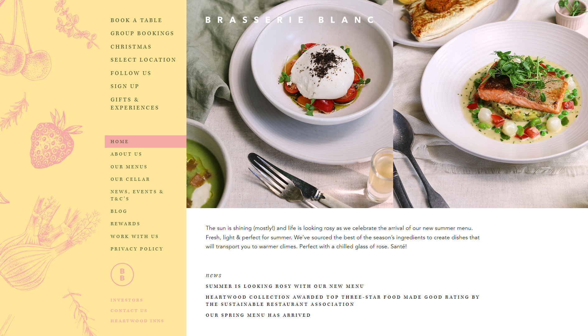
Brasserie Blanc, a small UK restaurant chain founded by French chef Raymond Blanc OBE, excels in serving multiple locations with a well-designed website. Its larger-than-life horizontal design sets it apart from most other restaurant websites. The navigation cleverly includes prompts at the top, covering all essential queries:
- Book a table
- Select Location
- Sign up
- Follow Us
Quick links to menus and pages for other services, such as Private Dining, Vouchers, and Events, add to the site’s efficiency. The website beautifully embodies Blanc’s culinary ethos through illustrations, photographs, and written content.
Additionally, it reflects their commitment to sustainability with information about suppliers and food seasonality. Brasserie Blanc’s website masterfully combines functionality, aesthetics, and the essence of its founder’s culinary vision.
What we like:
- Useful and easy-to-follow quick links.
- Unique, horizontal layout design.
Example 23: Frantzen – Immersive web design
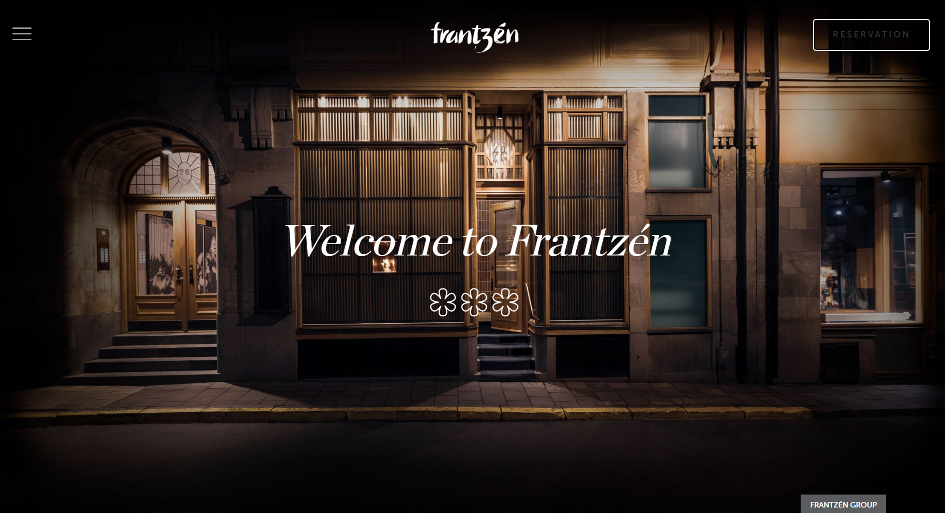
Frantzén offers a distinctive dining adventure, where guests explore the restaurant’s property while savoring courses in different rooms. The website adeptly captures this immersive experience, enticing visitors with captivating images of both the delectable dishes and the modern, low-lit spaces.
The intriguing combination of food photos and the allure of the restaurant’s ambiance dares visitors to embark on their culinary journey by making a reservation. The website skillfully reflects Frantzén’s unique charm, inviting guests to immerse themselves in an unforgettable dining experience.
However, there might be some performance issues having so many high-definition images on your web page. That’s where a tool like 10Web’s PageSpeed Booster comes in handy to help you identify and address performance issues.
What we like:
- A fully immersive and captivating one-page experience.
- The layout and content tell a clear story.
- Seamless booking system.
Example 24: Rose Foods – Vibrant, nostalgic, and stylish website design
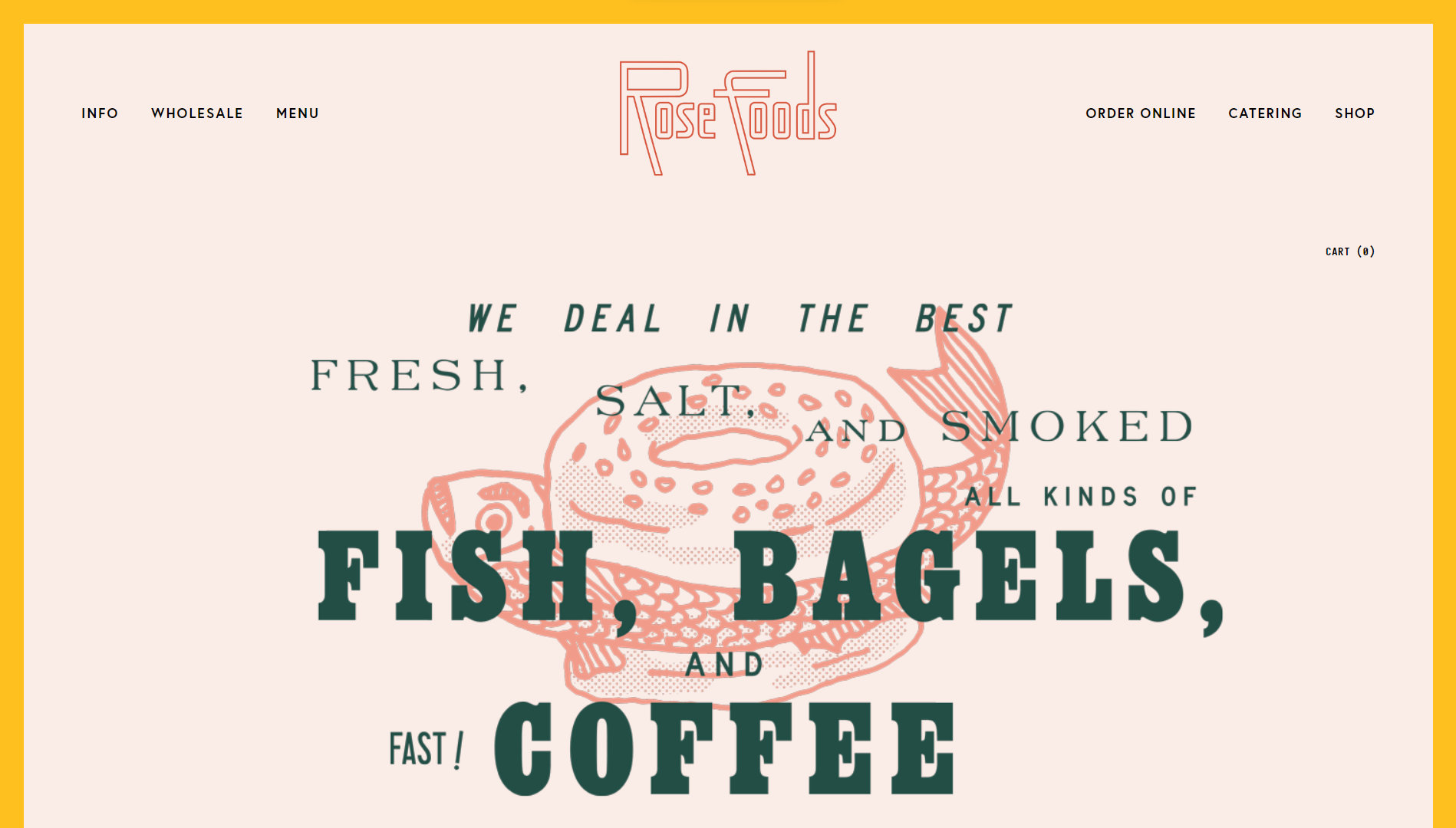
Rose Foods, based in Portland, Maine, showcases its brand personality through vibrant colors on its website. As a house-made bagel shop offering sandwiches and classic Jewish deli fare, the focus on tradition is evident.
Embracing a retro vibe, the website features kitschy line drawings and nostalgic fonts while incorporating a select few photos. This is an example of a website design that’s difficult to pull off if you have no web design experience. However, you can easily get a similar starting point for your restaurant website by using the 10Web AI Website Builder to replicate the design.
What we like:
- Spotify playlist creates a sense of ambiance.
- Excellent use of contrast in color and fonts.
Example 25: Adachi – Stunning Japanese-inspired website design
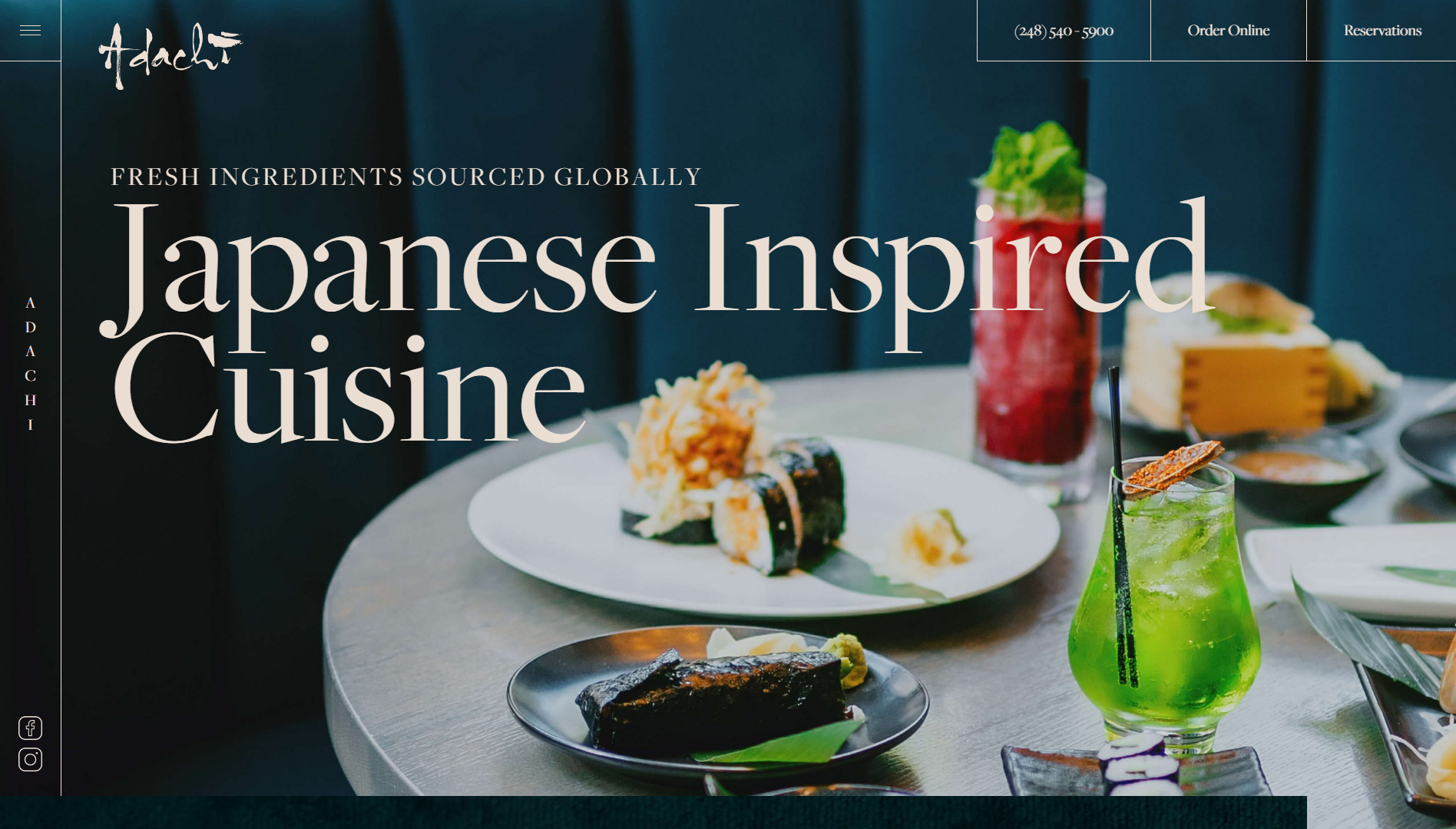
Adachi stands out among restaurant websites by showcasing their Japanese-inspired dishes with a visually captivating website. The site boasts an array of striking photography, impressive effects, and subtle enhancements that set it apart from competitors.
Notably, the sticky header’s seamless transition from transparent to opaque while scrolling and the hovering image tiles near the homepage’s bottom demonstrate the website’s tasteful attention to detail. These well-executed elements elevate the overall user experience, making Adachi’s website a cut above the rest of the world of restaurant websites.
What we like:
- Contact details are always visible thanks to the sticky menu.
- Good use of animation and movement.
Conclusion
We hope this list of the best restaurant websites inspires you to create a unique and memorable online presence for your F&B business. As you can see, there are many ways that you can create captivating, enticing, and mouthwatering experiences online that will keep your seats full and the online orders rolling in. The only limit is your imagination.
10Web AI Website Builder can help you unleash the power of AI to elevate your restaurant website! Get a professional website 10X faster with AI-generated content and images, saving time and effort. Customize every element with our intuitive drag-and-drop editor and premium widgets.
Even if you don’t have a template or know where to get started, 10Web AI Website Builder can help you create a brand new and unique restaurant website from scratch. If you like any of the ideas above, simply ask the AI builder to replicate it and then customize it with your own style, content, and branding. Plus, you can supercharge your website’s performance with 10Web Hosting and PageSpeed Booster.
Get a head start on website creation with AI
Create a custom website tailored to your business needs 10X faster with 10Web AI Website Builder!
No credit card required