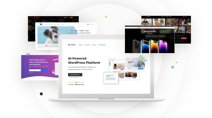
Creating a compelling landing page is often the most important step in turning your visitors into customers. A well-designed landing page will keep visitors engaged and encourage them to take action, such as signing up for an email list or making a purchase. In this article, we'll explore the purpose of landing pages, provide some of the best examples of landing pages for different cases, and share best practices for a high-converting landing page.
Well converting landing pages are crucial for any successful online marketing campaign. They effectively direct your visitors’ attention toward your desired action and help you convert them into customers, subscribers, or leads. By utilizing benefit-driven headlines, value proposition-focused copy, pertinent media, social proof, and a conversion-worthy call-to-action (CTA) offer, you can create landing page examples that effectively communicate your value proposition to potential customers or clients.
This article will provide a comprehensive guide to landing pages, covering specifics, types, examples, and best practices, and discuss high-converting landing page examples for inspiration.
In This Article
What is the purpose of a landing page?
A landing page is a powerful strategy to generate leads and move prospects down the sales funnel. By offering a valuable resource, such as an eBook or webinar registration, a landing page can encourage visitors to provide their contact information.
For instance, a company promoting an AI product for marketers can provide a free video on how to implement AI in sales in exchange for contact information. This can lead to potential customers showing interest in the product and the company following up with them.
However, creating a successful landing page requires careful planning and testing. It’s essential to track conversion rates after launching the landing page to measure its performance and make necessary changes.
Best landing pages: 8 key components
The key to creating the best landing pages is understanding the characteristics that successful landing pages share. Let’s explore these elements in more detail as we delve further into some good landing page examples.
To create an efficient landing page, there are several essential elements that you should include:
- Primary and supporting headlines: Your headline should be concise, compelling, and informative. You should also include a supporting subheadline to encourage visitors to stay on your page.
- Unique selling proposition: Use a unique selling proposition to differentiate your product or service from competitors.
- Significant benefits: Provide a detailed description of the benefits of your offer and respond to any concerns your customers may have.
- Images or videos demonstrating use: Use visuals to help visitors understand your offer and how to use it.
- Social evidence: Use social proof, such as customer testimonials and reviews, to show that others have used and benefited from your offer.
- Reinforcement statement: Use a secondary page title to reinforce your primary value proposition.
- Concluding statement: Use a concluding argument to convey the value of your offer and include a call to action.
- Call to action: Use a compelling call to action that stands out and encourages visitors to take action.
You can create an effective landing page with a high conversion rate using these elements. It’s important to continue to test and modify your landing page to achieve optimal results.
Related Articles
9 e-commerce landing page examples
If you’re in the e-commerce industry, you know that a landing page can make or break your sales. A landing page has the power to captivate potential customers, convince them of a product’s worth, and ultimately persuade them to make a purchase.
Whether you’re trying to launch a new product or improve an existing landing page, these landing page examples showcase the power of persuasive copy, captivating visuals, and smart calls to action. So, let’s dive in and explore these e-commerce product landing pages that excel at driving sales and revenue!
Example 1: Home Chef
Company description
Home Chef is a meal delivery service that delivers pre-portioned fresh ingredients directly to consumers.
Landing page analysis
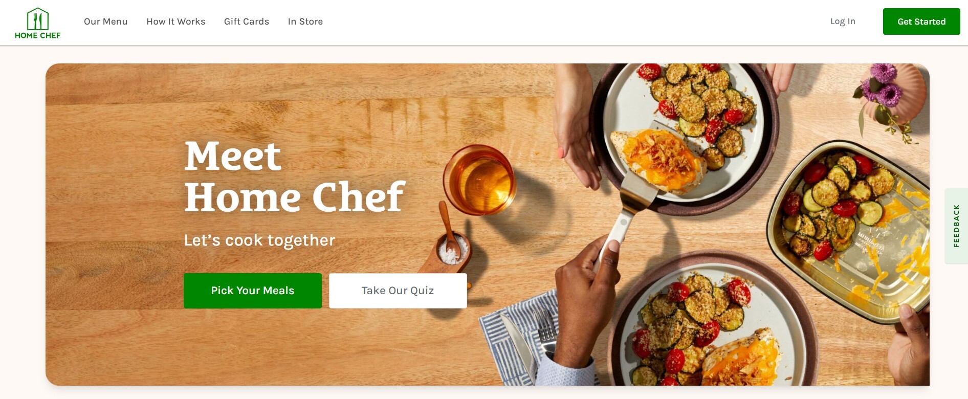
Let’s explore the Home Chef Landing Page. As you can see, this e-commerce landing page does the following well:
- The landing page features an image that clearly represents the brand category i.e food.
- The headline “Meet Home Chef” is engaging and sparks curiosity.
- There is a clear call-to-action button that says “Pick Your Meals” which leads to the meals selection page.
Example 2: 6KU
Company description
6KU designs and manufactures affordable and reliable urban bicycles, including Fixie/Single and 8-speed city cycles for commuting and Gravel bikes for off-road adventures.
Landing page analysis
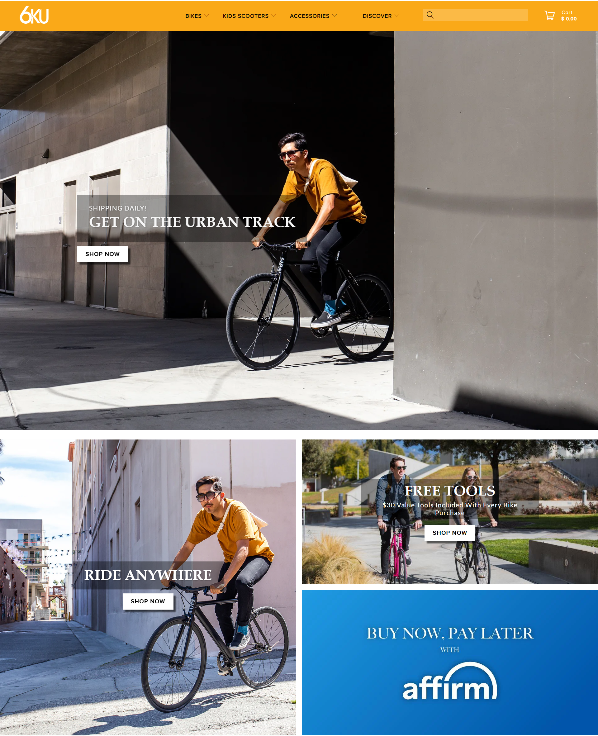
Here are the key points after analyzing the 6KU e-commerce landing page:
- Provides a high-energy overview of their new model, the Urban Track.
- Displays the bicycle from all angles through a combination of lifestyle photographs and product close-ups.
- With every purchase, customers get $30 worth of tools, but the offer’s positioning could be improved so that customers can easily find it.
Example 3: MeowBox
Company description
MeowBox is a cat subscription box service that delivers fun toys and tasty treats to cat owners in Canada, the United States, and the United Kingdom.
Landing page analysis
We’ll take a closer look at the MeowBox Landing Page, one of our best landing page examples.
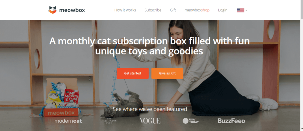
MeowBox has the optimal eCommerce landing page for animal enthusiasts. The concept of this landing page is reassuring and compassionate.
- Customer testimonials and photos of happy cats increase Meowbox’s credibility.
- The featured image and headline clearly convey Meowbox’s main selling point and what customers can expect from the service.
- Meowbox’s social proof is enhanced by a list of prominent companies and publications that have featured it.
Example 4: Solo Stove
Company description
Solo Stove is a DTC brand that manufactures high-quality cooking and heating products. These products enhance outdoor experiences and are made without assistance from outside sources, including camping cookers and fire pits.
Landing page analysis
Next is the Solo Stove page, which makes excellent use of promotional content.
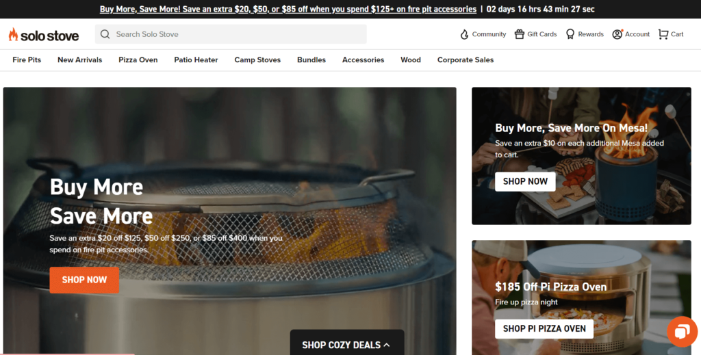
Below is a summary of the analysis:
- A 20% pre-sale discount encourages visitors to act promptly.
- Free returns, shipping, and other perks are prominently featured in the footer.
- The orange and black color scheme reflect the lively nature of the outdoor culinary equipment, with the CTA icon standing out and “Shop Now” creating a sense of exploration.
Example 5: The Ridge
Company description
The Ridge offers minimalist and durable gear for everyday use, including wallets, backpacks, and adapters. Their products feature RFID-blocking technology and come with a lifetime warranty.
Landing page analysis
One of the most effective landing pages we’ve seen recently comes from Ridge, which uses stunning visuals and concise copy. The Ridge’s landing page inspiration comes from its slimmer product line, which consists of fashionable RFID-blocking wallets.
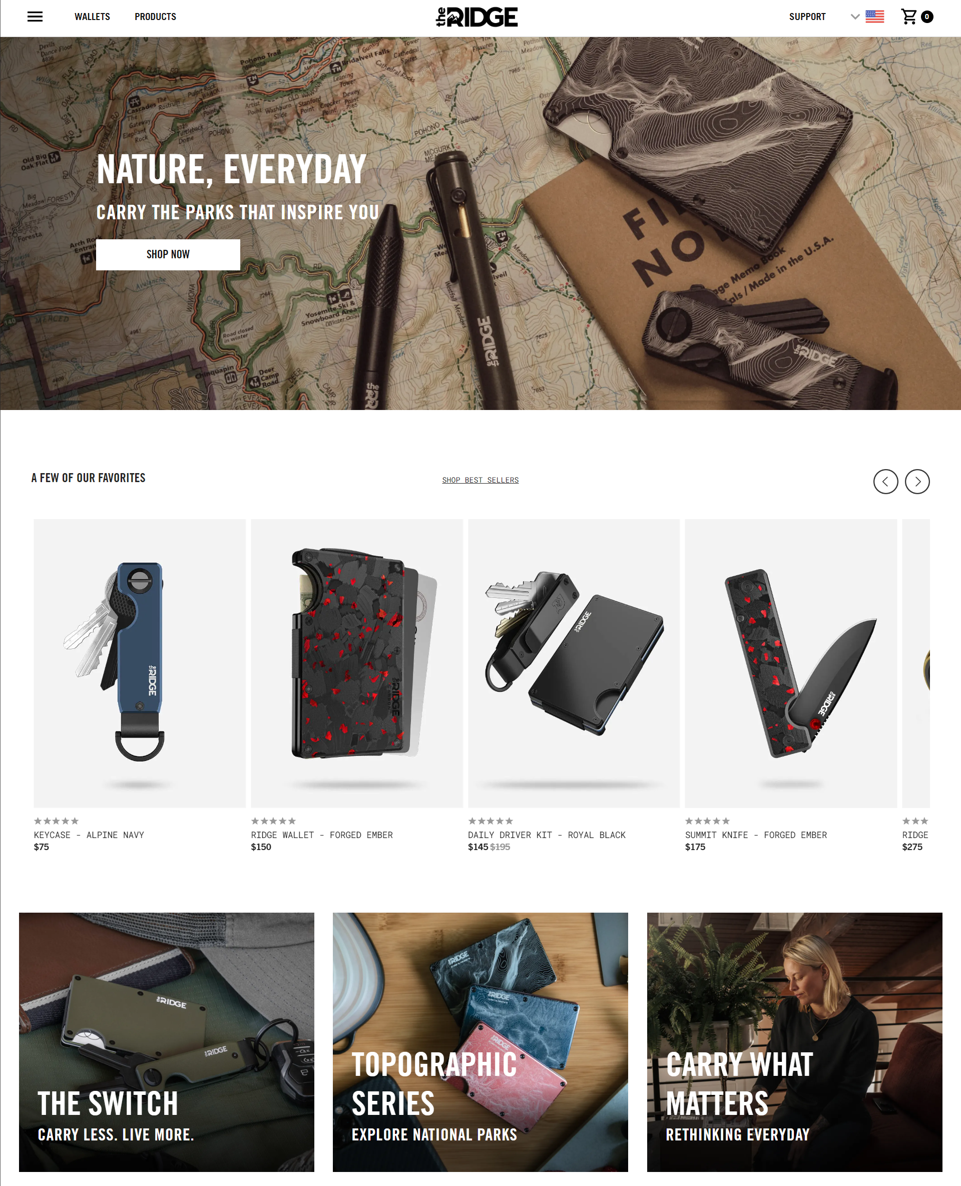
The most appealing aspect of this e-commerce landing page is:
- The header image shows a set of products with an inspiring message, luring visitors to explore.
- The page is well-structured for easy navigation.
- Unique style corresponding to the brand image.
Want to create a landing page that looks as impressive as the one above? With 10Web’s AI Builder recreation tool, you can recreate any webpage you love in just a few clicks! Just enter the URL of any web page, and our AI technology will recreate the layout for you. Then, customize it using 10Web’s editor based on Elementor.
Get a head start on website creation with AI
Create a custom website tailored to your business needs 10X faster with 10Web AI Website Builder!
Get a head start on website creation with AI
Create a custom website tailored to your business needs 10X faster with 10Web AI Website Builder!

Example 6: Vanity Planet
Company description
The company Vanity Planet provides cosmetics, hygiene, and wellness products.
Landing page analysis
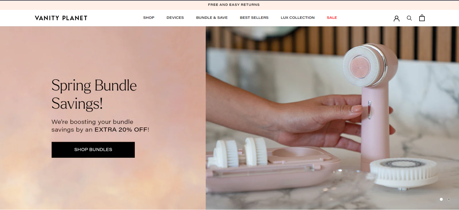
This eCommerce landing page example is worth studying if you’re looking to improve your website’s conversion rates. Here are some highlights:
- Concise headings with subheadings provide clarity to the content.
- High-resolution images highlight the product.
- “Shop Bundles” directs customers to the shopping section, where they can get a substantial discount on products.
Example 7: Nathan Sports
Company description
Nathan Sports is a provider of running and sporting goods, including apparel, equipment, and tools. They provide hydration belts, vests, bottles, gloves, and other running gear.
Landing page analysis
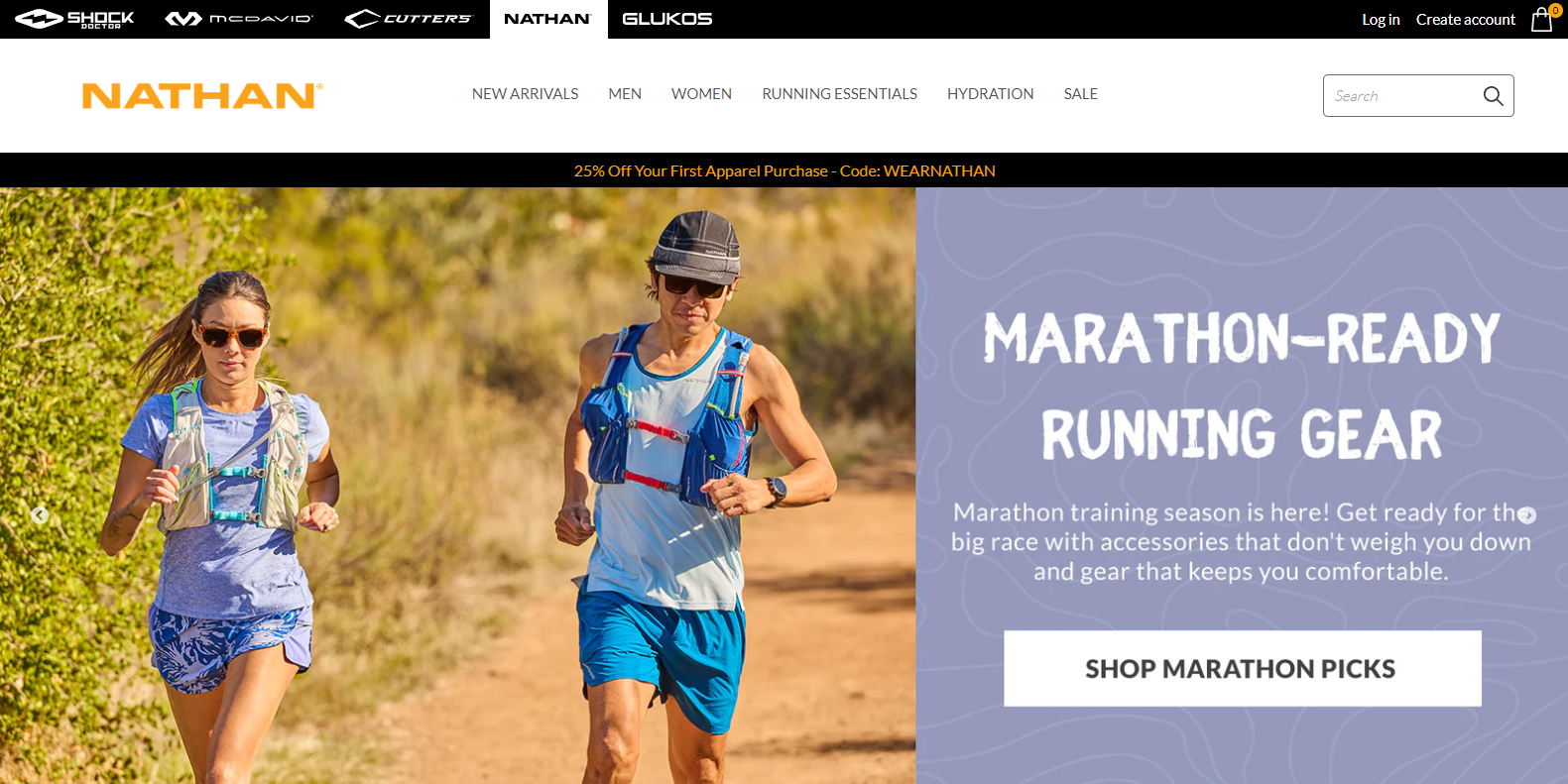
Nathan Sports is another excellent example of matching the ideal product to the right audience. Here are some highlights:
- Eye-catching catchphrase with perfect background with compelling sub-headline.
- A compelling visual of the product in action: Two people are shown wearing the gear and running, demonstrating the practical application of the product.
- Clear and concise call to action “Shop Marathon Picks”.
Example 8: Waterdrop
Company description
Waterdrop is a company that manufactures water-based beverages with the intention of promoting wellness and hydration.
Landing page analysis
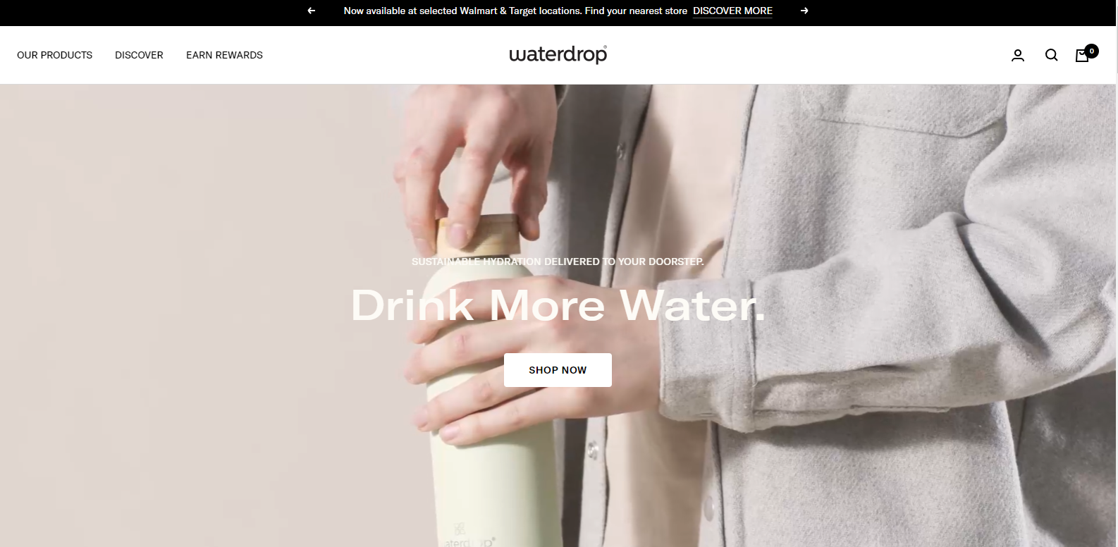
Waterdrop’s landing page features an aesthetic design with a high-resolution image of a person holding the product, making it look modern and innovative. Here are some highlights:
- Elegant and minimalist design with eye-catching animations.
- Images and videos depict the product’s numerous features.
- Throughout the entire page, there is one distinct CTA.
- Changing the color of the text on the landing page from white to dark would further enhance it since the background visuals are light.
Example 9: Quip
Company description
Quip is a productivity platform for Salesforce that improves the way enterprises work together by combining documents, spreadsheets, and chat into one place in Salesforce.
Landing page analysis
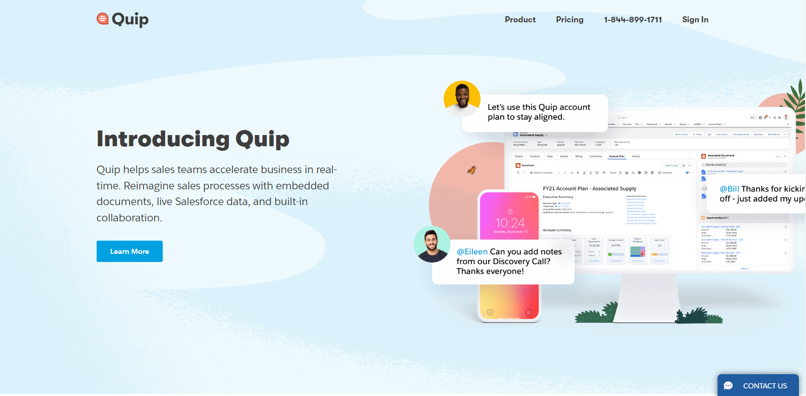
Here are some of the key highlights of Quip landing page example:
- The subheadline hits the nail on the head by depicting the product’s impact in a clear and concise manner.
- The visuals on the right side of the page are eye-catching and showcase the product’s features and collaborative nature effectively.
- While the first headline introduces Quip, it could be improved by adding a more attention-grabbing benefit or action-oriented headline to better captivate the audience.
9 lead generation (coming soon) landing page examples
Lead generation is a crucial component of any successful marketing strategy. It involves capturing potential customers’ interest and converting them into actual leads through effective and targeted messaging. One of the primary tools for lead generation is a well-designed landing page.
Below, we will analyze various lead-generation landing page examples to understand what makes them successful and identify the key elements that can help you create high-converting landing pages for your business.
Example 1: Microsoft Designer
Company description
Microsoft Designer is a new AI tool that enables non-designers to create professional-quality social media posts, invitations, digital postcards, and more.
Landing page analysis
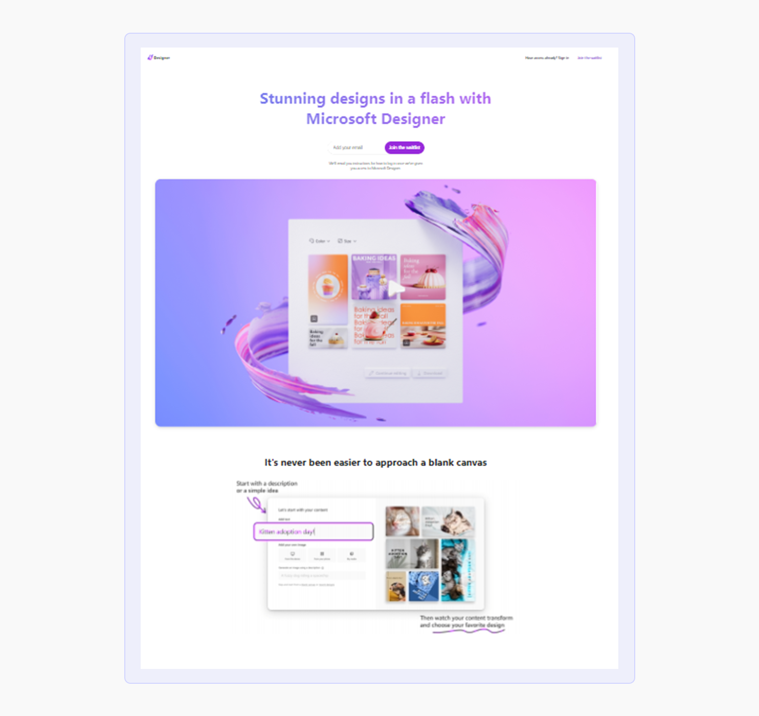
Microsoft Designer’s coming soon landing page generates excitement and anticipation for their upcoming product.
Here are the key points:
- Bold and modern design with a clear message.
- Vibrant colors and eye-catching graphics create a visually engaging experience.
- Waitlist sign-up form for collecting email addresses and providing updates.
- Effectively builds buzz and gathers feedback for the upcoming product launch.
Example 2: Storytellit
Company description
Storytellit provides social media management services to agencies. The company provides social media management services to agencies through its team and tools. By creating custom content, targeting media advertising, and maintaining an updated content library, they help small businesses create, enhance, and manage their social media presences.
Landing page analysis
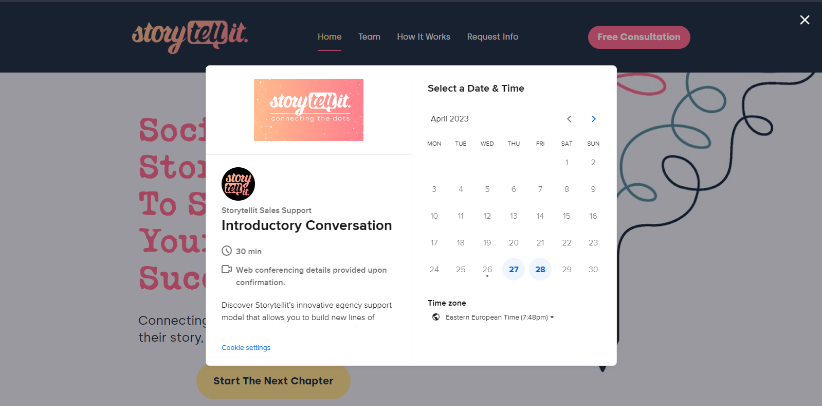
Here are the key points for Storytellit landing page:
- The CTA button integrates seamlessly with your calendar, allowing for effortless 1-1 conversations with customers.
- The landing page effectively communicates the product’s value proposition, making it easy to understand.
- The only downside is the hero image, which could benefit from a high-resolution update.
- The font styles could also be improved for a more cohesive look and feel.
Example 3: Varonis
Company description
As an industry leader, Varonis is taking on a challenge that traditional cybersecurity firms haven’t faced before: protecting and analyzing data. Varonis’s main goal is to keep businesses’ files, communications, financial records, strategy and product plans, and other intellectual property safe from harm. Varonis combines the best features of a dozen different security solutions.
Landing page analysis
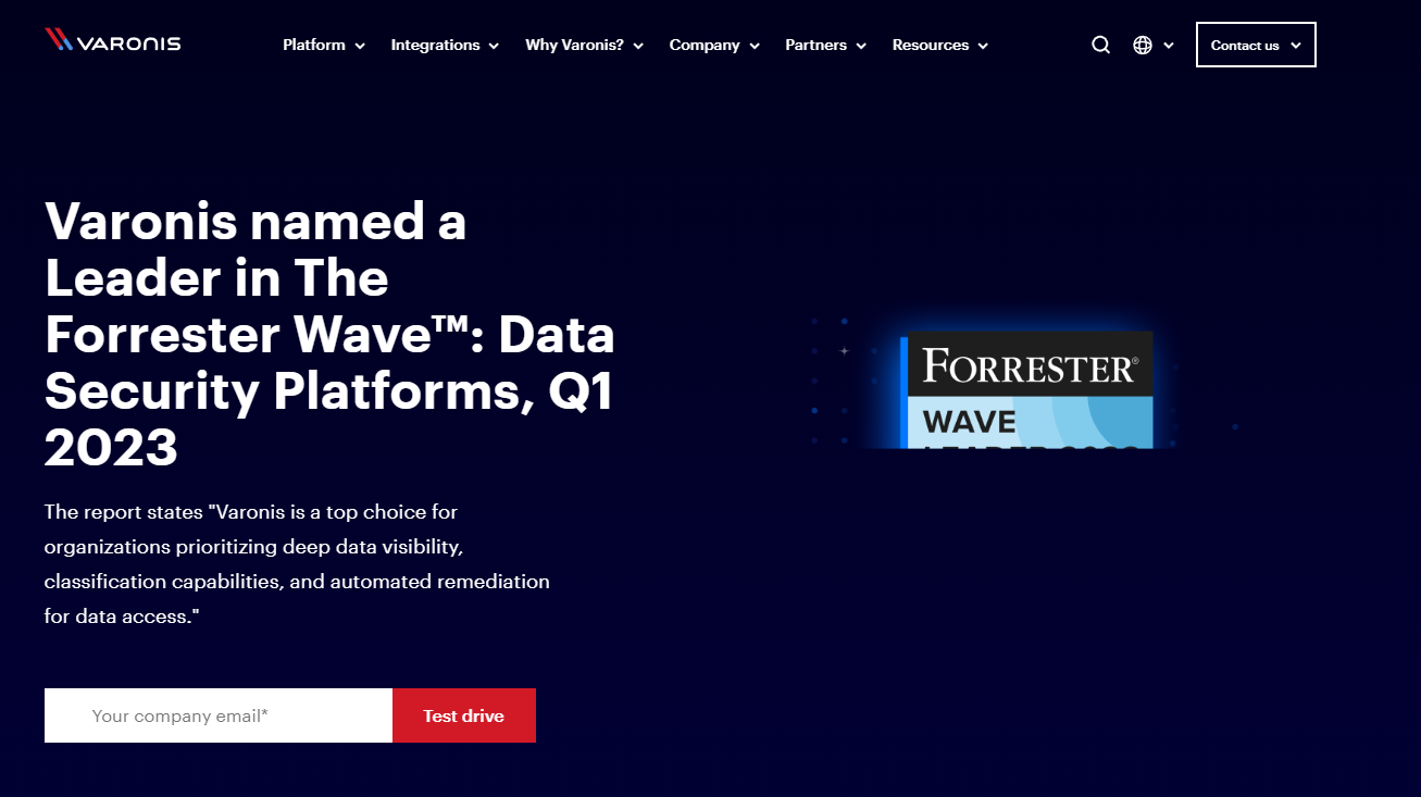
Here are some of the key highlights from Varonis landing page:
- Clear call-to-action button with textbox to provide company email, making it easy for users to sign up
- Hero text highlights the product’s achievement in the data security sector, positioning it as a leader in the industry
- Possibility to improve the hero image by replacing it with visuals that show the rankings or capabilities of the platform
Example 4: Sendinblue
Company description
Sendinblue is a platform for cultivating and expanding brand relationships with consumers. The company provides a range of marketing tools such as email marketing, SMS marketing, and marketing automation. It provides end-to-end marketing automation, transactional messaging, and digital marketing campaigns to organizations of all sizes.
Landing page analysis
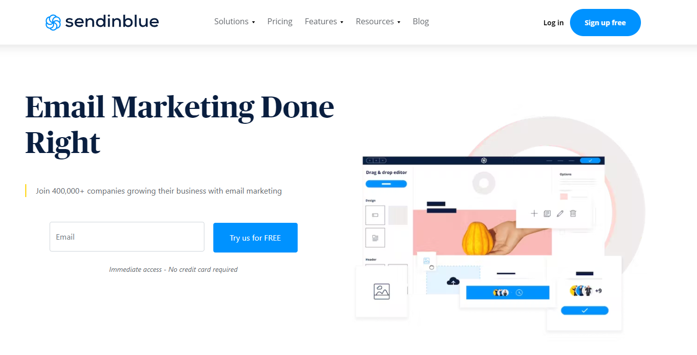
Sendinblue landing page is a perfect example of a lead generation website, focusing on email conversion. The following are some key points we found after analyzing the landing page of Sendinblue:
- The landing page highlights the no-credit-card-needed policy, making it easier for visitors to try the product without any additional steps.
- The product capabilities are showcased in a feature visual overview image, with additional features labeled using icons.
- The image is visually appealing and helps users understand the product at a glance.
Example 5: Walkme
Company description
With its headquarters in San Francisco, California, WalkMe is an American multinational software-as-a-service (SaaS) company. Its Digital Adoption Platform (DAP) enables organizations to measure, lead, and act in order to ultimately accelerate their digital transformations and realize greater value from their software investments.
Landing page analysis
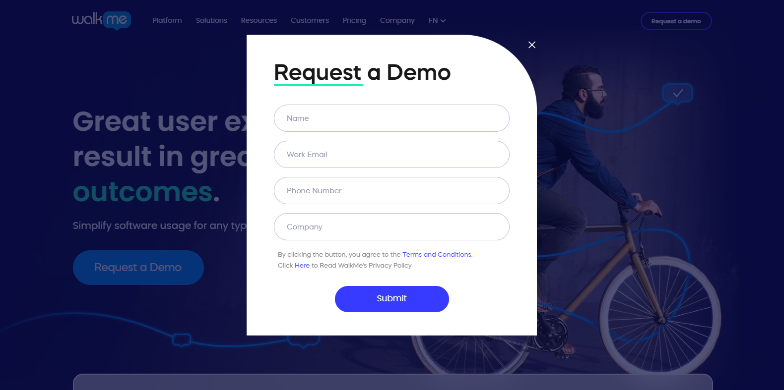
Having analyzed the Walkme landing page, here are some key points:
- The use of blue shades in the landing page design makes the visuals clear and easy to understand.
- The CTA to request a demo is clear and concise, making it easy for users to take action.
- The form UI is user-friendly and visually pleasing, with new design patterns for the form box.
- However, the headline and subheadlines do not clearly explain what the product is, making it unclear to users.
Example 6: Campaign Monitor
Company description
Campaign Monitor is an email marketing platform that allows businesses to create, send, and optimize email marketing campaigns.
Landing page analysis
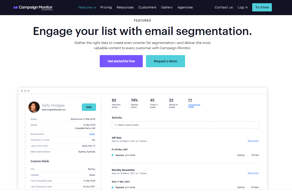
Here are the key points of Campaign Monitor landing page:
- The landing page’s hero section prominently displays the product’s name and its main feature
- The subheading concisely describes the value proposition of the product and how it can benefit its customers.
- The call-to-action button “Get started for free” is clear and prominent, directing visitors to create an account to start using the product.
- The hero image effectively showcases the product and provides a quick overview of its key elements.
Example 7: Netsuite
Company description
Netsuite is a cloud-based business management software suite that offers enterprise resource planning (ERP) and customer relationship management (CRM) capabilities.
Landing page analysis
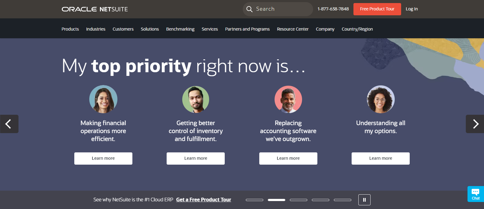
The landing page of Netsuite is visually appealing and professional, with engaging animations and prominent colors. The following are some of the key points:
- Clean design makes it easy for visitors to navigate the page
- Downloadable guidebooks, testimonials, and reports provide valuable information about the product
- Engaging animations and a professional look create a positive first impression
- Clear calls-to-action and easy access to contact information could be improved to enhance the user experience
Example 8: Trello
Company description
Trello is a web-based project management application that allows users to organize and prioritize projects using boards, lists, and cards.
Landing page analysis
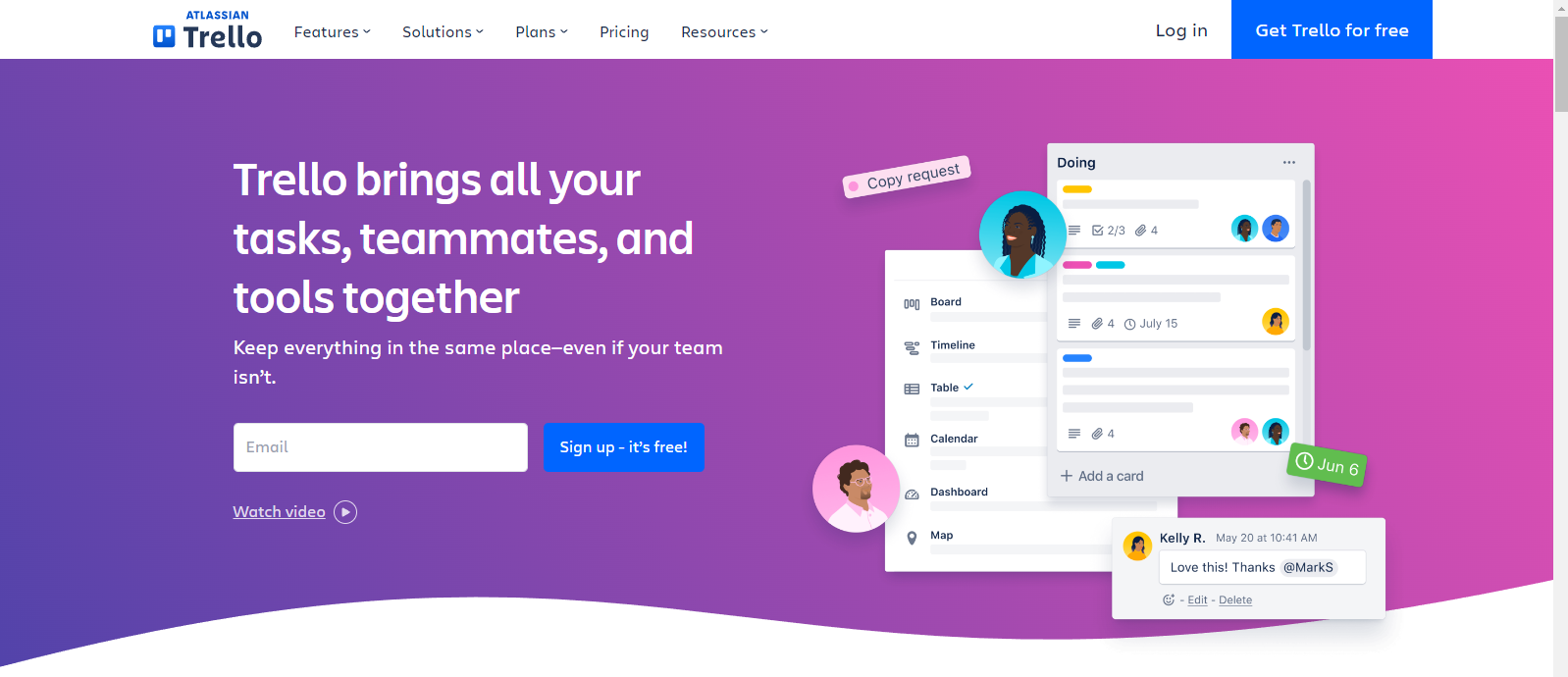
Trello’s landing page creates a strong first impression with its elegant design and effective use of colors, including blue for the prominent CTA. Here is the brief analysis:
- Using visuals and video, the page clearly illustrates the platform’s use cases, allowing visitors to instantly understand its value.
- Throughout the page, blue, purple, and pink colors create harmony and enhance its visual appeal.
Example 9: Asana
Company description
Asana is a company that develops online task management software solutions that allow teams to assign tasks and deadlines and track the progress of their projects.
Landing page analysis
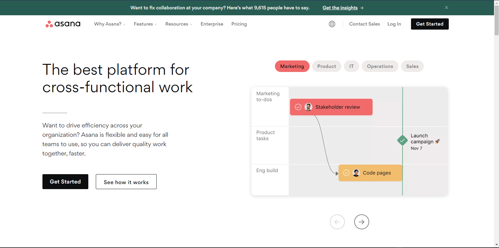
Here are the key points:
- With the heading and visuals, the platform’s function is immediately conveyed.
- The “Get Started” call to action button is prominent and easy to find, allowing users to explore the platform’s capabilities with just a few clicks.
- The straightforward approach makes it easy for users to understand how the platform can be useful for their work.
This landing page analysis shows that Asana effectively communicates its platform’s function through clear headings and visuals. Similarly, 10Web AI Website Builder can help marketers and business owners create stunning landing pages that attract and convert leads with customizable templates and intuitive editing tools.
Get a head start on website creation with AI
Create a custom website tailored to your business needs 10X faster with 10Web AI Website Builder!
9 SAAS landing page examples
Creating a compelling SAAS landing page is crucial for driving conversions and acquiring new customers. A well-designed landing page can make all the difference in generating leads and increasing sales.
To help you in your SAAS landing page design process, we have compiled a list of good landing page examples that will provide you with inspiration and guidance. You can apply these techniques to your own landing pages by following these examples.
Whether you’re looking for landing page inspiration or simply seeking to improve your lead generation efforts, these SAAS landing page examples are sure to provide valuable insights.
Example 1: 10Web
Company description
10Web is an AI-powered website builder that also provides a variety of tools and services for developing and maintaining websites. Along with the website builder, among its features are hosting and PageSpeed optimization. Additionally, its AI assistant assists with SEO-optimized content creation.
Landing page analysis
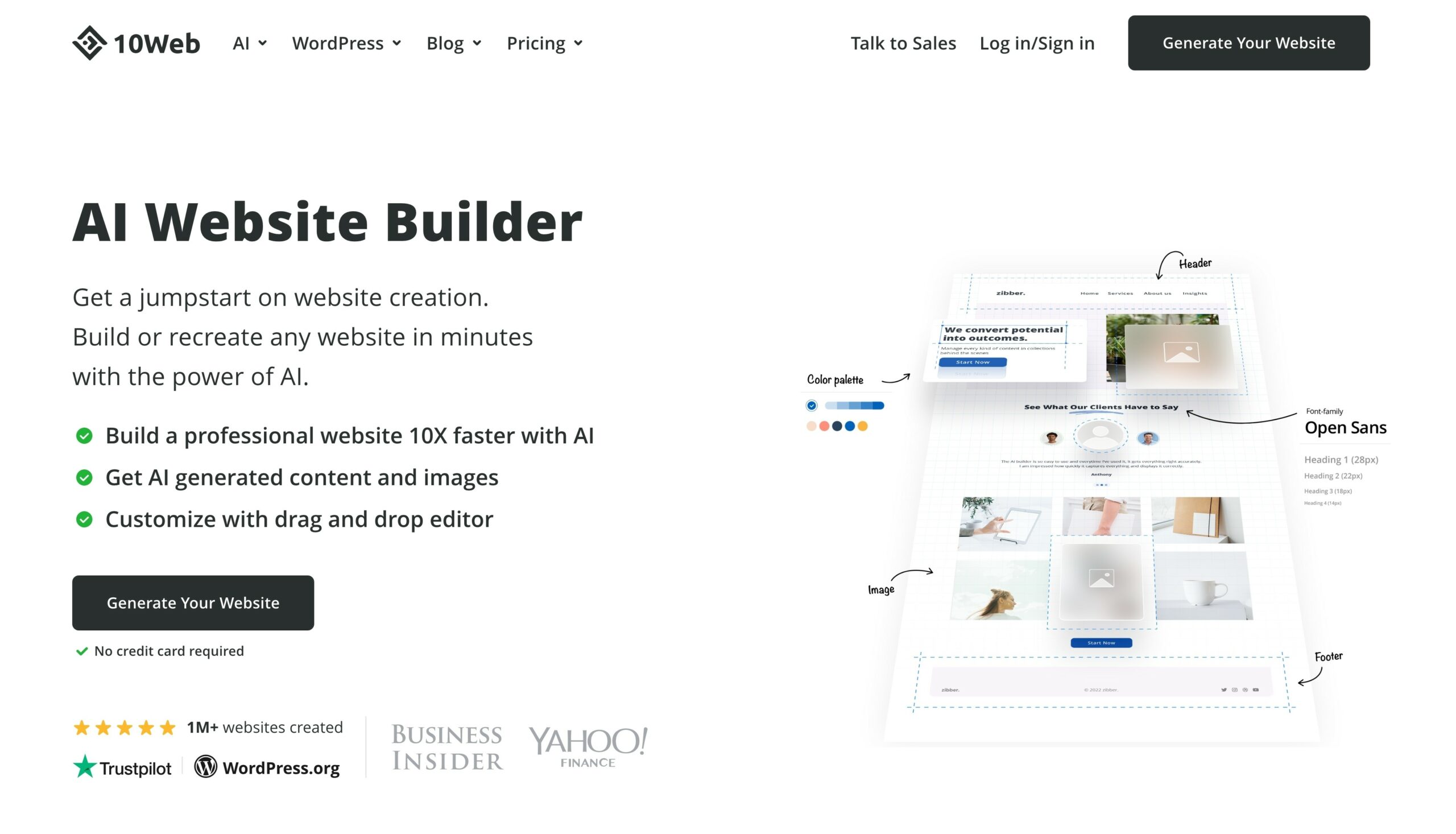
Their landing page succeeds in the following key areas:
- Provides a clear call-to-action for users to sign up for a free trial without needing credit card information
- Credibility is established through mentions of active users, TrustPilot, and WordPress.org
- Screenshots effectively demonstrate the product and its capabilities
- Highlights that all necessary tools are provided for website creation and management, enhancing the value proposition
- Design elements contribute to a clear and visually appealing landing page
As we discuss the landing page of 10Web AI Website Builder, it’s worth noting that you can also utilize this tool to create your own landing pages.
Example 2: Cloudtalk
Company description
CloudTalk is a technology company that develops cloud-based call center software. Its features include call queuing, call recording, voicemail, automated call distribution (ACD), interactive voice response (IVR), call forwarding, call tagging, and monitoring.
Landing page analysis
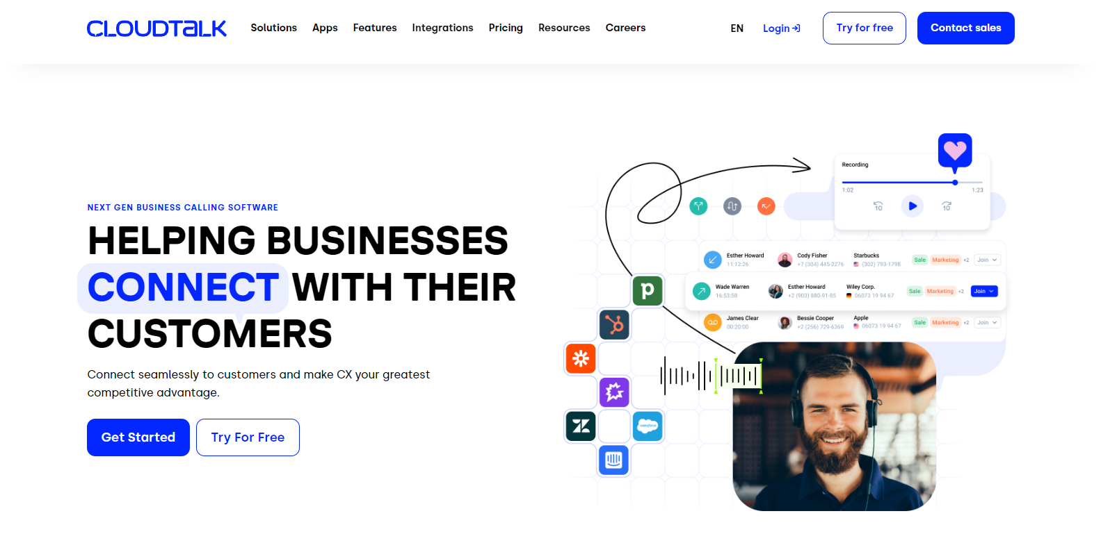
Here are the key points:
- Upon registration, Cloudtalk’s landing page offers a free ebook and highlights its benefits.
- Briefly explaining what the ebook offers is the focus of the landing page.
- On the landing page, there are two distinct forms that violate best practices.
- A phone number requirement may deter some users from registering for an ebook download.
Example 3: Connecteam
Company description
Connecteam is a mobile-first employee management app designed for deskless employees. It offers time tracking, scheduling, communication, and more features.
Landing page analysis
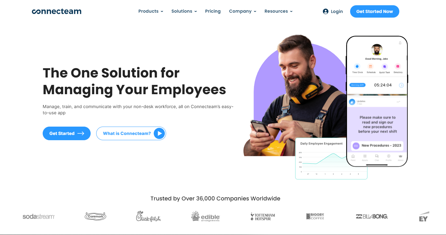
After analyzing Connecteam’s landing page, the following key points were identified:
- Hero section effectively targets the product’s audience of employees
- Clear and concise headlines and subheadlines make it easy to understand the product
- Simple and straightforward call to action with a video demo to showcase the product’s functionality
- Engaging animations visually depicting the product’s features in an elegant way
- The credibility of the brand is enhanced through the featured brands that use the ConnectTeam product.
Example 4: Zoho CRM
Company description
Zoho CRM is customer relationship management software that assists organizations with the administration of their sales, marketing, and customer care activities.
Landing page analysis
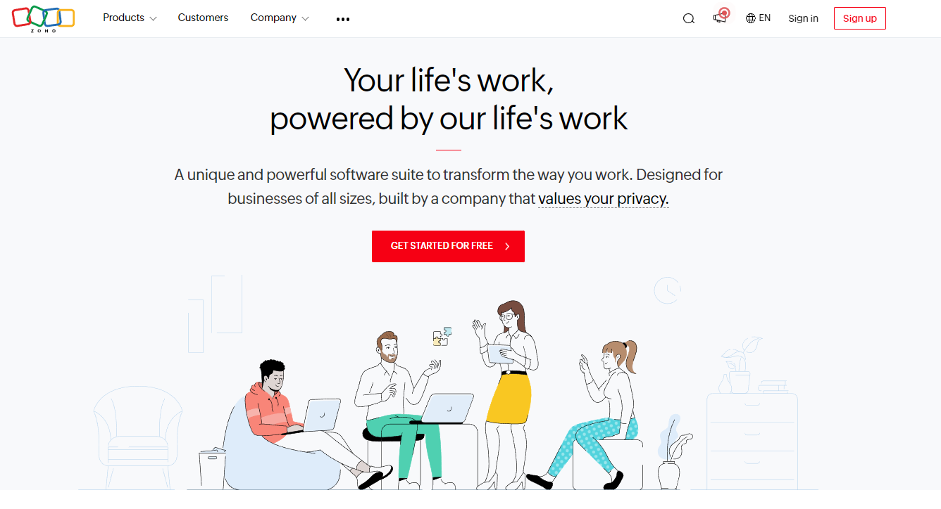
Zoho CRM’s landing page is a remarkable example of a successful landing page design, with an attractive hero area that immediately catches visitors’ attention.
- The interface is beautifully simple and elegant, with a clear focus on the CTA button.
- The headline is strong and empathy-based, grabbing the reader’s attention, and the subheadline clearly showcases who the product is for.
- While the image is decent, it could be improved to better depict the workflow of the product or a use case.
Example 5: Jira
Company description
Atlassian created Jira, a project management application. It is intended to assist teams in planning, tracking, and managing software development projects.
Landing page analysis
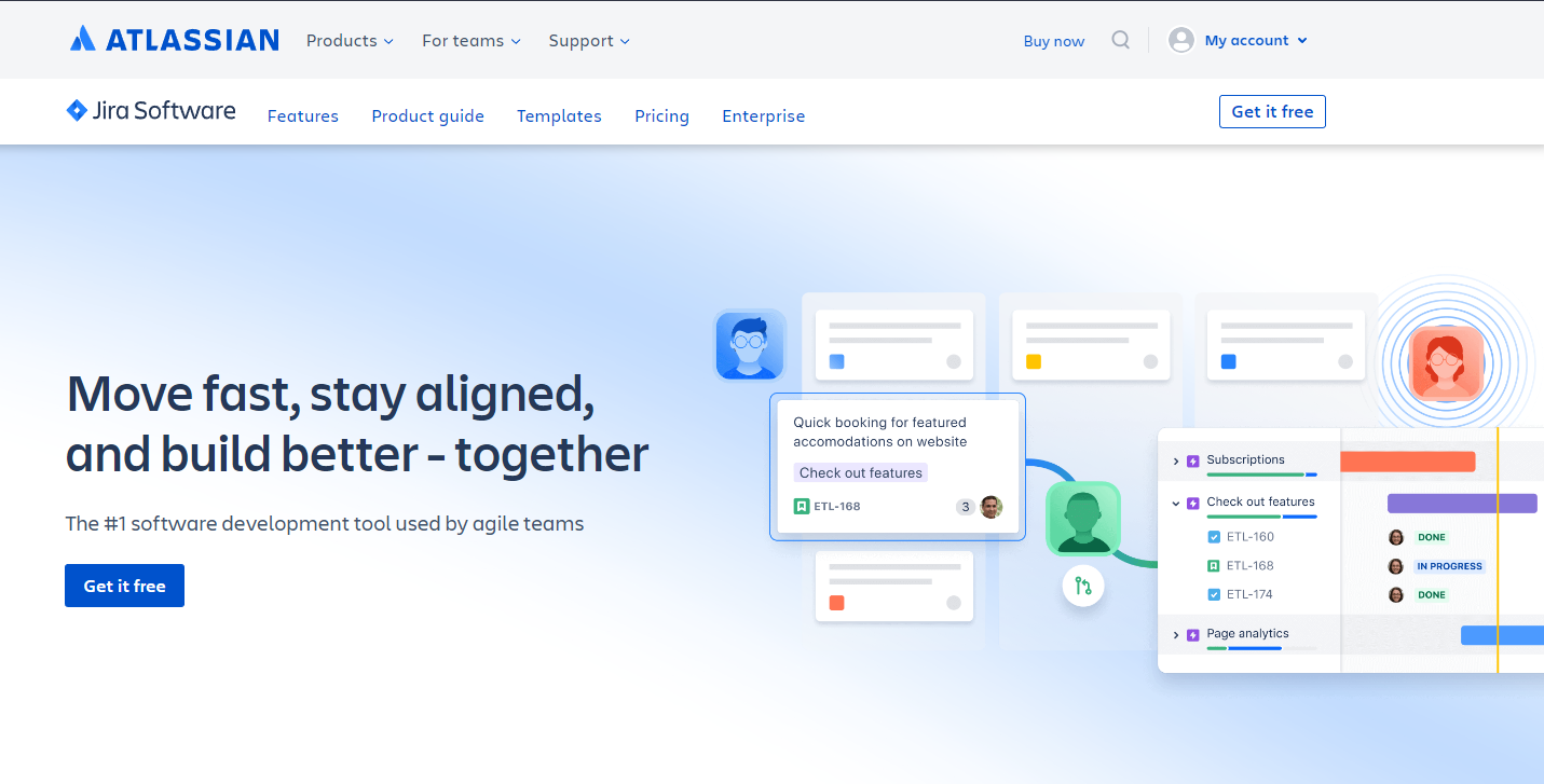
Some of the most notable attributes of Jira’s landing page are as follows:
- Information delivery is clear and concise.
- The minimalist design of the page ensures quick loading on mobile devices and is optimized for both desktop and mobile.
- Visual representation effectively depicts the workflow of the product.
- Product screenshots could be improved by featuring larger, more mobile-friendly images.
Example 6: WebEngage
Company description
WebEngage is a marketing automation platform that helps organizations boost user engagement and retention through email, SMS, online push notifications, in-app communications, and other channels.
Landing page analysis
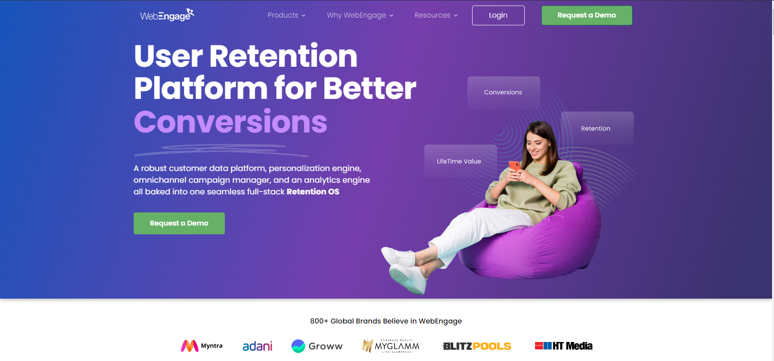
WebEngage’s landing page contains the following key elements:
- WebEngage’s landing page has a strong hero section with clear content, product description, and social proof.
- A landing page with visual graphics provides customers with the necessary information in small blocks without overwhelming them.
- Showcase of popular brands using this product to improve their brand reputation.
Example 7: Builder.ai
Company description
Builder.ai is a platform that enables businesses to create custom software without coding or technical expertise. The platform employs artificial intelligence to assist users in developing software tailored to their requirements.
Landing page analysis
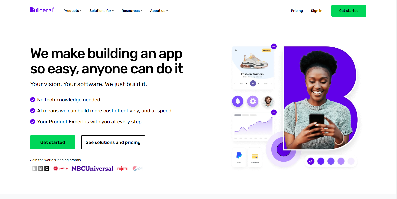
We have identified several key points worth noting on Builder.ai landing page:
- The hero text on the page cuts straight to the chase, letting you know they’re here to help you build an app.
- A handy checklist lays out exactly what sets this product apart and who stands to benefit from it, with no frills attached.
- Getting started is a breeze, with a user-friendly sign-up process and a clear view of pricing plans right at your fingertips.
- Impressive animations showcasing the biggest companies such as BBC, Pepsi who are using this product enhance the site’s credibility even further.
Example 8: Express VPN
Company description
ExpressVPN is a provider of virtual private networks that offers secure and anonymous Internet access. The service encrypts and conceals users’ IP addresses to safeguard their online privacy.
Landing page analysis
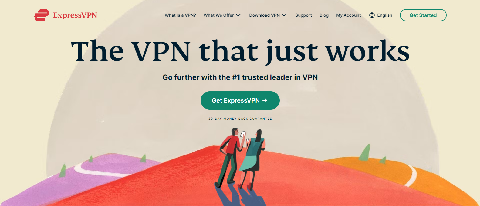
Here are the key points on Express VPN landing page:
- The 30-day money-back guarantee reassures hesitant customers.
- The showcase of people using mobile on a mountain is an excellent visual representation of the product’s capabilities.
- The copy includes essential phrases that a potential VPN customer would be interested in hearing, emphasizing its speed, security, and multi-platform support.
Example 9: Airtable
Company description
Airtable is a cloud-based collaboration platform that enables users to manage and organize data in a flexible and customizable manner.
Landing page analysis
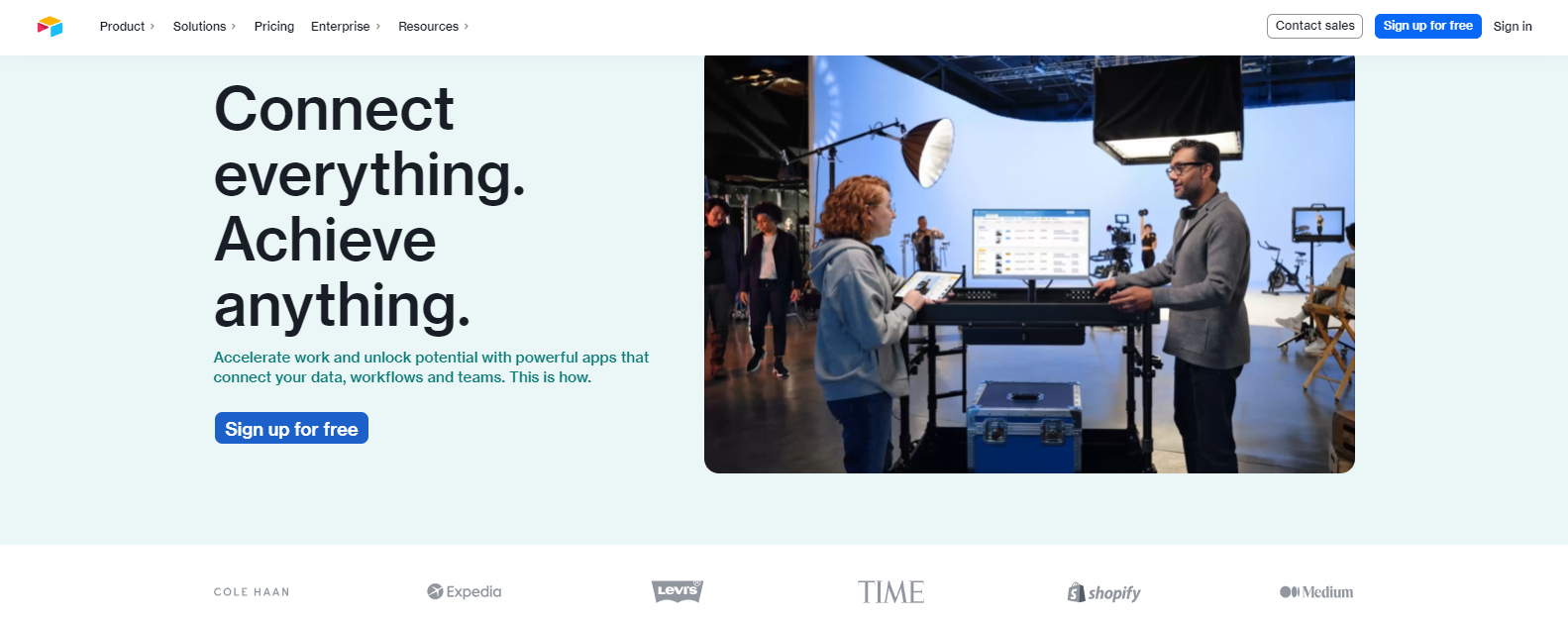
Here are the key points for the Airtable landing page:
- Animated product demonstration effectively showcases product functionality.
- The hero section has a clear and engaging copy that highlights product benefits.
- Prominent display of well-known client logos adds credibility to the product.
- Adding more call-to-action icons throughout the page to increase conversions.
- Improving mobile optimization for faster loading times on mobile devices.
If you are looking for an all-in-one solution to build and optimize your SAAS landing pages, 10Web AI Builder has you covered. Our platform features advanced AI technology, pre-designed templates, and powerful customization tools to help you create pages that convert. Sign up now and take your SAAS business to the next level.
Get a head start on website creation with AI
Create a custom website tailored to your business needs 10X faster with 10Web AI Website Builder!
Get a head start on website creation with AI
Create a custom website tailored to your business needs 10X faster with 10Web AI Website Builder!

8 best practices for a high-converting landing page
Previously, we explored the best landing page examples in depth. However, it’s equally important to understand the best practices for creating a high-converting landing page.
To help you create high-converting landing pages, we’ve compiled a list of eight best practices to follow.
- Showcase your product or service: Use visuals like images, animations, and videos to demonstrate how your product or service works and make them relevant and high-quality.
- Guide attention: Use directional signals like visual cues and animations to direct visitors’ attention to the important elements on the page, and ensure consistency with your overall design.
- Eliminate distractions: Remove any elements or links that may cause visitors to leave, and focus only on what’s necessary for visitors to convert.
- Include social proof: Use testimonials and social proof from real customers, including personal information like full names, job titles, and even photos or videos to make them more trustworthy.
- Use persuasive language: Use simple and clear language that is easy to understand and highlights the benefits of your product or service rather than just listing features.
- Optimize for speed: Keep your landing page quick by minimizing the number of elements on the page, optimizing images, and using tools like Google’s PageSpeed Insights.
- Continuously improve: Test and revise your landing page using A/B testing tools to continually improve the effectiveness of your landing page.
Conclusion
Any business or organization seeking to engage and convert online visitors into customers or leads must create a high-converting landing page. Based on the best landing page examples provided, businesses can follow certain best practices and key components to enhance their landing pages and maximize conversions. Businesses can communicate their value proposition to potential customers or clients through thoughtful consideration of design elements, clear messaging, calls-to-action, or testimonials, and social proof.
And with 10Web AI Website Builder, businesses can take it to the next level by creating high-converting landing pages for e-commerce, lead generation, and SAAS. With our powerful yet user-friendly platform and AI technology, businesses can easily create stunning pages that drive conversions. By following the best practices and utilizing our tools as inspiration, businesses can create landing pages that look great and deliver the business results they need.
FAQ
What is the difference between a website and a landing page?
How can I measure its success?
What's a good conversion rate for a landing page?
How can I optimize the loading time of my landing page?
How to do A/B testing for my landing page?


It’s really very readable, thanks a lot for sharing such good information.
Thank you… this article is very helpful for all of us I hope you bring more information related to this.
Thanks for the post
Wow! Finally I got a webpage from where I be capable of really take useful information concerning
my study and knowledge.
Such A Wonderful Blog thank you for the guide
great article, super clear and structured! Very Helpful to me.
greetings from Germany Berlin
Such A Wonderful Blog
Thank you Revy!